Saturday, April 30, 2011

Mark's Finest Papers 53 - A Hat Pin

Vicki Dutcher, our Blog Team Coordinator at Mark's Finest Papers, is stepping down from that position after this challenge.  I am going to miss her!  You can tell by Vicki's comments what a fun-loving, compassionate person she is. 

Patty Penn will be filling Vicki's shoes soon, and we warmly welcome Patty as our leader.  :)  Can't wait to see what you'll do, Patty!

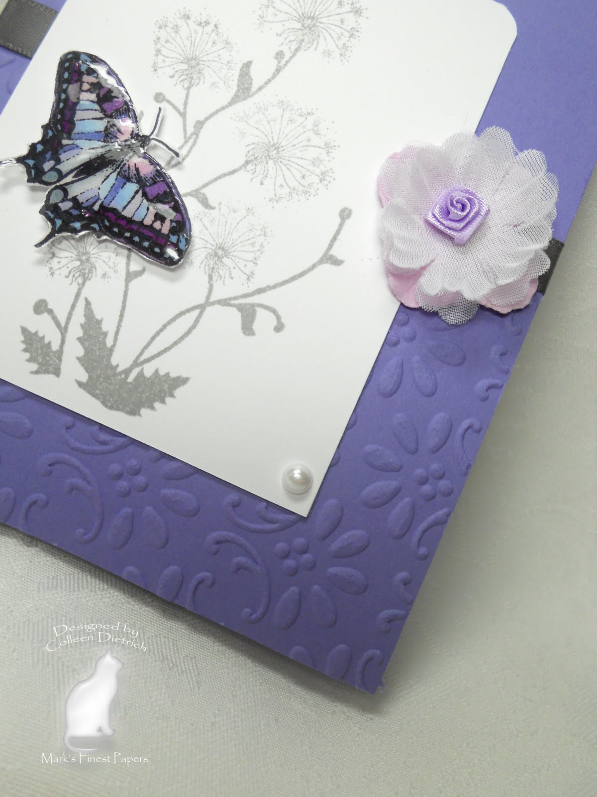
The challenge this week is to use a hat pin.  I have never been a fan of using pins on cards.  They look pretty, but doesn't it put the receiver at risk of getting poked?  ;)


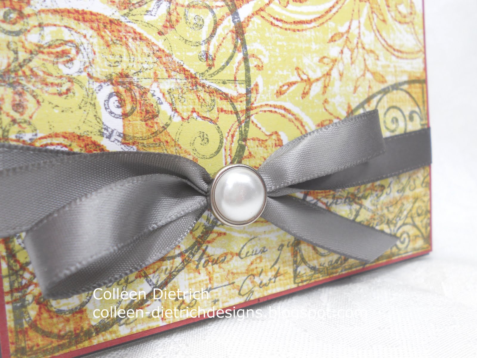
The patterned paper is available through Mark's Finest Papers...it was included in my Design Team package.  I really love the colors!  That was my inspiration for the cardstock colors of Old Olive and Buckaroo Blue.

The hat pin is also available through Mark's Finest Papers.  It IS a pretty one, isn't it?

I love my Spellbinders Fancy Tags, but am getting tired of having only those in my stash.  I noticed that there are some new ones available HERE and HERE and plan to order soon! 

Have any hat pins lying about?  Then make your creation and link it up HERE to play with us!  The deadline is Friday, May 6th at 3 pm EST.  For some inspiration, check out my teammates' creations, too:

Vicki Dutcher -- Joanne Grezlak -- Geri Utterback --

And just a reminder that there are weekly winners once again at Mark's Finest Papers challenge blog.  :)

Thanks for joining me!

Colleen

Stamps:  Just Dandy by Mark's Finest Papers
Paper:  Old Olive, Buckaroo Blue, patterned paper thru MFP, white by PTI
Ink:  Old Olive, Timber Brown Stazon
Other:  green seam binding (recycled), hat pin from MFP, sponge, Big Shot, Spellbinders Fancy Tags, green gems by Queen & Co., dimensionals


Friday, April 29, 2011

Mother's Day, Inspired by Royalty

I happened to wake a little early today, so I turned on the Royal Wedding.  I'm so happy for that young couple!  My eyes well up when I see a bride, whether I know her personally or not. 

I need to make several Mother's Day cards, so I began with this one yesterday.  Only a few more to go!

I love the color purple and fleur-de-lis images, and they sure are fitting for royalty.  I noticed a golden fleur-de-lis panel behind the priests this morning, during the Royal Wedding. 


The Curly Label punch, behind the fleur-de-lis punch, started as white cardstock.  I sponged the heck out of it with some Distress Inks to help it match the patterned paper at the top of the card.  And the purple fleur-de-lis also began life as a white punch-out.  I used Milled Lavender and Dusty Concord Distress Inks to color it.


I adore my Martha Stewart Iron Gate punch, and it looks very appropriate here.


The crown from Stampin' Up!'s Artistic Etchings was stamped in Frayed Burlap Distress Ink, then touched with gold Smooch Ink and small pearls.  The sentiment is from SU's Something to Celebrate, in Walnut Stain Distress Ink.

I'm entering this at City Crafter Challenge Blog:  'Mother May I' is the challenge.

An update on my daughter:  she has gained some much-needed weight, but her mind remains stuck in her anorexic thoughts.  She still thinks she is fat, and longs to be 'skinny'.  I pray that she will, in time, see herself the way we see her:  a slim, beautiful creature who has the world at her feet.  It will take months of therapy for her change the way she sees herself.  We feel we have the best team of doctors, therapists, nutritionists and are on the right course.  It makes me sad that she is so desperately unhappy.  She said she feels hollow inside.  :(  We've been using The Maudsley Approach to help her get well.  You can read about it HERE

Thanks for joining me today.

Colleen

Stamps:  Artistic Etchings, Something to Celebrate - SU
Paper:  purple from My Mind's Eye 'La Paperie', tan floral from DCWV 'Once Upon a Time' stack, white by PTI
Ink:  Milled Lavender, Dusty Concord, Frayed Burlap, Tea Dye, Walnut Stain, Old Paper, Antique Linen Distress Inks
Punch:  Martha Stewart Iron Gate, Fleur De Lis by Martha Stewart, Curly Label by SU
Other:  crochet trim, pearls from Recollections, Big Shot, Gold Smooch Ink, Spellbinders Fancy Labels, sponge, lavender gems from Queen & Co., dimensionals

Thursday, April 28, 2011

Play Date Cafe 79 - Hero Arts


Our very lovely, very British Sarah Anderson has the color story for us this week at The Play Date Cafe.
I had a bit of trouble with this one.  My creativity has been coming in fits and starts lately, and when it was time to prepare for this card, I had to really mull it over.

I found a patterned paper in My Mind's Eye La Paperie with lime and red in it, and then the rest was easy. 
Our sponsor this week, Hero Arts, kindly let each Design Team member choose a stamp set.  I chose Flourish Grids, because they remind me of my trip to Charleston, South Carolina last fall:


So, I stamped the semi-circle in gray ink a couple of times on my patterned paper, and also used a Hero Arts stamp I already owned, Old French Script


I mounted this piece on Ruby Red, then Basic Gray cardstock, added a couple of embellishments, and voila! 
Some close-up shots:


And you know me:  I like decorating envelopes, too!


The "Cup of the Week" winner this week will receive a $25 shopping spree from Hero Arts.  Lucky duck!

Check out our Design Team's samples:
Ruby -- Tracey -- Jaclyn -- Jinny -- Julie -- Michele --
Fiona -- Libby -- Andrea -- Savannah --  Sarah
and our special Guest Designer, Kelly Rasmussen of Hero Arts! 

If you are inspired to play along with us, here's what you have to do:
Please follow THE PLAY DATE CAFE RULES carefully to enter.
Deadline for prizes is 11:59pm EST on Tuesday
The 'Cup of the Week' will be announced during the next challenge.
ALL SKILL LEVELS ARE ENCOURAGED TO PLAY! 
We want you to enjoy this challenge. 
Interpret the colors the way you see them. 
We do not use specific card stock color names or brands.
Break out of the box and have fun! 
The main requirement is:
PDCC COLORS BE THE 
FOCUS OF YOUR SUBMISSION
When using additional colors, please limit them to neutrals. 
You are welcome to combine challenges, 
but we do ask that:
 1. The PDCC name and/or photo is used

2. OUR colors are the focus of the card.

Thanks for joining me today.  I always appreciate your visits.  :)

Colleen

Stamps:  Hero Arts - Flourish Grids, Old French Script
Paper:  Basic Gray and Ruby Red by SU, patterned paper by My Mind's Eye La Paperie
Ink:  Basic Gray by SU
Other:  gray satin ribbon by Offray, silver/pearl brad by Recollections, dimensionals

Wednesday, April 27, 2011

Mushrooms and Flowers

I was a busy, busy stamper yesterday.  The kids went back to school after a long Spring Break, and I was able to crank out 5 cards.  That's a lot for me!  It was extremely therapeutic, and so satisfying.

I played in two challenges over at Splitcoaststampers:  Clean and Simple 116 - Artist's Rule of 3s, and Ways To Use It 319 - OVAL-icious.

First up, the fun mushrooms....


Aren't these toadstools adorable?  I never used this stamp before, or the sentiment.  It is from Mark's Finest Papers Garden Fairies set.


The patterned papers are retired Stampin' Up! stuff, from one of those fun $1.00 scrap bags I get from my SU demo.  The jagged edges on the blue polka dot paper were already there!

The next card is more serious, with a floral theme. 


This time I used MFP's In My Mother's Garden.  There is an image in that set of a gateway, surrounded by flowers and cats.  I stamped it repeatedly in Antique Linen Distress Ink to create my own subtle patterned paper.  The gorgeous trim is from a cheap, cheap fabric warehouse in Philadelphia.  I can't remember what I paid for this, but it was waaaaay less than you'd get at a traditional craft or fabric store.

The sentiment was stamped with Timber Brown Stazon Ink (a new purchase this past weekend).  I used Antique Linen to sponge around it. 


The closest cardstock color I had to that ink color is River Rock, and matted the sentiment oval with it.

The flower is a layering of Prima plain white flowers, and a 5-Petal Flower punch from a page in a book.  Like that pearl brad?  I found it in the wedding aisle at Michael's.  BRIDE'S magazine has a line of goodies for the DIY bride, and these were too beautiful to pass up!  Inexpensive, too.  There were either 30 or 40 of them on a card for $3.99.

I'll be back tomorrow with a new Play Date Cafe card.  Hope you like it!

Colleen

Mushroom card:
Stamps:  Garden Fairies by Mark's Finest Papers
Paper:  assorted scraps from SU, white by Papertrey Ink
Ink:  Riding Hood Red, Wild Wasabi
Punch:  Modern Label
Other;  red pearls by Queen & Co., dimensionals

Floral Card: 
Stamps:  In My Mother's Garden by MFP
Paper:  white by Papertrey Ink, River Rock
Ink:  Timber Brown Stazon, Antique Linen Distress Ink
Punch:  5 Petal Punch
Other:  Big Shot, oval and scalloped oval Spellbinders nesties, pearls by Queen & Co. and Recollections, trim from fabric store (no name), Prima Flowers, pearl brad from BRIDE'S, dimensionals

Sunday, April 24, 2011

Happy Easter!

Happy Easter!  Our family is being very, very low-key today, for my daughter's sake.  No company, no visiting relatives.  We had an egg hunt this morning, which is our tradition, and the girls got their Easter baskets when they woke up. 

I had no time to make Easter cards this year.  Instead, I am sharing some cards I had done last year, before I began my blog. 


I still like these cards!  Sometimes I look back on something I'd done a while ago and say, "Blecch!", but not with these.

Hope your holiday is a blessed one, filled with happy moments.

Colleen

Top Card:
Stamps:  Tender Toile, Garden Silhouettes - both SU
Paper:  Going Gray, Very Vanilla, Whisper White, designer paper by SU
Ink:  Stazon Black, Basic Gray
Punches:  Iron Gate by Martha Stewart
Other:  Big Shot, Spellbinders Labels Eight dies, SU markers, dimensionals, ivory ribbon

Bottom Card:
Stamps:  Tender Toile by SU
Paper:  Whisper White, Basic Black
Ink:  Basic Black
Other:  sheer dotted ribbon from Stamp Simply Ribbon Store, oval and scalloped oval nestabilities from Spellbinders, dimensionals, Stampamajig

Saturday, April 23, 2011

Finally...a Purple Card!

Looking for the Mark's Finest Papers challenge?  Scroll down the the next post, please!

I absolutely love purple...it's been my favorite color most of my life.  With that being said, I think it's strange that I own very few purple things, and make very few purple cards. 

I coaxed out a piece of Lovely Lilac cardstock (sadly it is a retired Stampin' Up! color) the other day and made two of these cards.


This card was made with a Splitcoast Clean and Simple Challenge in mind.  It is CAS #115, and we were to be inspired by a sketch by "mamamostamps", otherwise known as Maureen Merritt.  Her clean style is fabulous!


I used Finial Press embossing folder on the bottom half of the card front.  A dandelion cluster from Mark's Finest Papers' Just Dandy was stamped in Going Gray (another retiree of SU).  The butterfly (MFP's Garden Fairies) was colored with a variety of Copic markers, then coated with Crystal Effects for a thick, glossy accent piece.  The lavender flower was a terrific bargain at Michael's.  I think there were 6 or so of these flowers in a bouquet cluster, and the cluster was 39 cents!  I bought several.  ;)


I really like how the envelope turned out, stamped in Lovely Lilac ink.


My 12 YO is doing better.  She is not out of the woods with her eating disorder, but she has gained some much-needed weight and is functioning more like the sweet girl we know and love.  Whew.  Our work continues, but we are so relieved to have the worst of it behind us.

Colleen

Stamps:  Just Dandy, Garden Fairies by Mark's Finest Papers
Paper:  Whisper White, Lovely Lilac
Ink:  Going Gray, Memento Tuxedo Black, Lovely Lilac
Other:  Big Shot, Finial Press embossing folder, gray satin ribbon by Offray, lavender bargain flower at Michael's, Crystal Effects, Copic markers, dimensionals, pearls by Queen & Co.

Mark's Finest Papers 52 - Haley's Favorite Colors


It just occurred to me as I am writing this post that I have created a card in my daughter Haley's favorite colors:  mint (well, kind of) and lavender.  :) 

This card is for the current Mark's Finest Papers / Speedy's Friends challenge:  to make a Congrats or Anniversary card.  The team is celebrating its first anniversary!  Happy Anniversary, MFP challenge blog!

I do not have many stamps from the MFP line that would be anniversary related, or even along the lines of congratulations.  So, I made a card that says "Forever Love", and hope that conveys a good sentiment for an anniversary. 

Can you see the word "Forever" on the green die cut from K & Company?  I stamped the word "Love" from Seasonal Poinsettias on the butterfly (from Garden Fairies, a new release) and lined it up with the "Forever". 
The fairy wand is also from Garden Fairies, and I used Pale Plum ink to stamp it and the butterfly.
I used Martha Stewart glitter on the wand, but regretted the color I chose.  It shows up too much.  I switched to a clear Martha glitter for other touches on the card. 

The tiny framed bird is a die cut from that same K and Company pack as the green die cut:  Susan Winget Spring Blossom Seed pack.  I mounted it on vanilla cardstock, then distressed the edges with my fingernail and added a pearl.

See the lavender background paper?  It's the packaging from a K and Company something-or-other I bought a while back.  I cut it to fit my card base and rather like how it turned out!

We want to see your Congrats/Anniversary creations this week!  You have until Friday, April 29 at 3 pm EST to link them up HERE.  And please note:

Go see what my teammates have created for you this week!

Vicki Dutcher -- Joanne Grezlak -- Geri Utterback --

PS - My "Inspired by An Anthropologie Mug" card, featured below, won a Pals Paper Arts Artist Pick!  It was also featured at Practical Scrappers today for their Fabulous Finds Friday feature.  Makes me glad I decided to play in some challenges after a long hiatus!


Colleen

Stamps:  Garden Fairies and Seasonal Poinsettias by MFP
Paper:  white card base from PTI, packaging from K and Co. as patterned paper background, Very Vanilla
Ink:  Pale Plum, Basic Black
Other:  pearls from Recollections, lace, Martha Stewart clear glitter, dimensionals, Two Way Glue Pen

Thursday, April 21, 2011

Play Date Cafe 78 - Pink Paislee Romance


Our wonderful Play Date Cafe leader, Julie Ranae, has brought us such a pretty color combo this week. I dug through my designer paper stash (which I happen to have plenty of, but still find need to buy more!) and found the perfect piece from Pink Paislee Sweetness to work with the colors.
I didn't want to cover up the beauty of the paper too much, so I added just a couple of doily bits to the corners, and a focal point in the center of the card.

Do you just love this Pink Paislee Artisan Element?  It is an off-white color, but I buffed on some Treasure Gold wax by Plaid and it looks like an antique piece!  My dad would be proud.  He loved to use Treasure Gold on vintage picture frames he found in junk stores.

The pink "Sweet Memories" sticker is from K & Company, and the white die cut beneath is from Martha Stewart.  I sponged a little Pink Pirhouette ink on its edges.

Be sure to see what my lovely teammates have created this week, too:
Ruby -- Tracey -- Jaclyn -- Jinny -- Julie -- Michele --
Fiona -- Libby -- Andrea -- Savannah --  Sarah
and our special Guest Designer, Hanna Craner
Hanna is the graphic designer for CARDS magazine, and she is so beautiful! 
She should be a model, too.

I can't wait to see what you all come up with for the challenge this week!  If you'd like to join us, check out these rules:
Please follow THE PLAY DATE CAFE RULES carefully to enter.
Deadline for prizes is 11:59pm EST on Tuesday
The 'Cup of the Week' will be announced during the next challenge.
ALL SKILL LEVELS ARE ENCOURAGED TO PLAY! 
We want you to enjoy this challenge. 
Interpret the colors the way you see them. 
We do not use specific card stock color names or brands.
Break out of the box and have fun! 
The main requirement is:
PDCC COLORS BE THE 
FOCUS OF YOUR SUBMISSION
When using additional colors, please limit them to neutrals. 
You are welcome to combine challenges, 
but we do ask that:
 1. The PDCC name and/or photo is used

2. OUR colors are the focus of the card.

See you soon!

Colleen

Stamps:  none!
Paper:  Pink Paislee designer paper, white cardstock by PTI
Ink:  Pink Pirhouette
Other:  doily, pearls by Recollections, Treasure Gold Wax, Pink Paislee Artisan Element, Martha Stewart doily die-cut, sponge

Saturday, April 16, 2011

A Custom Creation: Inspired by an Anthropologie Mug

My friend Linda asked me to make a card to go with some mugs she's giving to a friend.  The mugs are from Anthropologie and look like this:


I am so happy she gave me my first commissioned job!
During the one free day I had this past week, I came up with this:


I used two Stampin' Up! sets:  Vintage Vogue and Charming


Each of the flowers was stamped and cut out, then attached to the white layer, which had already been stamped with a flower/vine from Charming

The inside of the card.

The envelope reminds me of pottery my husband
and I bought in Spain in 2002.
The Pals Paper Arts inspiration photo...


also helped inspire the design of my card.  Their challenge is to use flowers.
And at Etsy Inspired, I chose this trim


from the shop, Creating Is Fun.  The navy color and shape of the trim remind me of the border I created at the top and bottom of the card.

It felt WONDERFUL to create a card and get paid for it!  Thank you, Linda!

Colleen

Stamps:  Vintage Vogue, Charming by Stampin' Up!
Paper:  white by PTI, Pumpkin Pie, Tempting Turquoise
Ink:  Wild Wasabi, Not Quite Navy, Pumpkin Pie, Summer Sun, Basic Black, Tempting Turquoise
Other:  bling, dimensionals, Stampamajig

Mark's Finest Papers - Collage Tag

The new challenge this week at Mark's Finest Papers / Speedy's Challenge blog is the Collage technique, hosted by yours truly.  To see a tutorial on the technique, click HERE

It's actually quite easy to do, and it helps to have stamps in a similar theme that work together well.  I used Just Dandy, two tiny images from Grandma's Boudoir and Garden Fairies


I began with a rectangular piece of ivory cardstock, cut angles at the top, and used a scalloped border punch along the bottom and top angles.

Using the following Distress Inks, I began randomly stamping images from lightest to darkest:
  • Antique Linen
  • Old Paper
  • Scattered Straw
  • Frayed Burlap
  • Walnut Stain

The teensy paper flowers are from Stampin Up!, with little pearls added.

After everything was stamped to my liking, I sponged the edges of the tag with most of those same inks, except Tea Dye and Walnut Stain. 

Even the envelope got some decoration, using a butterfly from Just Dandy.

We want to see your collage creations this week!  You have until Friday, April 22 at 3 pm EST to link them up HERE.  And please note:


The Prize Package has changed!  Every week, we will have a random winner of 1 of Mark's Finest Papers stamp sets from the next month's RELEASE.
For more collage inspiration, check out the fab ideas from these talented ladies:

Thank goodness for the scheduling feature of Blogger.  I am writing this ahead of time, because of my very full week of therapy for my daughter. 

Have a peaceful weekend, whatever your plans.

Colleen

Stamps:  Grandma's Boudoir, Just Dandy, Garden Fairies - MFP
Paper:  ivory by Stampin' Up!
Ink:  Distress Inks - Antique Linen, Old Paper, Scattered Straw, Frayed Burlap, Tea Dye, Walnut Stain
Punch:  scalloped border by SU, 1/16" hole punch by Fiskars
Other:  sponge, raffia, paper flowers from SU, pearls by Recollections

Thursday, April 14, 2011

Play Date Cafe 77 - The Greeting Farm


This week's Play Date Cafe colors are brought to us by Ruby 2 Shoes.  I like the inspiration pix she pulled together:  the colors can be both modern and classic at the same time.  

The generous folks at The Greeting Farm (our sponsor this week) blessed everyone on our Design Team with a randomly chosen stamp.  I received Cheeky Glamour, this little lady you see here.  She reminds me of Marilyn Monroe, so I tried coloring her hair platinum blonde.  It turned out a little too gray, I think.  I find people images very difficult to color.

I've never made a pocket card before....this is my first!  It was easy, thanks to a die-cut I had from old Stampin' Up! stashes. 
This is the die cut.  All I had to do was secure it at the scored lines with Scor-Tape, which is my fave strong adhesive.

The inside of the pocket holds a tag that could be a bookmark, or a place to write your message.
I got my Martha Stewart Deco Fan Punch-Around-The-Page punch set to work beautifully, because I finally followed the directions that came with it.  :)  The piece measured 3.25" x 5" to start. 

My wonderful teammates have an impressive array of creations for you this week:
Ruby -- Tracey -- Jaclyn -- Jinny -- Julie -- Michele --
Fiona -- Libby -- Andrea -- Savannah
and our special Guest Designer, Jessica Diedrich!

The Cup of the Week winner will receive a $25 gift certificate from The Greeting Farm - a generous gift, indeed!

Here's how to play: 
Please follow THE PLAY DATE CAFE RULES carefully to enter.
Deadline for prizes is 11:59pm EST on Tuesday
The 'Cup of the Week' will be announced during the next challenge.
ALL SKILL LEVELS ARE ENCOURAGED TO PLAY! 
We want you to enjoy this challenge. 
Interpret the colors the way you see them. 
We do not use specific card stock color names or brands.
Break out of the box and have fun! 
The main requirement is:
PDCC COLORS BE THE 
FOCUS OF YOUR SUBMISSION
When using additional colors, please limit them to neutrals. 
You are welcome to combine challenges, 
but we do ask that:
 1. The PDCC name and/or photo is used

2. OUR colors are the focus of the card.

I don't mean to sound like a broken record, but thank you again for your prayers and positive vibes for my family.  We are going through an intensive therapy program this week, and it is taking a lot out of me and my husband but especially our 12 year old.  Wow.  We're dealing with such heavy stuff.  I know we're going to get through it, but this is such a difficult passage.

Colleen

Stamps:  Cheeky Glamour by The Greeting Farm
Paper:  kraft, Garden Green designer series paper, sand-colored dp from SU (in a scrap bag, don't know the name), Whisper White, Garden Green
Ink:  Memento Tuxedo Black
Punch:  Deco Fan Border punch by Martha Stewart, corner rounder by SU, 1/16" circle (to make a hole for the ribbon)
Other:  Copic markers, white Swiss dot sheer ribbon from The Stamp Simply Ribbon Store,  Scor-Tape adhesive, dimensionals.

Sunday, April 10, 2011

DeNami Monochromatic Love

Welcome to the DeNami Design Monochromatic Blog Hop!  I thought for some time about what hue to choose, and ultimately let my buttons make the decision for me.  Paulina Nakamura of DeNami sent goodies to our Design Team a while back, and a bag of buttons were in my package.  I've used about half of those on my card today.  I really like them:  they remind me of sea glass. 

I stamped the large Love Heart three times on white cardstock, in these ink colors:  Brilliant Blue, Marina Mist and Baja Breeze.  I thought they matched the buttons pretty well.

Then I cut each of the hearts into three sections and re-aligned them on a separate piece of cardstock.  I trimmed around the image, and attached the buttons with Aleene's Tacky Glue. 

The card base was embossed with a Cuttlebug folder from the Love Is In The Air set, which I got for Christmas. 

I kept the card simple, letting the image and buttons speak for themselves. 

Details from the DeNami Team that you need for Hoppin' around:

When: The blog hop starts on April 10 at 6 AM,PST. However, you have until April 11, 2011, 11:59pm PST, to leave comments on all the blogs (to be eligible for a prize).
Why: To be inspired by beautiful creations featuring DeNami Design stamps and also the chance to win mini shopping sprees on the DeNami Design website!
Prizes: We are giving away THREE $20 gift certificates to our website! We'll be giving away one gift certificate to a random participant (DT members not eligible) and then we'll also be giving away TWO gift certificates to TWO people who comment along the hop!
 
List of Participants:

    1. Michele Gross http://studiomsg.blogspot.com
    2. Laurie Willison http://www.soapboxcreations.blogspot.com/
    3. Wendy Elliot http://wendyelliot.blogspot.com
    4. Andrea Matthews http://workinprogress-am.blogspot.com/
    5. Paulina Nakamura http://prettypinkposh.blogspot.com
    6. Lisa Petrella http://bellalistona.blogspot.com
    7. Ayana Posadas http://ayanaposadas.typepad.com/
    8. Sue Lelli  http://suelelli.blogspot.com/
    9. Pat Quinet http://patqcards.wordpress.com/
    10. Melissa Tousse http://www.studio-m-crafts.blogspot.com/
    11. Kristy Smith http://kbsmith34.blogspot.com
    12. Ruza Rebel http://ruzascraftcorner.blogspot.com/
    13. Anne Marie Davis http://marriedtotheempire.blogspot.com/
    14.  Dana Seymour http://kismetartlife.blogspot.com
    15.  Linda Nomura www.scraphappylin.blogspot.com
    16.  Debbie Marcinkiewicz www.debssimpletreasures.blogspot.com
    17. Ruby McGuire www.ruby2shoesdesign.blogspot.com
    18. Julie Ranae http://juliesopenwindow.blogspot.com/
    19.  Lori Gunderson http://www.imaginethatbylori.blogspot.com/
    20. Nicki Scheck http://idreamcreateinspire.blogspot.com/
    21. Colleen Dietrich You Are Here!
    22. Karen McAlpine http://www.dreamingncreating.blogspot.com
    23. Virginia Larsen http://doyoureallywant2know.blogspot.com
    24. Samantha Mann http://www.samsscrapcandy.blogspot.com
    25. Kimmy Kowalik http://www.stampscrapnmore.blogspot.com
    26. Pattie Goldman http://pattie-g.blogspot.com
    27. Danielle Pandeline http://girlracerscrap.blogspot.com/
    28. Andrea Ewen http://www.ewenstyle.com/
    29. Libby Hickson http://stampinlibby.blogspot.com/
    30. Amy Smidebush http://amysmid88.blogspot.com/
Thanks for joining me and have fun looking at all of the creations!

Colleen

Stamps:  Large Heart by DeNami Design
Paper:  white by Papertrey Ink
Ink:  Brilliant Blue, Marina Mist and Baja Breeze
Other:  Cuttlebug embossing folder from "Love Is In The Air" set, Big Shot, Aleene's Tacky Glue, buttons from DeNami, dimensionals
Related Posts Plugin for WordPress, Blogger...