
Our very lovely, very British Sarah Anderson has the color story for us this week at The Play Date Cafe.
I had a bit of trouble with this one. My creativity has been coming in fits and starts lately, and when it was time to prepare for this card, I had to really mull it over.
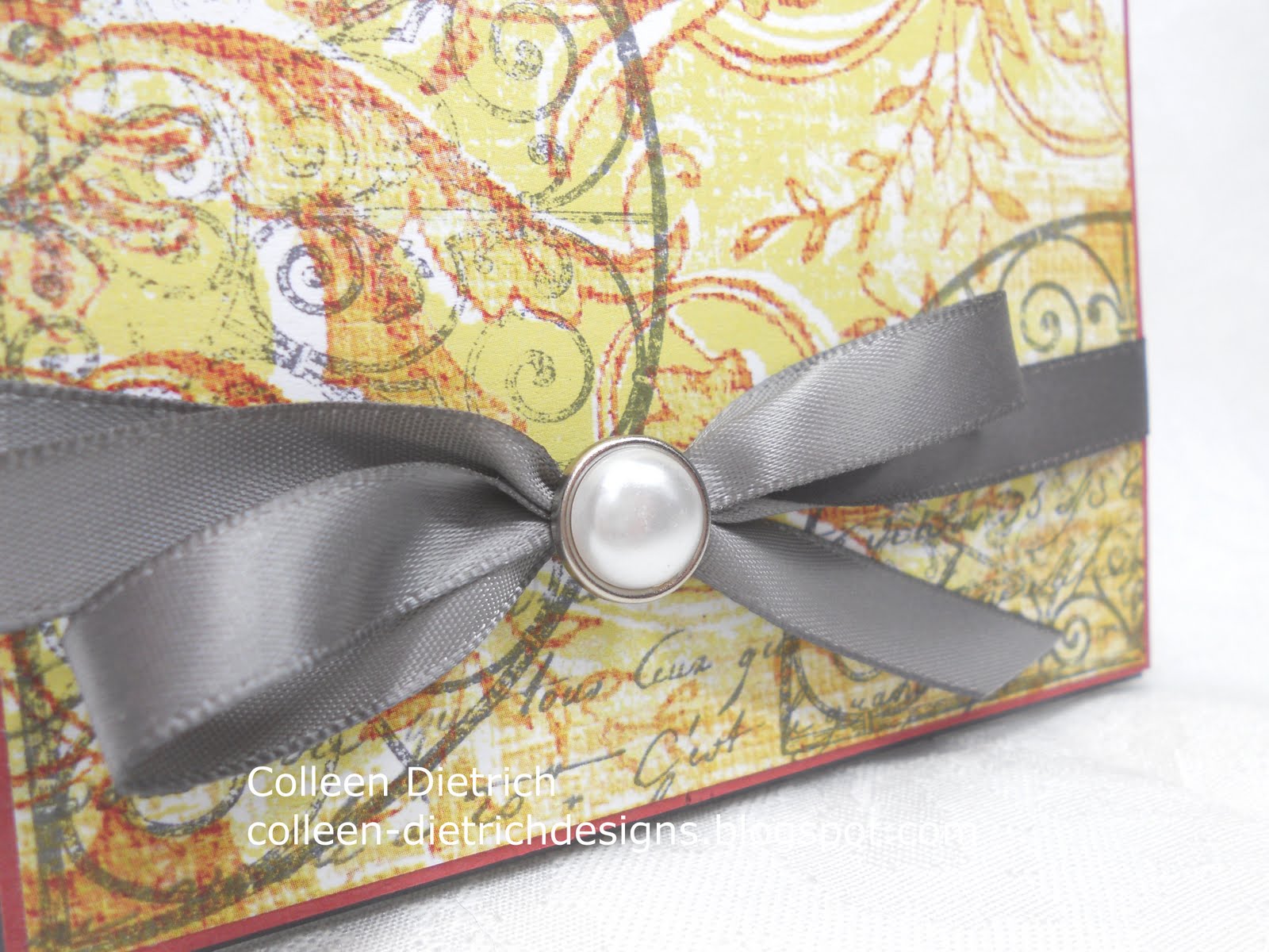
I found a patterned paper in My Mind's Eye La Paperie with lime and red in it, and then the rest was easy.
Our sponsor this week, Hero Arts, kindly let each Design Team member choose a stamp set. I chose Flourish Grids, because they remind me of my trip to Charleston, South Carolina last fall:


So, I stamped the semi-circle in gray ink a couple of times on my patterned paper, and also used a Hero Arts stamp I already owned, Old French Script.

I mounted this piece on Ruby Red, then Basic Gray cardstock, added a couple of embellishments, and voila!
Some close-up shots:

And you know me: I like decorating envelopes, too!

The "Cup of the Week" winner this week will receive a $25 shopping spree from Hero Arts. Lucky duck!
Check out our Design Team's samples:
Fiona -- Libby -- Andrea -- Savannah -- Sarah
and our special Guest Designer, Kelly Rasmussen of Hero Arts!
and our special Guest Designer, Kelly Rasmussen of Hero Arts!
If you are inspired to play along with us, here's what you have to do:
Please follow THE PLAY DATE CAFE RULES carefully to enter.
Deadline for prizes is 11:59pm EST on Tuesday
The 'Cup of the Week' will be announced during the next challenge.
ALL SKILL LEVELS ARE ENCOURAGED TO PLAY!
We want you to enjoy this challenge.
We want you to enjoy this challenge.
Interpret the colors the way you see them.
We do not use specific card stock color names or brands.
Break out of the box and have fun!
The main requirement is:
PDCC COLORS BE THE
FOCUS OF YOUR SUBMISSION
When using additional colors, please limit them to neutrals.
You are welcome to combine challenges,
but we do ask that:
1. The PDCC name and/or photo is used
but we do ask that:
1. The PDCC name and/or photo is used
2. OUR colors are the focus of the card.
Thanks for joining me today. I always appreciate your visits. :)
Colleen
Stamps: Hero Arts - Flourish Grids, Old French Script
Paper: Basic Gray and Ruby Red by SU, patterned paper by My Mind's Eye La Paperie
Ink: Basic Gray by SU
Other: gray satin ribbon by Offray, silver/pearl brad by Recollections, dimensionals
love how you pulled this together Colleen! - your creativity came through for you!! love the ribbon with that beautiful pearl :)
ReplyDeleteColleen, I saw those colors and ran for the hills, but your card is gorgeous!
ReplyDeleteThis is so beautiful and elegant, Colleen! You did a super job with that challenging color combo. I love the Hero Arts set you chose!!
ReplyDeleteSuch a beautiful design, Colleen! So elegant and regal!
ReplyDeleteWow I love this! And the best part is that unexpected gray ribbon - beautiful against the background!
ReplyDeleteLovely DP and use of that set on the card. The grey ribbon is a lovely touch.
ReplyDeleteColleen this has a very vintage appeal. I love the paper and how you stamped on it. The colors are rich and oh so pretty. Just fabulous!
ReplyDeleteSo pretty!! I love you you stamped on the pattern paper-gorgeous effect!!
ReplyDeleteI am blown away by the beauty and elegance of this precious handmade jewel. WOW; this is fabulous!
ReplyDeleteI love this stamp set! It too reminds me of the beautiful gates in Charleston. And I love how you stamped on the DP and that beautiful bow!
ReplyDeleteVery elegant!
ReplyDeleteSo pretty Colleen! This is a tough color scheme, but you did fantastic! It is very elegant and the grey bow is a perfect touch!
ReplyDeleteOHHHHHH! I love this beautiful card--so elegant and that ribbon! You must have known that I would be drooling!! LOVE that pearl too! And you decorated the envelope! BEAUTIFULLY done:)
ReplyDeleteHugs to you! LOVE LOVE LOVE!!!
Very classy and a great OLC!
ReplyDeleteReally neat design you created on the dp-love Hero Arts. When I first started stamping one of my first sets was from Hero Arts-bought at Hobby Lobby I think.
ReplyDeleteWhat a lovely way to use that stamp set, really pretty and I love how you've done the envelope too, I've started to do more of that, it's so pretty!
ReplyDeleteBeautiful, Colleen! I love how you stamped onto the designer paper. The gray bow is the perfect touch!
ReplyDeleteSuch an elegant look with these colors! I really do love what you created once again!
ReplyDeletep.s....congrats on 100 followers!!! YAY!
ReplyDeleteWaw,, nice and creative cards,,
ReplyDeleteUhooi.blogspot.com
Such a beauty Coleen!!! LOVE all those yummy layers of colours!
ReplyDeleteSo gorgeous and elegant! Love the close up pictures for the detail for me to say, "Oh wow"! Truly a surprising beauty! Love it, Colleen...great job! Take care!:-)
ReplyDeleteThis card is quite lovely, Colleen, not an appearance at all that you struggled with it in the least! That grey, pearl adorned ribbon is the perfect accent to the sea of swirling beautiful colors on the front. An awesome use of the colors, my dear!
ReplyDeleteSimply elegant... it's beautiful!
ReplyDeleteSo elegant and I love the subtle colours. Beautiful.
ReplyDeleteYou were so lucky to have that paper on hand. I want to do the challenge and was thinking maybe I could do Anne's QFTD card in those colors. You know she is all about red. But, I have to find the time. Ugh! Love the beautiful, elegant ribbon and pearl.
ReplyDelete