Showing posts with label emboss-resist. Show all posts

Friday, April 20, 2012

Inspired by a Honeybee Print - Emboss Resist Tutorial

I've got a tutorial to show you today for the Emboss Resist technique, using the Blockheads set, ATC Honey Bees:


I was inspired by a print, offered as a free download from Victoria Magazine. (there are two prints at that link) You can see the image below HERE as a PDF file.


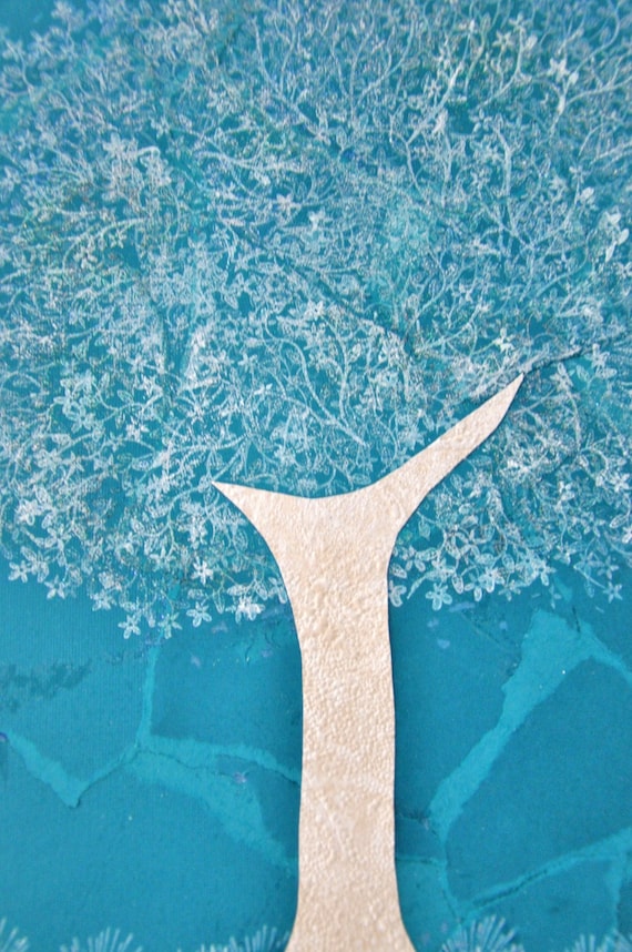
I love that the stamp set has different words included, so you can create your own sentiment/phrase.  I used gold embossing powder on mine.  The label was kind of a happy accident, and fit perfectly over the honeycomb panel.  A bit of lace and pearls added finishing touches.

Now, please go easy on me; I'm not a pro at tutorials.  :-) Note that I've used only Distress Inks by Ranger on this project, but you can use any dye inks you wish.

1. Rub an Embossing Buddy or dryer sheet over paper,
so you don't get stray 'freckles' of embossing powder.
2. Ink up stamp with VersaMark watermark ink.
3. Sprinkle clear embossing powder over image, and tap off excess.
4. Use heat tool to set image.  I use a wooden clothespin on
small papers, so I don't burn my fingers.
5. Begin layering colors. Antique Linen Distress Ink is first.
Use a light hand and a swirling motion to put the ink down
with a sponge (even a makeup sponge would work.)  Do not
pat sponge on paper; it creates a different look altogether.
Swirl color all the way to the edges of the paper.
6. This is the image after a coat of Antique Linen.
It's too light, so we need to add more colors.
7. Scattered Straw is next.  Pick up color from ink pad with your
sponge.   Dab off color once or twice onto a scrap piece
of paper, so the color is not too intense.  Sponge in a
light, swirling motion almost to the edges of the paper.
8. Time for Frayed Burlap.  Again, pick up color with the
sponge from ink pad and dab off once.  Sponge lightly around the edge
of  the honeycomb image, to the edges of the paper.
9. With Walnut Stain, lightly go over edges of paper.
10. Go back to center of image with more Scattered Straw.
Think of a warm glow, leaving the very center of the image lighter.
11. Make a card base from white cardstock.  Stamp edges with  flowers
from stamp set, using Scattered Straw and Frayed Burlap.
Don't forget the envelope!  I used Scattered Straw and Walnut Stain here.
Please feel free to ask me any questions you may have on this project.  It was fun to put this together for you!

Play along with  the Blockheads Emboss Resist Challenge by linking your creation with the linky tool below, and be sure to visit the Blockheads blog link for more details:


Thanks for coming by.  I always love when you visit.  :-)


Dimensions: 4.25" x 5.5"
Stamps: ATC Honey Bees - Blockheads Paper Arts
Paper: white - PTI
Ink: Antique Linen, Frayed Burlap, Walnut Stain, Scattered Straw - Ranger; VersaMark - Tsukineko
Fibers: lace - JoAnn
Other: Gold, Clear embossing powders - Stampin' Up!; heat tool; pearls

Friday, March 9, 2012

Emboss Resist Flowers

I wish you could see these cards in person - they are just full of color, reminding me of Easter Eggs!


I used the Flowers Full Sheet set from Blockheads Paper Arts.

Using the Emboss Resist technique (you can see a tutorial HERE), I stamped each of the three kinds of flowers with Versamark ink on separate squares of cardstock.  For each, I sprinkled clear embossing powder on the images, then used the heat tool to set them.

The fun part was using multiple inks to bring out the images.  Any dye inks will work great; I used my ginormous stash of Stampin' Up! ink pads on these (specific colors are listed in the Details section at the bottom of this post).

Marigolds
The Marigolds card is entered in the Flourishes Timeless Tuesday challenge.  We're to choose 3 colors from this inspiration photo to enter (I chose yellow, apricot and green).

Poppy

Tulips
Each stamped square was mounted on black cardstock, then attached to the card bases with foam dimensional stickers.  And of course, a touch of bling graced each card's corner.  ;)

Thanks for coming by!  Hope you enjoyed these Spring-y creations.


All Cards included --
Stamps: Flowers Full Sheet - Blockheads Paper Arts
Paper: white - PTI; Basic Black - SU
Ink: Versamark - Tsukineko
Other: all bling - Queen & Co.
Dimensions: 4.25" square

Marigold Card --
Ink:  Summer Sun, Apricot Appeal, Cameo Coral, Gable Green, Green Galore, Wild Wasabi - SU

Poppy Card --
Ink: Almost Amethyst, Perfect Plum, Lovely Lilac, Orchid Opulence, Pixie Pink, Elegant Eggplant, Garden Green, Kiwi Kiss, Old Olive

Tulip Card -- 
Ink:  Pretty In Pink, Pixie Pink, Passion Pink, Blush Blossom, Wild Wasabi, Certainly Celery, Mellow Moss

Saturday, April 9, 2011

Mark's Finest Papers #50 - Emboss Resist

This card was such a joy to make!

The challenge this week at Mark's Finest Papers / Speedy's Friends is Emboss Resist.  You can find a tutorial on it HERE.

I began with a piece of white cardstock.  I used a dandelion and butterfly from Just Dandy  and stamped the images with Versamark, sprinkled with clear embossing powder, and hit them with the heat tool.

Then the fun part began...adding a sentiment stamp and sponging on the color.   The sentiment is also from the same stamp set, and I stamped it repeatedly with True Thyme (SU) dye ink.  With a sponge, I washed on some ink in the following Distress Ink colors:  Frayed Burlap, Tattered Rose, Old Paper, Scattered Straw, and Antique Linen.  The edges were sponged with True Thyme.

I matted it with black cardstock, and punched a hole with my Horizontal Slot punch from Stampin' Up!.  I threaded the accordion-pleated ribbon through the hole and around the card.  The ribbon is from SU, too.

The card base and patterned paper were both in my Design Team goodie package when I joined at MFP.  I don't know the names of them, but I LOVE their Old World feel.

We'd love to have you play with us!  Emboss resist is fun, and I wish I did it more often.  :)
Just link up your card HERE by Friday April 8th at 3:00 pm EST.  We'll be around to comment on your terrific creations.

For more inspiration, check out what my teammates have done for you:

Thanks for joining me today.

Colleen

Stamps:  Just Dandy by MFP
Paper:  So Saffron and Basic Black by SU, white by PTI, caramel cardstock and patterned paper through MFP
Ink:  Distress Ink colors:  Frayed Burlap, Tattered Rose, Old Paper, Scattered Straw, and Antique Linen; True Thyme by SU
Punch:  Lattice Edge by Martha Stewart, corner rounder and Horizontal Slot by SU
Other:  sponge, ribbon by SU, pearls by Queen & Co., dimensionals

Saturday, March 26, 2011

Mark's Finest Papers #48 - Polar Bear

Hello everyone!  This week's Speedy's Friends Challenge at Mark's Finest Papers:  to use dry AND heat embossing AND to pop up part of your image. 

I dry-embossed my little polar bear from the Mark's Finest Papers set, Time To Chill, using a Cuttlebug folder called  Holly Ribbons.  I did it twice, so I could cut out his head and pop that up even more than his body. 


The card base began as a white card.  I stamped the snowflakes from Time To Chill in Versamark ink, then heat-embossed with clear embossing powder.  On this card, I tried my hand at brayering layers of color over those snowflakes for the evening sky.  I don't have good brayering skills!

My disappointment with the brayering led me to create the same card, but with a sponged sky in those same colors.

 Gives it a much different look, doesn't it?


We'd love for you to play in our challenge this week!  Visit the Speedy's Challenge webpage for details, then link up your card there by Friday, April 1, 2011 at 3:00 pm EST. 

For more inspiration, check out what my teammates have done for you:

Thanks for joining me!

Colleen

Stamps:  Time To Chill
Paper:  white by PTI
Ink:  Versamark, Basic Black, Pale Plum, Orchid Opulence, Almost Amethyst, Ballet Blue, Brilliant Blue
Other:  clear embossing powder (SU), heat tool, iridescent glitter, Big Shot, Cuttlebug Holly Ribbons embossing folder, dimensionals, sponge, brayer, glue pen

Friday, December 10, 2010

Winter Dusk

When my mom visited me in the summer, she asked me to do a card that looked like the evening sky as it changes colors.  Mom, I'm sorry it took me 6 months to do it, but this one's for you:


Techniques used:  emboss-resist (check out this tutorial on SCS), masking and sponging.   I had all of these dye inks out for sponging:  Perfect Plum, Lavender Lace, Tempting Turquoise, Ballet Blue, and Brilliant Blue. 


The sketch is from Splitcoast's Sketch Challenge #310, turned on its side:


And the color palette is courtesy of The Play Date Cafe:


I also drew inspiration from the EtsyInspired Challenge's Paper Seeds company:


The emboss-resist technique is this week's Try a New Technique challenge at Splitcoast.
And even though I am late for it, I simply had to play at Stampin' B's challenge #87 (which ended Wednesday) because it was issued by my friend Emily Keaton!  We had to use turquoise, purple and something shiny.  Sorry I am late, Emily.  :(

Thanks for joining me today!  Keep your eyes open for Blog Candy here very, very soon.  I am in a celebratory mood because my blog has over 10,000 visits.  I am so grateful to you all.

Colleen

Stamps:  Lovely As A Tree (SU)
Paper:  Lavender Lace, Whisper White, Tempting Turquoise, Brilliant Blue
Ink:   Perfect Plum, Lavender Lace, Tempting Turquoise, Ballet Blue, and Brilliant Blue
Punches:  snowflake by Martha Stewart, Bracket by EK Success
Other:  silver ric-rac by Michael's, dimensionals, iridescent glitter, Zig Two Way Glue Pen, blue rhinestones, Big Shot, Top Note die 
Related Posts Plugin for WordPress, Blogger...