Thursday, May 19, 2011

Play Date Cafe 82 - Delight In Little Things


Our very sweet Ruby 2 Shoes put together the color story for this week's Play Date Cafe challenge.  I searched my patterned paper stacks and found some things that helped me pull together a card quickly, easily and with NO stamping!


The brown and blue paper is from Pink Paislee 'Sweetness', the butterfly one is from DCWV 'Mariposa'.  The sticker is from K & Co.  The doily bits were cut from a larger one, then sponged with Antique Linen Distress Ink.


I decorated the inside of the card with butterfly punches, using the same Pink Paislee paper:


And just for good measure, I made a second card with some slight alterations:


Our sponsor this week is Discount Cardstock.com, and our guest designer is the oh so talented Laura Davis!

We'd love to see your creations hanging in the gallery at The Play Date Cafe

Thanks for joining me today.  :)

Colleen

Stamps:  none!
Paper:  DCWV Mariposa, Pink Paislee Sweetness, So Saffron cardstock, aqua blue from Mark's Finest Papers
Ink:  Antique Linen Distress Ink
Punch:  Iron Gate, butterflies by Martha Stewart
Other:  pearls by Recollections, crochet trim, doily, sponge, dimensionals, Big Shot, Tim Holtz Elegant Flourishes die (on second card)

Tuesday, May 17, 2011

It Started Out White...

Yes, this started out as completely bare, white cardstock:


I made this for my stepmother for Mother's Day, but made two so I could keep one!  My inspiration was found in a library book about stamping. 

On the card base, which is 4 1/4" square, I repeatedly stamped a butterfly from Mark's Finest Papers Garden Fairies in Tattered Rose Distress Ink.  I sponged on a variety of Distress Inks in so many colors, I can't remember them all.  Then I used a Stampin' Up! background stamp, Wonderfully Worn, in Frayed Burlap Distress Ink in random places.  This gives the slight appearance of a splatter. 


The next stamped layer features Old French Script by Hero Arts, in Stazon Black.  I used more Distress Inks, including Milled Lavender and Dusty Concord, to sponge on, softly blending the colors together.


On the top stamped layer, I used a berry stamp from Le Jardin Botanique (SU) in Stazon Black. More sponging took place on top of that, followed by a liberal coating of glue and Crystal Coarse Glitter (Martha Stewart).

I like the look of thin black matting to help set off each individual layer.  And of course, there are pearls.  :)

My first anniversary of blogging is happening at the end of May.  I will be offering Blog Candy, so stay tuned! 

Colleen

Stamps:  Le Jardin Botanique, Wonderfully Worn (SU); Old French Script (Hero ARts); Garden Fairies (MFP)
Paper:  white by PTI, Basic Black and Mellow Moss (SU)
Ink:  variety of Distress Inks including Tattered Rose, Scattered Straw, Frayed Burlap, Milled Lavender, Dusty Concord, Antique Linen and more; Stazon Black 
Other:  pearls from Queen & Co, dimensionals, Crystal Coarse Glitter by Martha Stewart

Monday, May 16, 2011

Tulip Wishes & A Happy Story


Hello everyone!  On Mother's Day, I had some time to make cards (and really no time since then!) and this was one of them.

This is a wedding card that my aunt commissioned me to make for her friend.  My inspiration:  a card on Splitcoaststampers by a stamper named Chris Smith.  I don't have a link to the original card by Chris, because I saved the photo to my computer (as I often do when I want to CASE something).  I changed the flower and added a punched border, but otherwise, it looks a lot like the original.  Thanks for the idea, Chris!


I have a happy story to share with you.

My 12 YO (soon to be 13!) daughter, Haley, adores lip glosses by Philosophy.  She has many flavors and uses them all.  She seeks out 'rare' flavors on sites like eBay and Amazon, Sephora and Nordstroms.  Haley has even given much thought to flavors that they should make, with clever titles and themes. 

Because her passion for it is so strong, I encouraged her to write to the company and tell them of her ideas.  We sent the letter off about two weeks ago.

Last week, a large, heavy box arrived at our house from Philosophy.  Inside were so many goodies, it was like Christmas here!


An executive at Philosophy wrote the kindest note to my daughter.  He said that as soon as he received Haley's letter, he shared it with his team and they packed up a box full of shower gels, lip glosses and perfumes.  They even included a large bottle of Amazing Grace perfume for me -- one of my faves!
He said that Haley's passion for their products inspired them and reminded them of how they make a difference in the lives of their customers.  He forwarded her letter to the Customer Service and Marketing teams so they can evaluate Haley's suggestions for new flavors.  In our thank you letter, I included the above  photo so they could see how excited she is.

Isn't this such a happy tale??  It sure made my daughter's day, no - week! - brighter.  She feels very special, and indeed she is....to us, and to everyone who loves her. 

Thanks for joining me today.  :)

Colleen

Stamps:  tulip - Thank You by Flourishes, sentiment - Sincere Salutations by Stampin' Up!, floral background - Anna Griffin
Paper:  white by PTI, Basic Black
Ink:  Memento Tuxedo Black, Basic Black
Punch:  Lattice Edge by Martha Stewart
Other:  black satin ribbon by Offray, Copic markers, dimensionals

Saturday, May 14, 2011

Mark's Finest Papers #55 - Inspired by a Sign

I see this sign when I go to the dentist...


...and it always makes me think of a clean and simple card design.

When this challenge cropped up at Mark's Finest Papers -- to use Monochromatic Blues -- I thought this was the perfect chance to do a card based on that sign.


It's quite modern, which really isn't "me" at all, but I just HAD to do a card based on that sign! 
The sentiment is from Mark's Finest Papers' African Veldt set. 

If you would like to play along with our "blue" challenge, just link up your creation HERE by 3:00 pm EST Friday, May 20th.  Remember you can win free stamps each week!

Thanks for joining me today.  :)
Colleen

Stamps:  African Veldt - Mark's Finest Papers
Paper:  white thru MFP, Night of Navy, Brilliant Blue, Tempting Turquoise - SU, light blue by DCWV
Ink:  Basic Black
Punch:  large oval by Stampin' Up!
Other:  Night of Navy satin ribbon from SU

Thursday, May 12, 2011

Play Date Cafe 81- In My Prayers

I really like this week's color story from The Play Date Cafe:


A grape, a lime and a silvery-light gray.  Pretty!  The closest lime I had in my stash is Kiwi Kiss cardstock, from Stampin' Up!.


Had some trouble photographing this in a charming way.  It didn't want to stand up, and I don't own a flower frog (as so many other crafters use to support their cards), so I had to lean it against the tablecloth backdrop. 

Since our sponsor this week is Stampotique Originals, each of us on the Design Team got to choose a stamp and a sentiment stamp.  I LOVE the ones I was blessed with:

and


I stamped the Baroque Background (#7109) in Dusty Concord Distress Ink, then used a circle die cut.

Just realized how many punches and die cuts I used here - 11 total!  And this is a small card, 4 1/4" around.


To construct the fan behind the sentiment, I used the Martha Stewart Deco Fan Corner Punch three times and trimmed away unnecessary parts.  The flower was made with a Flower Trio punch (SU) and a matte silver brad from JoAnn's.  Once the brad was placed through all three flower layers, I used my fingernail to distress the layers of paper. 

Our Guest Designer this week is the fabulous Debbie Hughes.  You can check out her creative stuff HERE.  Thanks for joining us, Debbie! 

And if you want to see the prize for our Cup of the Week winner, head on over to The Play Date Cafe!

Thanks for joining me today.  :)

Colleen

Stamps:  Baroque Background and sentiment from Stampotique Originals
Paper:  white from PTI, Kiwi Kiss (SU)
Ink:  Dusty Concord Distress Ink, Basic Black
Punch:  large oval and Flower Trio (SU), Deco Fan corner punch (Martha Stewart)
Other:  gray pearls - Queen & Co, piercing tool, gray satin ribbon - Offray, Big Shot, standard circles and  Beaded Circles Spellbinders Nesties

Monday, May 9, 2011

Pink Lilac

How was your Mother's Day, if you celebrate it?  Mine was just right:  I got to do some stamping!  It soothes my soul.

The card I'm featuring today is highly inspired by my SU demonstrator, Gail Murray, who did a very similar card a few years back.  I saved a photo of that card, so that one day I could try to replicate it.  I changed a few things, like dropping the sentiment, and using a different stamp on the Olive layer. 


I just LOVE how this turned out!  The colors say "spring" to me, and I've always loved this lilac stamp from Stampin' Up!'s Blossoms Abound set.  The green layer is stamped in Old Olive ink with an Anna Griffin background floral stamp that I adore.

I'm entering this card at two challenges:


A bit of hardware from my Hodgepodge Hardware collection.


You know me:  even envelopes are tempting to decorate!

Almost forgot to share:  I just found out that THIS card won a Spotlight Artist Award at City Crafter Challenge Blog! 

I can't tell you how good it feels to have a moment to make a card and blog about it.  I thank you for your continued prayers for my daughter.  She improves little by little, but there are setbacks sometimes.  I really need these card-making moments to help give me my own kind of therapy.

Colleen

Stamps:  SU's Blossoms Abound, Anna Griffin floral background
Paper:  Regal Rose, Pretty In Pink, Old Olive cardstock, white by PTI
Ink:  Old Olive, Regal Rose, Pretty in Pink, Always Artichoke
Punch:  1/16" hole by Fiskars
Other:  ribbons from SU, Antique Brass Hodgepodge Hardware by SU, dimensionals

Sunday, May 8, 2011

DeNami Girlie Girl Blog Hop


Hi there!  If you are hoppin' in the DeNami Girlie Girl Blog Hop, you should have arrived here from Chrissie Tobas' blog. 

This is the third DeNami Design Blog Hop that I've participated in.  I love to do them!  The DeNami stamps are so sweet and I happen to own a couple of real cuties.  Today I am using a more elegant, feminine stamp called Love Script Heart.   


The card began with a piece of pink, cream and brown patterned paper from My Mind's Eye La Paperie.  I sponged Antique Linen Distress Ink around most edges, then stamped the Love Script Heart in Chocolate Chip on the paper. 


Pink and cream pearls were added here and there, to put in some much-needed bling.  This is, after all, a girlie-girl card!


Pink, polka-dotted ribbon is the final touch before mounting the piece onto Chocolate Chip cardstock, then the white base.

Some important Blog Hop Details for you, from DeNami:
When: The blog hop starts on May 8 at 6 AM, PST. However, you have until May 9, 2011, 11:59 pm PST, to leave comments on all the blogs (to be eligible for a prize).
Why:
To be inspired by beautiful girlie creations featuring DeNami Design stamps and also the chance to win mini shopping sprees on the DeNami Design website!
Prizes:
 We are giving away THREE $20 gift certificates to our website! We'll be giving away one gift certificate to a random participant (DT members not eligible) and then we'll also be giving away TWO gift certificates to TWO people who comment along the hop!
Next up in the Hop:  Dana Seymour!  You can also go to the DeNami Design blog to start from the beginning. 

Thanks for joining me!

Colleen

Stamps:  Love Script Heart by DeNami
Paper:  Chocolate Chip, white cardstock by PTI, pink patterned paper from My Mind's Eye La Paperie
Ink:  Chocolate Chip, Antique Linen Distress Ink
Other:  pink dotted sheer ribbon from Stamp Simply Ribbon Store, pink and cream pearls from Queen & Co, sponge

Saturday, May 7, 2011

Mark's Finest Papers #54 - A Mighty Fine Boot


This week's challenge at Mark's Finest Papers is Paper-Stamps-Ink.  That's it:  no embellishments, no ribbons, flowers, brads, chipboard, etc.  I know there are dozens of different ways to pull that off, but I was in rather a clean-and-simple mood the day I made this card.

I used a boot image from Grandma's Boudoir.  I tried to do different tricks with this boot, like stamping it multiple times with different ink colors in a large circle, like a pinwheel, but that didn't work out.  I tried making the boot look like it was kicking up its heels and having a good time.  Nope. 

I made this Victorian footwear look more fun that it probably was to wear  by using a paper-piecing technique.  And let me tell you, that boot was CRYING OUT for little pearls as buttons!  But, no, I had to rein myself in.


Are you up for the challenge of Paper-Stamps-Ink?  The deadline to link up your creation HERE is Friday, May 13, 2011 at 3 PM EST.   Can't wait to see what you do!  Don't forget that there is a weekly winner of a stamp set, too.  Free stamps = good fun.  :)

ETA:  after the challenge, I changed the card a bit by adding pearls and rounding the corners of my card.  Aah - that's much better!


Thanks so much for joining me today.

Colleen

Stamps:  Grandma's Boudoir by Mark's Finest Papers
Paper:  Vintage Cream by PTI, Chocolate Chip, Stampin' Up! patterned paper scraps
Ink:  Early Espresso
Other:  dimensionals


Thursday, May 5, 2011

Play Date Cafe 80 - A Sunny Thank You

 If you are looking for the Pals Paper Arts Guest Designer post, please scroll down one post.

Our super-sweet Ruby 2 Shoes chose this week's challenge colors for The Play Date Cafe:


What a pretty picture!  Reminds me of summer days that will soon be here.

I dug through my patterned papers and found two that match our colors pretty closely.


I find myself doing much more of the patterned paper thing these days, because it's quicker.  I'm not hoarding them as much anymore.  :)  It would have been wise of me to write down which stacks of paper these came from as I made the card, because now I can only find the maker of the poppy paper:  DCWV Mariposa Stack.  The yellow one?  Your guess is as good as mine.  Sorry about that.  :(


The sentiment die cut is a Spellbinders Beaded Circles nestie, new to me for my birthday.  I sponged Scattered Straw Distress Ink on it to match the paper.   The flowers and butterfly are from Stampin' Up!'s Bliss set.  I colored the stamps with markers (Crushed Curry and Poppy Parade), stamped and cut out, then added bling.  The sentiment is from SU's Because I Care


Our sponsor this week is Paper Smooches.  Our Guest Designer this week is the ultra-talented Kim Hughes!  Kim was a Go-To Gal for Paper Crafts Magazine and now has started her own line of stamps called Paper Smooches.

We hope you will play with us this week and show us what you've got.  I am wowed each week by the entries our players hang in the Play Date Cafe Gallery.  Such amazing talent out there!

Please follow THE PLAY DATE CAFE RULES carefully to enter.
Deadline for prizes is 11:59pm EST on Tuesday
The 'Cup of the Week' will be announced during the next challenge.
ALL SKILL LEVELS ARE ENCOURAGED TO PLAY! 
We want you to enjoy this challenge. 
Interpret the colors the way you see them. 
We do not use specific card stock color names or brands.
Break out of the box and have fun! 
The main requirement is:
PDCC COLORS BE THE 
FOCUS OF YOUR SUBMISSION
When using additional colors, please limit them to neutrals. 
You are welcome to combine challenges, 
but we do ask that:
 1. The PDCC name and/or photo is used

2. OUR colors are the focus of the card.

Here's hoping you have a wonderful, craft-filled day!

Colleen

Stamps:  Because I Care, Bliss - both Stampin Up!
Paper:  white by PTI, orange patterned paper DCWV Mariposa, yellow ?
Ink:  Scattered Straw Distress Ink, Basic Black
Punch:  Martha Stewart border (can't remember the name!)
Other:  Big Shot, Beaded Circles Spellbinders nesties, rhinestones by Recollections, dimensionals, sponge

Pals Paper Arts Guest Designer


A few months back, Mary Fish asked me to be a Guest Designer at Pals Paper Arts.  I felt completely honored!  I play there sometimes, when my time allows, and love the challenges they issue. 

This week's challenge colors are:

I have to admit I kind of freaked out when I saw the colors.  They are so not "me".  I didn't even own anything in those Stampin' Up! In Colors except for the markers.  Enter my fabulous SU demonstrator, Gail Murray.  She gave me a piece of cardstock, a square of patterned paper, a glitter brad and a length of ribbon for EACH In Color for this challenge!  Thank you so much, Gail!  You can expect this card in your mailbox, soon, as a way of showing my thanks.  :)

I used my markers to color the floral image, cut it out and popped it up on that lacy frame.  These are both from SU's Charming set, which is new to me. The Poppy oval behind the framed flower was embossed with another new thing for me:  Tim Holtz's Brick Wall Embossing Folder.


I finally got to use my new set, Thank You Kindly, also from SU.  I bought a whole bunch of stamps back in February and have had too little time to play with them. 

Thank you to the gang at Pals Paper Arts for having me as your Guest this week.  You are a terrific, super-talented bunch of folks!

Colleen

Stamps:  Charming, Thank You Kindly - SU
Paper:  Peach Parfait, Poppy Parade, Pear Pizzazz, Whisper White, Peach Parfait designer series paper
Ink:  Basic Black
Punch:  Punched Scallop border, Large Oval
Other:  Spellbinders Oval Nestabilities, SU markers, Stampamajig, pearls from Queen & Co., Pear Pizzazz ribbon, dimensionals, Big Shot, Tim Holtz Brick Wall embossing folder

Saturday, April 30, 2011

Mark's Finest Papers 53 - A Hat Pin

Vicki Dutcher, our Blog Team Coordinator at Mark's Finest Papers, is stepping down from that position after this challenge.  I am going to miss her!  You can tell by Vicki's comments what a fun-loving, compassionate person she is. 

Patty Penn will be filling Vicki's shoes soon, and we warmly welcome Patty as our leader.  :)  Can't wait to see what you'll do, Patty!

The challenge this week is to use a hat pin.  I have never been a fan of using pins on cards.  They look pretty, but doesn't it put the receiver at risk of getting poked?  ;)


The patterned paper is available through Mark's Finest Papers...it was included in my Design Team package.  I really love the colors!  That was my inspiration for the cardstock colors of Old Olive and Buckaroo Blue.

The hat pin is also available through Mark's Finest Papers.  It IS a pretty one, isn't it?

I love my Spellbinders Fancy Tags, but am getting tired of having only those in my stash.  I noticed that there are some new ones available HERE and HERE and plan to order soon! 

Have any hat pins lying about?  Then make your creation and link it up HERE to play with us!  The deadline is Friday, May 6th at 3 pm EST.  For some inspiration, check out my teammates' creations, too:

Vicki Dutcher -- Joanne Grezlak -- Geri Utterback --

And just a reminder that there are weekly winners once again at Mark's Finest Papers challenge blog.  :)

Thanks for joining me!

Colleen

Stamps:  Just Dandy by Mark's Finest Papers
Paper:  Old Olive, Buckaroo Blue, patterned paper thru MFP, white by PTI
Ink:  Old Olive, Timber Brown Stazon
Other:  green seam binding (recycled), hat pin from MFP, sponge, Big Shot, Spellbinders Fancy Tags, green gems by Queen & Co., dimensionals


Friday, April 29, 2011

Mother's Day, Inspired by Royalty

I happened to wake a little early today, so I turned on the Royal Wedding.  I'm so happy for that young couple!  My eyes well up when I see a bride, whether I know her personally or not. 

I need to make several Mother's Day cards, so I began with this one yesterday.  Only a few more to go!

I love the color purple and fleur-de-lis images, and they sure are fitting for royalty.  I noticed a golden fleur-de-lis panel behind the priests this morning, during the Royal Wedding. 


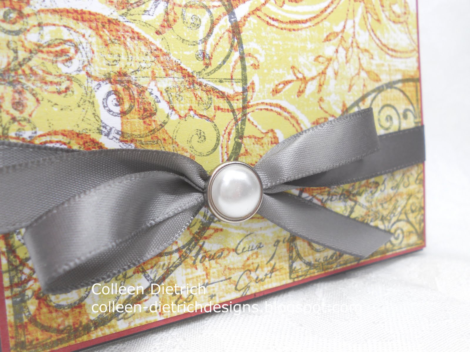
The Curly Label punch, behind the fleur-de-lis punch, started as white cardstock.  I sponged the heck out of it with some Distress Inks to help it match the patterned paper at the top of the card.  And the purple fleur-de-lis also began life as a white punch-out.  I used Milled Lavender and Dusty Concord Distress Inks to color it.


I adore my Martha Stewart Iron Gate punch, and it looks very appropriate here.


The crown from Stampin' Up!'s Artistic Etchings was stamped in Frayed Burlap Distress Ink, then touched with gold Smooch Ink and small pearls.  The sentiment is from SU's Something to Celebrate, in Walnut Stain Distress Ink.

I'm entering this at City Crafter Challenge Blog:  'Mother May I' is the challenge.

An update on my daughter:  she has gained some much-needed weight, but her mind remains stuck in her anorexic thoughts.  She still thinks she is fat, and longs to be 'skinny'.  I pray that she will, in time, see herself the way we see her:  a slim, beautiful creature who has the world at her feet.  It will take months of therapy for her change the way she sees herself.  We feel we have the best team of doctors, therapists, nutritionists and are on the right course.  It makes me sad that she is so desperately unhappy.  She said she feels hollow inside.  :(  We've been using The Maudsley Approach to help her get well.  You can read about it HERE

Thanks for joining me today.

Colleen

Stamps:  Artistic Etchings, Something to Celebrate - SU
Paper:  purple from My Mind's Eye 'La Paperie', tan floral from DCWV 'Once Upon a Time' stack, white by PTI
Ink:  Milled Lavender, Dusty Concord, Frayed Burlap, Tea Dye, Walnut Stain, Old Paper, Antique Linen Distress Inks
Punch:  Martha Stewart Iron Gate, Fleur De Lis by Martha Stewart, Curly Label by SU
Other:  crochet trim, pearls from Recollections, Big Shot, Gold Smooch Ink, Spellbinders Fancy Labels, sponge, lavender gems from Queen & Co., dimensionals

Thursday, April 28, 2011

Play Date Cafe 79 - Hero Arts


Our very lovely, very British Sarah Anderson has the color story for us this week at The Play Date Cafe.
I had a bit of trouble with this one.  My creativity has been coming in fits and starts lately, and when it was time to prepare for this card, I had to really mull it over.

I found a patterned paper in My Mind's Eye La Paperie with lime and red in it, and then the rest was easy. 
Our sponsor this week, Hero Arts, kindly let each Design Team member choose a stamp set.  I chose Flourish Grids, because they remind me of my trip to Charleston, South Carolina last fall:


So, I stamped the semi-circle in gray ink a couple of times on my patterned paper, and also used a Hero Arts stamp I already owned, Old French Script


I mounted this piece on Ruby Red, then Basic Gray cardstock, added a couple of embellishments, and voila! 
Some close-up shots:


And you know me:  I like decorating envelopes, too!


The "Cup of the Week" winner this week will receive a $25 shopping spree from Hero Arts.  Lucky duck!

Check out our Design Team's samples:
Ruby -- Tracey -- Jaclyn -- Jinny -- Julie -- Michele --
Fiona -- Libby -- Andrea -- Savannah --  Sarah
and our special Guest Designer, Kelly Rasmussen of Hero Arts! 

If you are inspired to play along with us, here's what you have to do:
Please follow THE PLAY DATE CAFE RULES carefully to enter.
Deadline for prizes is 11:59pm EST on Tuesday
The 'Cup of the Week' will be announced during the next challenge.
ALL SKILL LEVELS ARE ENCOURAGED TO PLAY! 
We want you to enjoy this challenge. 
Interpret the colors the way you see them. 
We do not use specific card stock color names or brands.
Break out of the box and have fun! 
The main requirement is:
PDCC COLORS BE THE 
FOCUS OF YOUR SUBMISSION
When using additional colors, please limit them to neutrals. 
You are welcome to combine challenges, 
but we do ask that:
 1. The PDCC name and/or photo is used

2. OUR colors are the focus of the card.

Thanks for joining me today.  I always appreciate your visits.  :)

Colleen

Stamps:  Hero Arts - Flourish Grids, Old French Script
Paper:  Basic Gray and Ruby Red by SU, patterned paper by My Mind's Eye La Paperie
Ink:  Basic Gray by SU
Other:  gray satin ribbon by Offray, silver/pearl brad by Recollections, dimensionals
Related Posts Plugin for WordPress, Blogger...