Thursday, August 25, 2011

Prayers Are With You - Inspired by a Pillow

The East Coast is bracing for Hurricane Irene this weekend, and even though we are an hour from the shoreline, our area is still in a danger zone.  Sheesh, an earthquake earlier this week, and now this! 

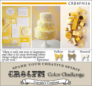
Before the storm hits and we lose power, I wanted to upload this post and play in yet another challenge, this time at CR84FN.  Check out their color story:


Ah, so sweet!  Love those soft colors together.

I was inspired by a pillow I saw in Somerset Life Magazine, Spring 2011, page 53.  Artist Alice M. Wingerden created many pillows made with burlap and other materials, such as this one:


If you love beautiful photographs of beautiful things, you'll want to visit her website, Thoughts From Alice W.  It takes my breath away!  I highly recommend a visit. 

Back to my card.  It's simple, but very much inspired by Alice's pillow --

I used Stampin' Up!'s old background stamp, Canvas, to decorate the kraft portion to look like burlap.  The light yellow patterned paper is retired SU, and my daughter gave me a piece of her own stash to use.  Thanks, Haley!


The flower is built from petals that had fallen to the sidewalk outside of a local craft store, where I helped "pick up the trash" for the storeowners.  ;)  I added a pearl brad.


More new Verve goodness.  :)  This is from Notes of Prayer.  LOVE it.

Thanks so much for joining me today.  I appreciate every single visit and comment, subscriber and Follower to my blog.  You all make me happy!

Colleen

Stamps:  Notes of Prayer - Verve; Canvas background - SU
Paper:  Crumb Cake & Whisper White cardstock, patterned paper - SU
Ink:  Versafine black - Tsukineko; Crumb Cake - SU
Punch:  Doily Edge - Martha Stewart
Other:  flower petals; pearl brad - Bride's; pom pom trim - Wright's; pearl
Play Date Cafe 96

Mint, ivory and coral - our colors this week at The Play Date Cafe....


Our sponsor this week is Market Street Stamps, who graciously allowed our design team to pick out their fave stamp.  I chose Vintage Wallpaper:   I just adore anything damask.  :)

Had a bit of trouble finding mint in my stashes....but finally found a K & Company package insert that came with some stickers I'd recently bought.  I used that, and punched a border with it.  Don't throw away your pretty packaging!  LOL


The background was stamped in Groovy Guava - remember that SU color?  The accents on the bird sticker matched PERFECTLY. 


Go see the other luscious creations our DT has cooked up for you this week.  You might just be inspired to play along with us!  The Cup of the Week winner will receive TWO background stamps! 

Thanks for joining me today.  :-)

Colleen

Stamps:  Vintage Wallpaper - Market Street Stamps
Paper:  Very Vanilla - SU; mint packaging from stickers
Ink:  Groovy Guava - SU; Antique Linen Distress - Ranger
Punches:  Double Embossed Dotted Lace, Dotted Scallop - EK Success; Quilted - Martha Stewart
Other:  Big Shot; Floral Doily Motifs die - Spellbinders; pearls; dimenionals; ribbon - vintage

Tuesday, August 23, 2011

'God is our Refuge...'

I received my very first Verve stamps just the other day!  I'm excited to have them.  Verve was having a sale, and I thought it was the perfect time for me to try them.  I've seen my friends Andrea and Marisa enjoying theirs so much, I just had to try. 

Here's a creation using one of the new stamps, Psalm 46:1:
 You know how much I loooove hydrangeas, judging by my blog header.  I fell in love with these K & Co. 3D stickers, and picked up a couple of packs during the summer (on sale, of course).  I added some small pearls to them...


...because I can't get enough of pearls!

A detail of the sentiment panel --


I used a Spellbinders Parisian Motifs die to create a topper for the Petite Oval, and let about half of it show. 

I'm entering this at Flourishes, where the challenge is all about your sentiment.

While I was typing this post today, we had an earthquake here on the East Coast.  Talk about shocking (no pun intended there)!  Just one of my daughters and I were home at the time, and I thought she might've been jumping around upstairs (it's a smaller old house and things like that can be felt throughout).  My china cabinet doors were opening and closing, and I thought, "Geez, she'd better take it easy up there!"  My next thought was that a huge truck had rumbled by our house, because plenty of them had done that last year while our street was all torn up.   Those trucks would shake our entire house.

But this shaking and rumbling went on far too long, and then I realized something scary was happening.  I've never been in an earthquake before, and should've run outside but instead I called for my daughter to come down and hug me.  I felt afraid, and she did too.  She had been upstairs drawing on her antique desk, which shimmies when she uses it.  So at first, she didn't think anything of it either.  Then she noticed the items on her dresser were shaking about.  When I called for her, she thought, "Oh, God, something is REALLY wrong!"

The news reporters said it was a 5.8, a 5.9 or a 6.2 on the Richter scale, and it lasted about 30 seconds.  It was very freaky and very surreal!  Glad everyone is okay.  My brother and sister-in-law are up here in NJ visiting, and he said he was on the beach in a chair when he felt this.  I called my in-laws in North Carolina, and they sure felt it too.  My mother-in-law and I BOTH had goosebumps as we were talking about it.   

I find it very interesting indeed what the sentiment on this card says, and what I've just experienced.

Edited to add:  my card, Inspired by Rosy Gloves, took Top 3 at The Shabby Tea Room!  I forgot to mention due to the excitement of today.  :)

Colleen

Stamps:  Psalm 46:1 - Verve
Paper:  Wild Wasabi, Very Vanilla - SU; patterned paper - SU
Ink:  Antique Linen Distress ink - Ranger; Versafine black ink - Tsukineko
Punch:  Doily Lace Edge double trim - Martha Stewart
Other:  Big Shot; Petite Ovals and Parisian Motifs dies - Spellbinders; sponge; pearls; stickers - K & Co.; green twine from a package

Saturday, August 20, 2011

Mark's Finest Papers 69 - Birthday Embossing

This week's challenge at Mark's Finest Papers is to emboss - heat or dry, your choice.
I chose dry embossing for this birthday card, but only on the bottom half of the card:

I used Ruby Red cardstock, then rubbed Ruby Red ink lightly over the embossing, to help it stand out a bit better.  The designer paper is Sweetness by Pink Paislee.  The stamped butterfly comes from Just Dandy, and the frame and sentiment from Flourishes and Frame - both by Mark's Finest Papers.


This card is for my husband's cousin, who is having a milestone birthday.  ;)  Happy birthday, Marianne!

I can't remember where the ribbon is from, but it sure is nice to work with!

Come emboss with us!  Just link up your card HERE by Friday, August 26, 2011 at 3 PM EST. 

Colleen

Stamps:  Flourishes and Frame, Just Dandy - MFP
Paper:  Ruby Red CS - SU; Sweetness DP - Pink Paislee; Vintage Cream CS - PTI
Ink:  Soft Suede, Ruby Red - SU; Memento Tuxedo Black - Tsukineko
Punch:  Doily Edge - MS
Other:  Big Shot; Spellbinders circle nesties; Victoria embossing folder - Cuttlebug; Copic markers; amber bling - Queen & Co.; ribbon; dimensionals; sponge

Thursday, August 18, 2011

Play Date Cafe 95

It's a new week, and a fresh color combo over at The Play Date Cafe - navy, bubblegum, leaf green.....


Lucky for me, I had some pretty patterned paper from Savannah O'Gwynn, my friend and teammate at The Cafe, that matched two of our colors.


This card base is white, so that it's easy to include a message inside.  To the card front, I added a strip of Night of Navy cardstock that was embossed with an Organic Flourish folder from Cuttlebug. 

The sentiment is from Stampin' Up!'s Occasional Quotes, and was heat embossed to give it a crisper image.
The pink ribbon is vintage, from my grandmother's sewing room.  :)  Thank you, Mom-mom!


The center medallion is a 3D sticker from K & Company.  I added the green bling and a white satin bow.

Our sponsor this week is Avocado Arts, which has the most ADORABLE stamps!  You've gotta go check out the prize, plus all the fabulous inspiration from our Design Team HERE

Thanks for joining me today!

Colleen

Stamps:  Occasional Quotes - SU
Paper:  Night of Navy cardstock - SU; white cardstock - PTI; patterned paper (?)
Ink:  Versamark - Tsukineko
Other:  doily - Wilton; satin ribbon - Michael's; sticker - K & Co.; white embossing powder - SU; heat tool; pink ribbon - vintage; Big Shot; Organic Flourish embossing folder - Cuttlebug 

Tuesday, August 16, 2011

Inspired by Rosy Gloves

I was immediately inspired by these gloves, found in HandCrafted:  The Best of Stampington & Company, Volume 7 - page 157 (pardon the glare from the camera):


And because The Shabby Tea Room is going polka-dotty this week, I picked out a piece of Stampin' Up! specialty paper from last season:


I don't have any velvet leaves (wish I did), as they used on the gloves.  I substituted a combination of Tim Holtz Flourish die cuts plus some Martha Stewart Rose Leaf punches. 


The sentiment is Anna Griffin, from one of my beloved sets purchased from eBay several years ago.  They do not have set names, though.  Another eBay find: that gorgeous Venise lace.  I bought some for myself, and for my friend, Andrea Ewen.  (I owed her some goodies.  ;) )


The flowers are handmade, but I cannot take credit for the original idea.  I actually do not remember where I first saw these!  I took a few pics as I went along, to show you how I did it.


Punch out 6 Scalloped Circles (SU punch) in Cherry Cobbler cardstock. 
Sponge edges of each with Bravo Burgundy dye ink.
Spritz each circle with plain water, then wrinkle each one as tightly as you can, into a little ball. 
Unwrinkle them and lay them flat.
While damp, punch a small 1/16" hole in the center of each.
Stack them together, and insert brad in center, like this:


Tightly scrunch up the first layer, into what becomes the center of the flower, like this:


Then do the next layer, the same way:


Continue with the next 4 layers, scrunching up each tightly around each other.


After you've scrunched up all 6 layers, slightly loosen one layer from another to form a flower like the one you see above.
I hope this little tutorial of sorts inspires you to make a flower.  If you try it and show it on your blog or gallery, please let me know!

Thanks for joining me today.  I'll be back early Thursday with a new Play Date Cafe card!

Colleen

Stamps:  Anna Griffin sentiment
Paper:  white cardstock - PTI; Garden Green, Cherry Cobbler, Basic Black cardstock, polka dot specialty paper - Stampin' Up!
Ink:  Bravo Burgundy - SU; Versafine black - Tsukineko
Punch:  Double Scallop, Rose Leaf - Martha Stewart
Other:  Big Shot; Flourish die - Tim Holtz/Sizzix; Fancy Tags die - Spellbinders; Venise lace- eBay; pearls; dimensionals

Sunday, August 14, 2011

Kindness In Pink

Pinch me - I must be dreaming!  I'm ACTUALLY playing in a challenge!  Oh my, how I've missed playing in challenges these last several months. 

Today, I'm entering Flourishes Bring Back Beautiful 'The Beauty of Clean and Simple' challenge. 


I was inspired by a card my Stampin' Up demo did, in olive tones and a different sentiment.  Thanks for the idea, Gail!

I chose to do mine up in pink, a color I don't use often enough.  It reminds me of a poem I had published in our school newsletter when I was in 5th Grade.  It was all about the color pink, and I'll see if I can remember it....

Pink is pretty
Pink is bright
Pink is a ribbon you wear on Prom Night
Pink is a baby's nose
Pink are your little toes!
Pink is wonderful, and do I dare?
Pink is sometimes on your underwear!
Hee hee....not bad for a 5th grader, huh?


I got to use THREE new stamps for my card!  Sentiment is from Occasional Quotes, frame from Four Frames - both SU; and the damask motif is Desert Star from Stampendous. 

Thanks soooooo much for joining me here on my foray back into challenges!

Colleen

Stamps:  Desert Star - Stampendous; Four Frames, Occasional Quotes - Stampin' Up!
Paper:  Pretty in Pink, Very Vanilla - SU
Ink:  Pretty in Pink, Soft Suede, Crumb Cake - SU
Punch:  Decorative Label - SU
Other:  pink ribbon - Stamp Simply Ribbon Store; pearls - Recollections; dimensionals

Saturday, August 13, 2011

Mark's Finest Papers 68 - Distressed Wisteria

I have a neighbor who is growing a wisteria vine.  It is located on the side of his house, very close to my dining room windows.  I would be delighted if it were dripping with flowers like this:

Photo courtesy of mommysmidwestmountain.blogspot.com
But, no, there hasn't been a single bloom on it in the four or five years it has been growing.  (insert sad face here)

Faith Hofrichter of Mark's Finest Papers drew us a lovely wisteria set, though, called Butterflies and Wisteria.  I was tickled pink purple to use it!


Our challenge this week at Mark's Finest Papers is to Distress Your Edges!  That can mean a lot of things.  You can use a fingernail to distress edges of paper (if you don't own a distressing tool, which I don't); the pattern of a paper might have a distressed, aged look; and distressing edges with ink is also an option. 

For the edges of my wisteria oval die cut and punched lace border, I used Distress Inks by Ranger. 


On the edges of the card base and the cocoa panel, I took out my handy (get it?) fingernail tool.  Ha ha.  I used the Damask embossing folder by Sizzix / Tim Holtz on the card base and shabbed up the outer edges with Distress Inks.  Even the twine has a rough, distressed texture to it.  


Sometimes I make two of a card, so I can keep one and give the other away.  Here's the other one I made, using a cocoa polka dotted ribbon:

My 13 YO likes this version better, and I think I do too. 
Which one do you prefer?

(By the way, have you checked out my daughter's new blog yet?  It's called Glossip Girl, and it's dedicated - mostly - to her love of Philosophy products.)

If you'd like to check out what the rest of the design team has distressed for your viewing pleasure, head over to Mark's Finest Papers.  Don't forget - if you play, you have a chance to win a stamp set!

Colleen

Stamps:  Butterflies and Wisteria - MFP
Paper:  Pale Plum, Close to Cocoa - Stampin' Up!; Vintage Cream - PTI
Ink:  Antique Linen, Frayed Burlap - Distress Inks by Ranger; Memento Tuxedo Black - Tsukineko; Close to Cocoa - SU
Punch:  Doily Lace double edge - Martha Stewart
Other:  Big Shot; Vintage Wallpaper embossing folder - SU; Damask embossing folder - Sizzix; twine; cocoa ribbon - Michael's; pearls - Recollections; Scalloped Oval dies - Spellbinders; dimensionals; sponge; Copic markers

Thursday, August 11, 2011

Play Date Cafe 94 - Butterfly Thanks

Fall is coming our way, whether it feels like it or not outdoors.  Here in New Jersey, it's been one long hot summer, with many days above 90 degrees, sometimes near 100.  I know my friends in the South will say, "Ha!  Is that all??" because they deal with hotter temps than that for more months than we do.  I LOVE the four seasons, but most especially autumn.   

The color story for The Play Date Cafe this week definitely reminds me of autumn days:


Our sponsor this week is Practicing Creativity, and they graciously sent each of us a new stamp set. 


My set is called Nature's Wonder:

Here's my card --

The twine was sooooo not part of the design, but when I adhered my colored cardstock panels together and embossed them (Damask by Sizzix), there were unsightly gaps.  I wound twine around those parts, to cover up the mistakes.


Love my new border punch, Scallop Dot by Martha Stewart.  :)

Visit The Play Date Cafe blog, to see what the yummy prize is this week.  And with our new design team in place, you've got lots of samples to check out!

Thanks so much for joining me today.  :)

Colleen

Stamps:  Nature's Wonder - Practicing Creativity
Paper:  Vintage Cream - PTI; Not Quite Navy, So Saffron, Early Espresso - Stampin' Up!
Ink:  Not Quite Navy, Early Espresso - SU
Punch:  Scallop Dot - Martha Stewart
Other:  Big Shot; Damask embossing folder - Sizzix; jute twine

Saturday, August 6, 2011

Mark's Finest Papers 67 - Black Eyed Susan

I had a chance to play with a new release from Mark's Finest Papers called Black Eyed Susans for Encouragement.  Really long name, but it's a wonderful set!


I am hostess for this week, and my challenge is to do a shaped card that is anything other than your standard 4.25" x 5.5" rectangle. 

I picked a Spellbinders Lacy Square die to make my card.  I cut two pieces out of kraft cardstock, then scored near the top of one of them, and attached with Scor-Tape to the front die cut.


It is super simple, with just one colored Black Eyed Susan and a sentiment from the same set.  A tiny jute bow and chocolate pearl were all that I needed to finish it off.


If you'd like to play along with my challenge, just link up your card HERE by 3 PM EST on Friday, August 12, 2011.  Remember, each week you can win a free stamp set!

Thanks for joining me today.  :)

Colleen

Stamps:  Black Eyed Susans for Encouragement - MFP
Paper:  kraft
Ink:  Memento Tuxedo Black - Tsukineko
Other:  Big Shot; Spellbinders Lacy Squares die; Copic markers; jute; chocolate pearl - Queen & Co.; dimensionals
Thursday, August 4, 2011

Play Date Cafe 93 - Cutest Butterfly

This week we are starting a brand new term at The Play Date Cafe!  I am moving from my position as Private Blend Designer to First Term Designer.  Whoo hoo!  Makes me a happy camper.  :)

We have two new ladies joining us:  Denise January and Julie Day.  Julie is on the CAS-ual Fridays DT, and was just announced as a new member of the Market Street Stamps DT.  And Denise is on the DT for Pink Persimmon, who happens to be our sponsor this week. 

Check out our bright color story this week!  I loved the colors when I saw them, even though I'm not typically a bright-color gal.  However, when it came time to actually create with them, I had difficulty on that green.  I seem to own nothing close to it, so I did the best I could.


Isn't that the sweetest butterfly ever??  I put him together from a Stampendous set called Petals Plus


I bought this set for $3.99 at my Michael's store a couple of weeks ago.   The set is so cute and the price was phenomenal!


As is often the case when a color combo stumps me, I go clean and simple.  I kept the focus on the butterfly, adding just a small bow and three little rhinestones as accents.  The card base is embossed with a Cuttlebug folder, Textile, and the corners rounded.


One lucky player this week will win the prize package from Pink Persimmon, and that winner could be YOU!  Head over to The Cafe for more details on that. 

Thanks for joining me today!
Cristabel on my stamping shelf.

Colleen

Stamps:  Petals Plus - Stampendous
Paper:  Whisper White, Regal Rose, Kiwi Kiss - Stampin' Up!
Ink:  Memento Tuxedo Black - Tsukineko
Punch:  corner rounder - SU
Other:  Big Shot; Textile embossing folder - Cuttlebug; green rhinestones - Recollections; dotted ribbon - SU; dimensionals
Related Posts Plugin for WordPress, Blogger...