Thursday, September 30, 2010

Box O' Cards Birthday Gift

Okay, this is it for the monogrammed birthday cards for my MIL.  I LOVE how it all turned out; I hope she does too!


This was the final set I created yesterday, using all scraps (except for the card bases).  It makes me super-happy to use up scraps; I feel clever and creative and thrifty all at once!

The card looked too bare with just a circle monogram and its Sahara Sand mat, so I used my Fancy Tags Spellbinders dies underneath that.  Love how that looks!

And this is  the entire monogrammed series I made this week:


This project was so much fun for me, and certainly a labor of love.  I couldn't ask for a better mother-in-law, and she deserves every extra effort.  She is a kind, classy, Christian lady who loves my children and my husband beyond belief.  And she's a gourmet cook, to boot!  It's always a pleasure to be in her company.

Thanks for joining me, and may you have a blessed day!

Colleen

Stamps:  JustRite Monogram set and Damask Borders
Paper:  Whisper White, Certainly Celery, retired SU dp, Sahara Sand, So Saffron
Ink:  Certainly Celery
Punches:  1 3/4" circle, Lattice Edge border by Martha Stewart
Other:  Big Shot, Fancy Tags by Spellbinders, dimensionals

Wednesday, September 29, 2010

Pastel Monograms

Are you tired of seeing my JustRite Monogram set yet?  ;)


I'm still creating cards to put into the box of goodies for my MIL's birthday this weekend.  Today, I made a set of 4:


Everything but the card bases were scraps.  I get these awesome $1 Scrap Bags from my local SU demo, and these designer paper strips were already in there, along with scraps of Orchid Opulence and So Saffron cardstock.  All I had to do was cut everything to size. 

I used my new Spellbinders Labels Ten nesties, a circle nestie, and a 1 3/4" round punch to create my horizontal element, as per this sketch here at the Waltzingmouse Challenge
Also got a chance to play with my new Cuttlebug "Organic Flourishes" embossing folders.  They come in a pack of 5 and they are skinny, so you can put one along the edge of a card.  Fun!


I think I need a few more cards for this gift I am putting together...so hope to see you soon!

Happy Stamping,

Colleen

Stamps:  JustRite Monogram set
Paper:  Certainly Celery, Very Vanilla, Orchid Opulence, So Saffron, retired SU designer paper
Ink:  Old Olive
Punches:  1 3/4" circle
Other:  Big Shot, Cuttlebug Organic Flourishes embossing folder, Spellbinders Labels Ten and circle nesties, olive pearls, dimensionals

Monday, September 27, 2010

"N" is for Wonderful Mother-in-Law


"N" actually stands for Nancy, my MIL whose birthday rapidly approaches. 
I made two of these for her to use, and they are going into a beautiful box I bought recently.  Here's the box (it looks like and opens like a book):


The photos of that box don't do it justice.  It is so very beautiful.  I plan to fill it with a few more cards, and a couple of other treats. 

The card has a vintage feel to it, which is exactly what Alphabet Challenge Blog wants from us this week in their "V is for Vintage" challenge.  And I'm also submitting this to the Midnight Madness Sketch Challenge #72.  This is the sketch:


Because the card base is made from Basic Gray paper, I lined the inside with a piece of white cardstock so handwriting is more easily read. 

Some details:  Morocco Lace punched border, fussy-cut flowers from Vintage Vogue (SU), my favorite pearls, a flower garland (also from Vintage Vogue) stamped in white craft ink to create a frame.

Thanks for joining me, and I always appreciate your comments - I truly do.  :)


Happy Stamping,
Colleen

Stamps:  Vintage Vogue, JustRite Monogram/Damask border
Paper:  Basic Gray, Going Gray, Basic Black, Whisper White
Ink:  Basic Black, Going Gray, Basic Gray, Craft Whisper White
Punches:  1 3/4" circle, Spellbinders circle nesties, Morocco Lace by EK Success
Other:  pearls, dimensionals, sharp scissors

Best Witches

Mondays make me happy.  It's usually my best crafting day, because the family is off at school and work.  On weekends I typically don't stamp because I'm working, or there's lots of family/house stuff going on.

This morning I was able to make 4 cards, 2 each of 2 designs.  Here's the first one:


Mark's Finest Papers is challenging us this week to use a pumpkin on our card.  I've got my pumpkin images from the Stampin' Up! set Thoroughly Thankful on designer paper, then cut each one out. 

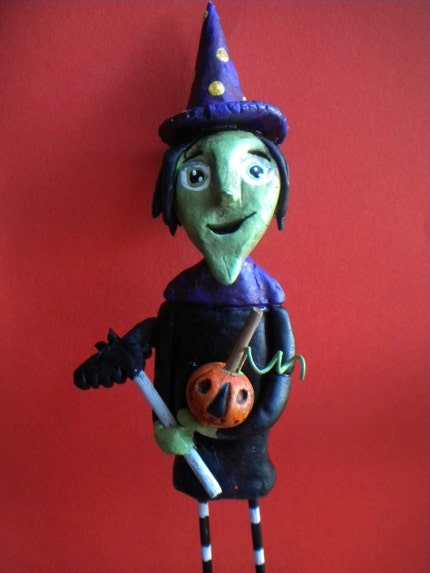
And over at EtsyInspired, the inspiration site this week is Indigotwin.  I've chosen this photo here for my challenge: 


Cute witch, huh?  I used the green skin color on my own witch, and the purple shows up on the border surrounding the image, as well as the trim on her hat, and the ribbon.

I tried something new-to-me today.  These Spellbinders Labels Eight dies do not allow for a tight-fitting mat, so I visited Becca Feeken's blog, Amazing Paper Grace.  She does a video tutorial explaining how to get that tighter fit.  Look at the difference:


The photo on the left shows the tight-fitting mat, while the pic on the right shows two mats cut from the dies provided in the package of Nesties.  I prefer the snugly-fitting one better.  May I also suggest you use the sharpest craft blade you have....don't do as I did, and hack the thing up.  :)


I hope this helps put you in the "spirit" for Halloween.  It is only 34 days away!


Happy Stamping,
Colleen

Stamps:  Thoroughly Thankful, Tricky Treats (both SU)
Paper:  Basic Gray, retired SU designer paper, Whisper White, Basic Black
Ink:  Memento Tuxedo Black, Apricot Appeal, So Saffron
Other:  Big Shot, Spellbinders Labels Eight, ribbon from Target $1 bin, dimensionals, craft knife, self-healing mat, Copic markers

Friday, September 24, 2010

Happy Birthday, Nancy!

My wonderful mother-in-law is celebrating a birthday soon, and this card is for her, as it incorporates some of her favorite colors.
I like how this turned out, as compared to my other post today.  :)

Over at Embellish Magazine, this is the inspiration photo:

This is where my card's colors came from, and they happen to be among Nancy's faves.  Happy coincidence.  Embellish also wants us to create background paper using stamps.  I pulled out Vintage Vogue by Stampin' Up! and used one of the flourishes on the gray scrap.  Can that count?  ;) 

Over at Flourishes, the Timeless Tuesday Challenge 85 is "Celebration".   My MIL's birthday is definitely cause for celebrating!  I can't wait for her to see this card.

Got to use a new rhinestone brad from my local craft store,
and of course, I had to add pearls.


As for the layout, I looked through an older SU catalog and found a sketch that appealed to me. 

Older SU catalogs are often bed-time reading for me and I get so many ideas from them!

Have a terrific weekend, everyone.


Colleen

Stamps:  Vintage Vogue, Warm Words
Paper:  So Saffron, Going Gray, Basic Gray, Whisper White
Ink:  Going Gray, Basic Gray, Basic Black
Punches:  double scallop by Martha Stewart
Other:  pearls, Stampamajig, dimensionals, yellow rhinestone brads 

Apple of My Eye


My 8 year old daughter encouraged me to put this on the blog, even though I'm not nuts about the tree.  She thought I "might win a prize," bless her heart. 

See this sketch here by Midnight Madness Sketch Challenge


I used it for my layout inspiration.  The tree is the oval and the apples are the embellishments.  But the way the tree came together is not how I pictured it in my mind.  I had these pre-cut large scalloped ovals, already embossed, from a dollar bag of goodies from my Stampin' Up! lady.  I cut them up and layered them, and that's where things got screwy.  The top most layer is NOT as I would like it to be, but I just couldn't make it work.  I'm hoping that the apples and their leaves draw the eye away from my mistake.


The Shabby Tea Room challenge, "School Days", is all about this photo's colors and something to do with school.  


I noticed the chalkboard looked like Not Quite Navy (an SU color), so I used a panel of that, and a lighter blue is there on the textbook page, so I used a panel of that, too.  The ruler and chalkboard frame are represented by the Creamy Caramel card base.  The apple, of course, is on my card too.   

I used a red marker to give the apples some depth and shadow,
and chocolate ink and a sponge on the tree trunk.
Thanks for letting me ramble on. :)
Colleen

Paper:  Not Quite Navy, Baja Breeze, Close to Cocoa, Real Red, Garden Green, Handsome Hunter, light green handmade paper from California Paper Goods
Ink:  Chocolate Chip
Punches:  3/4" circle
Other:  Big Shot, Real Red Marker, Real Red grosgrain ribbon, Elegant Bouquet embossing folder, Elegant Lines embossing folder, dimensionals

Wednesday, September 22, 2010

Winter Post Mojo

The Mojo Monday Sketch Challenge #157 was the inspiration for my Christmas card layout today.

I went with a color palette that I have used before, on this card here:  kraft, chocolate, red, and vanilla. 


Using the Top Note Bigz Die from Stampin' Up!, I stamped Sahara Sand with the Weathered background, then went over it with a snowflake from Winter Post in Chocolate Chip, used full-strength and stamped-off as well.  The Post Card stamp is one of my faves from that set; it has a wonderful vintage look to it and can be used in so many ways (not just on holiday cards).

Another of my SU faves is the Medallion background stamp, applied in Whisper White craft ink on the bottom left corner of the card base.  I dried it quickly with my heat tool, because I'm too impatient to wait for that stuff to dry.

You can see the Weathered background better here.


I made 4 of these cards (one goes in my "Keep" box, the others will be given away) so this was all the stamping I managed today. 

I seem to be addicted to stick-on rhinestones and pearls.

We have Back-To-School Night for my third grader tonight, and my 12 YO has soccer practice.  Busy, busy - I guess it's a Hamburger Helper night.

Thanks for visiting me!


Happy Stamping,
Colleen

Stamps:  Weathered, Winter Post, Medallion
Paper:  kraft, Chocolate Chip, Real Red, Very Vanilla
Ink:  Chocolate Chip, Sahara Sand, Real Red, Whisper White craft
Punches:  Martha Stewart Modern Garland, 1 3/8" + scalloped circles (SU)
Other:  Big Shot, Top Note Bigz die, red rhinestones, dimensionals

Monday, September 20, 2010

Groovy Monograms and Honorable Mention

I made a quick set of monogrammed cards today for a friend whom I am visiting tomorrow.  If you've read my posts before, you know I hang on to my designer paper stash with a death grip and rarely pull them out to use.  Well, since this is for a friend, I dug out my Groovy Guava designer paper and cardstock, both of which are retired from Stampin' Up!.  I used a variety of patterns from that pack to mix and match, so the cards in the set won't all be identical. 

And my JustRite Monogram set saw ink for the first time ever!  You don't want to know how long that has just been sitting unused in its box.  :) 

I really like the way the JustRite system works, and that set of Damask Borders is so beautiful - can't wait to use it again.

This morning, my card - Fresh Living - won an Honorable Mention over at The Shabby Tea Room for this past week's challenge! You don't get a badge for the Honorable Mention, but I wanted to toot my own horn on that. Hope you don't mind!


Thanks so much for joining me today.  I really appreciate all of you who read my posts.  :)


Happy Stamping,
Colleen

Stamps:  JustRite monograms, Damask Borders
Paper:  Groovy Guava, Groovy Guava designer paper, Whisper White, Close to Cocoa
Ink:  Close to Cocoa
Punches:  1 3/4" circle (SU)
Other:  Big Shot, Spellbinders circle nesties, dimensionals

Friday, September 17, 2010

Autumn Pear

I squeezed this card in today, between cleaning the house and taking a walk with a friend.  We have company coming for dinner tomorrow night, so the house must be clean; no getting around it!  But all morning I was thinking about what kind of fall card to create for the Mark's Finest Papers challenge that ends today.  Here's what I came up with:


I am also playing in the City Crafter Challenge, where the inspiration photo is this:

The picture seems to glow, and I love that swirly tree. 

I tried to capture the essence of that with the swirls and sponged background.

A couple of close-ups:
This picture shows the black embossing best.


A trio of olive pearls.
To create this look, I started by using black embossing powder/heat tool/Versamark ink and the swirl stamp from Baroque Motifs (SU).  Once the embossing was done on the white cardstock, I then sponged on the following colors in this order:
  • So Saffron
  • Summer Sun
  • Apricot Appeal
  • Pumpkin Pie
  • Certainly Celery
  • Old Olive
  • Elegant Eggplant
  • Basic Black
I began with the lightest color in the middle of the paper and as I progressively added colors, my sponging moved outward.  After using just a bit of Eggplant and Black at the end, I also used the direct-to-paper technique to edge the layer with Black.  It is matted on a black layer of cardstock as well, then attached to a white card base.

I feel like Michelle Zindorf when I play with sponges like this.  She is uber-talented with sponges and brayering, if you've never seen her work.  It's worth taking a visit to her blog, even if all you do is look (and never try the stuff she does); she's amazing.

Have a wonderful weekend, everyone!


Colleen

Stamps:  Baroque Motifs, Pear by Rubber Stampede
Paper:  Whisper White, Basic Black
Ink:  So Saffron, Summer Sun, Apricot Appeal, Pumpkin Pie, Certainly Celery, Old Olive, Elegant Eggplant, Basic Black; Memento Tuxedo Black for pear image
Other:  heat tool, dimensionals, pearls ($1 selection at AC Moore), SU black embossing powder, Copic markers, sponge

Thursday, September 16, 2010

Blue Christmas, Flourishes Style

I've been dying to play in Flourishes FLLCNOEL5 "Blue Christmas" challenge.  You must use Flourishes stamps, and luckily I have two sets of their holiday stuff.

The gold embossed pinecone is from All That Glitters, and the sentiment is from Sleigh Ride.

I followed the sketch from Repeat Impressions S810:


At Ooh La La Challenge Blog (OLLCB) #62, we are to use stripes.  I have white-on-white striped paper behind the main focal point, under the rhinestones.

The designer papers are from Stampin' Up but for one; it is from my much-guarded stash of Anna Griffin paper.  I can't believe I cracked it open.


I did make two of these cards, but they're not quite identical.  The three squares of paper under the Fancy Tag, turned so they're diamond-shaped, are the difference.  This version looks a bit too plain, I think.


For the sentiment, I used my new Spellbinders Fancy Tags dies.  Wow, are they nice to work with!  Small rhinestones and pearls dressed it up even more.

I don't have too many Christmas cards made for this year.  Time is passing quickly by, and those cards aren't going to make themselves.  Perhaps I should focus on that! 

How's your holiday card-making going?
Colleen

Stamps:  Flourishes All That Glitters, Sleigh Ride
Paper:  Anna Griffin blue dp, white cardstock from PTI (luscious stuff), and all other designer paper from SU
Ink:  Versamark
Other:  Big Shot, Spellbinders Fancy Tags dies, pearls, rhinestones ($1 stash at AC Moore), dimensionals, SU gold embossing powder, heat tool

Tuesday, September 14, 2010

Inspired by a Balloon Wreath

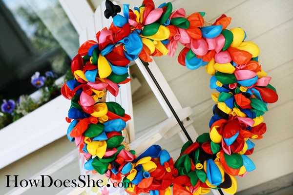
Over at Splitcoast, the Clean and Simple Challenge #84 this week is to be inspired by this photo: 


Isn't that an adorable wreath of balloons? 

I came up with this square card:


Using my Scalloped Heart of Hearts Embosslit from SU on 6 different colors of cardstock, I fanned out the hearts, then mounted them on a white circle (using Spellbinders dies).  Adhered some dimensionals on the back of the circle, then attached to a Perfect Polka Dot-embossed 4 1/4" square card base.  


My sentiment was made with - what else? - more punching and the set Think Happy Thoughts by SU.   

Over at Penny's Challenge blog, #37 is all about birthdays, so this card fits in there.
And, it might be a stretch, but I'm putting this over at Stampin' B too.  The challenge is to use pink/blue/green and a neutral.  Well, I've got all those covered, plus a few more.  I don't think they'll mind! 


Lots of dots, huh?

I showed this card to my 12 YO, my own personal consultant, and she didn't like it.  It is because of the bright colors,  she said.  And you know what?  I have to agree.  Really bright cards are not my thing.  But, hey, I'm trying to go by the inspiration photo above, and it's all about brightness.  I also got to use up some of my retired colors in the Bold Brights family.  Amen to that.  I never really liked those Bold Brights, only a few of them. 

I made 6 of these today.  Seems like a good birthday card for anyone, any age. 

Thanks for joining me!  Hope you liked what you saw.


Happy Stamping,
Colleen

Stamps:  Think Happy Thoughts (SU)
Paper:  Brilliant Blue, Glorious Green, YoYo Yellow, Pixie Pink, Whisper White, Real Red, Only Orange
Ink:  Real Red, Basic Black
Punches:  1 1/4", 3/4", 1/2" circles
Other:  Big Shot, circle Spellbinders dies, Scalloped Heart of Heart Embosslit, Perfect Polka Dot embossing folder, dimensionals, paper piercer, brads


Yesterday, my blog buddy and fellow Punchkateer Marisa presented me with this over at her blog:


A big hug and thank you to Marisa for passing that on to me!  You're so sweet.

Monday, September 13, 2010

Fresh Living

The Shabby Tea Room challenge #27, "Fresh Living", wants us to be inspired by this photo:
I just had my Le Jardin Botanique set out the other day and decided that pretty much fit in the nature category.  Used the label/sign stamp again, but combined it with the foliage stamp from that set this time.  Creative Belli challenge #99 wants us to use our old stamps.  Well, this one is not my oldest set, but certainly not my newest either.  It falls somewhere between.


I'm sorry for the color of the photo; I am still trying to work out my best photographing situation.  The card is much brighter in real life, and even with my photo-enhancing software, I just couldn't get it to look right.

Another angle:
And a close-up of that distressed label:

I'm leaving the inside of this card blank; I imagine it could be used for many different occasions.

And, as usual, I have made two of this card:  one for the give-away box, and one for me.  (at some point, the "one for me" box will be too full and the spill-over will go into the give away pile)

Thanks for joining me today. 


Until next time,
Colleen

Stamps:  Le Jardin Botanique, French Script
Paper:  Whisper White, River Rock
Ink:  Memento Tuxedo Black, Antique Linen Distress Ink
Punches:  large oval
Other:  Big Shot, Vintage Wallpaper embossing folder, pearls, sponge, Copic markers, dimensionals

Saturday, September 11, 2010

Happy Mail x 2

Yesterday, I received a box of shabby-chic goodness from my blogging friend, Kirsty Vittetoe of Handmade Little Things.  I had been visiting her post here and saw her winning creation (she won at The Shabby Tea Room).  I jokingly asked in my comment could she make one for me too, 'cause I love it.  And what did she do?  She sent it to me from Las Vegas to New Jersey!


If you pop over to her blog, she has more (and better) pictures of it to really appreciate all the little details on this hanging plaque.  There is so much to see!  (I mean, on this plaque, but also so much to see on her blog!)

Kirsty is creator and one of the Design Team members for City Crafter Challenge Blog.  They truly have fun challenges there...you should visit and play sometime!

Kirsty, I can't thank you enough.  I am still overwhelmed by your random act of kindness!  I feel very lucky to have you as my blogging buddy, indeed.  :)  I am so happy to display this in my home!


My other piece of Happy Mail yesterday came via Blog Comment from my friend, Bonnie Klass of Stamping with Klass.  Bonnie told me she had a surprise for me over at her blog, and it was this:


Bonnie, you are such a sweetheart!  I really appreciate you thinking of and choosing me.  I have always enjoyed our back-and-forth visits to each other's blogs. 
Bonnie frequently plays in many of the Splitcoast Challenges and makes the most lovely clean and simple cards.  I know she would love your visit.  :)

Thank you ladies, from the bottom of my heart, for being so kind to me!
Colleen

Shabby Geranium

I spied my Ornament Punch yesterday and wanted to try the "vase" trick with it.  I've seen so many people do it, and I wanted to try it too.  A black scrap from one of my $1.00 scrap bags became the vase.


My 12 YO thought I should use something to dress it up, so I made one card with many pearls on it, and one with just a few.  Which do you like better?


This card uses sketch #60 from "2 Sketches 4 You", turned on its side.


The color inspiration comes from The Play Date Cafe #46.
And finally, Creative Belli #99 challenges us to use Old Stamps.  Well, this set falls somewhere in the middle between my really old stamps and my new ones.  Le Jardin Botanique is a set I think I've only used once (sounds true for most of my sets...sheesh).  I love the little sign/label that comes with the set.  I tried to give it an aged look with Copic markers:


And the label beneath it?  At first, I had punched it out of white paper, thinking that was what I wanted.  When it looked too pale and stark, I got out a black Copic marker and colored it in.  Voila!  Faux black cardstock with no waste.


Well, I think I've gone on long enough.  Thanks for bearing with me! 

It's just beautiful here in New Jersey today, perfect for my daughter's soccer game today.  Hope you enjoy your day, too, wherever you are. 

Colleen

Stamps:  Le Jardin Botanique (SU)
Paper:  Whisper White, black specialty SU retired paper, black and white dp's also retired, pink paper from free My Mind's Eye paper pack (comes with a card magazine from UK)
Ink:  Memento Tuxedo Black
Punches:  large oval, ornament, Modern Label
Other:  Big Shot, Scalloped Circles Bigz Die, circle nesties from Spellbinders, Copic markers, pearls, dimensionals, lace
Related Posts Plugin for WordPress, Blogger...