Sunday, August 14, 2011

Kindness In Pink

Pinch me - I must be dreaming!  I'm ACTUALLY playing in a challenge!  Oh my, how I've missed playing in challenges these last several months. 

Today, I'm entering Flourishes Bring Back Beautiful 'The Beauty of Clean and Simple' challenge. 


I was inspired by a card my Stampin' Up demo did, in olive tones and a different sentiment.  Thanks for the idea, Gail!

I chose to do mine up in pink, a color I don't use often enough.  It reminds me of a poem I had published in our school newsletter when I was in 5th Grade.  It was all about the color pink, and I'll see if I can remember it....

Pink is pretty
Pink is bright
Pink is a ribbon you wear on Prom Night
Pink is a baby's nose
Pink are your little toes!
Pink is wonderful, and do I dare?
Pink is sometimes on your underwear!
Hee hee....not bad for a 5th grader, huh?


I got to use THREE new stamps for my card!  Sentiment is from Occasional Quotes, frame from Four Frames - both SU; and the damask motif is Desert Star from Stampendous. 

Thanks soooooo much for joining me here on my foray back into challenges!

Colleen

Stamps:  Desert Star - Stampendous; Four Frames, Occasional Quotes - Stampin' Up!
Paper:  Pretty in Pink, Very Vanilla - SU
Ink:  Pretty in Pink, Soft Suede, Crumb Cake - SU
Punch:  Decorative Label - SU
Other:  pink ribbon - Stamp Simply Ribbon Store; pearls - Recollections; dimensionals

Saturday, August 13, 2011

Mark's Finest Papers 68 - Distressed Wisteria

I have a neighbor who is growing a wisteria vine.  It is located on the side of his house, very close to my dining room windows.  I would be delighted if it were dripping with flowers like this:

Photo courtesy of mommysmidwestmountain.blogspot.com
But, no, there hasn't been a single bloom on it in the four or five years it has been growing.  (insert sad face here)

Faith Hofrichter of Mark's Finest Papers drew us a lovely wisteria set, though, called Butterflies and Wisteria.  I was tickled pink purple to use it!


Our challenge this week at Mark's Finest Papers is to Distress Your Edges!  That can mean a lot of things.  You can use a fingernail to distress edges of paper (if you don't own a distressing tool, which I don't); the pattern of a paper might have a distressed, aged look; and distressing edges with ink is also an option. 

For the edges of my wisteria oval die cut and punched lace border, I used Distress Inks by Ranger. 


On the edges of the card base and the cocoa panel, I took out my handy (get it?) fingernail tool.  Ha ha.  I used the Damask embossing folder by Sizzix / Tim Holtz on the card base and shabbed up the outer edges with Distress Inks.  Even the twine has a rough, distressed texture to it.  


Sometimes I make two of a card, so I can keep one and give the other away.  Here's the other one I made, using a cocoa polka dotted ribbon:

My 13 YO likes this version better, and I think I do too. 
Which one do you prefer?

(By the way, have you checked out my daughter's new blog yet?  It's called Glossip Girl, and it's dedicated - mostly - to her love of Philosophy products.)

If you'd like to check out what the rest of the design team has distressed for your viewing pleasure, head over to Mark's Finest Papers.  Don't forget - if you play, you have a chance to win a stamp set!

Colleen

Stamps:  Butterflies and Wisteria - MFP
Paper:  Pale Plum, Close to Cocoa - Stampin' Up!; Vintage Cream - PTI
Ink:  Antique Linen, Frayed Burlap - Distress Inks by Ranger; Memento Tuxedo Black - Tsukineko; Close to Cocoa - SU
Punch:  Doily Lace double edge - Martha Stewart
Other:  Big Shot; Vintage Wallpaper embossing folder - SU; Damask embossing folder - Sizzix; twine; cocoa ribbon - Michael's; pearls - Recollections; Scalloped Oval dies - Spellbinders; dimensionals; sponge; Copic markers

Thursday, August 11, 2011

Play Date Cafe 94 - Butterfly Thanks

Fall is coming our way, whether it feels like it or not outdoors.  Here in New Jersey, it's been one long hot summer, with many days above 90 degrees, sometimes near 100.  I know my friends in the South will say, "Ha!  Is that all??" because they deal with hotter temps than that for more months than we do.  I LOVE the four seasons, but most especially autumn.   

The color story for The Play Date Cafe this week definitely reminds me of autumn days:


Our sponsor this week is Practicing Creativity, and they graciously sent each of us a new stamp set. 


My set is called Nature's Wonder:

Here's my card --

The twine was sooooo not part of the design, but when I adhered my colored cardstock panels together and embossed them (Damask by Sizzix), there were unsightly gaps.  I wound twine around those parts, to cover up the mistakes.


Love my new border punch, Scallop Dot by Martha Stewart.  :)

Visit The Play Date Cafe blog, to see what the yummy prize is this week.  And with our new design team in place, you've got lots of samples to check out!

Thanks so much for joining me today.  :)

Colleen

Stamps:  Nature's Wonder - Practicing Creativity
Paper:  Vintage Cream - PTI; Not Quite Navy, So Saffron, Early Espresso - Stampin' Up!
Ink:  Not Quite Navy, Early Espresso - SU
Punch:  Scallop Dot - Martha Stewart
Other:  Big Shot; Damask embossing folder - Sizzix; jute twine

Saturday, August 6, 2011

Mark's Finest Papers 67 - Black Eyed Susan

I had a chance to play with a new release from Mark's Finest Papers called Black Eyed Susans for Encouragement.  Really long name, but it's a wonderful set!


I am hostess for this week, and my challenge is to do a shaped card that is anything other than your standard 4.25" x 5.5" rectangle. 

I picked a Spellbinders Lacy Square die to make my card.  I cut two pieces out of kraft cardstock, then scored near the top of one of them, and attached with Scor-Tape to the front die cut.


It is super simple, with just one colored Black Eyed Susan and a sentiment from the same set.  A tiny jute bow and chocolate pearl were all that I needed to finish it off.


If you'd like to play along with my challenge, just link up your card HERE by 3 PM EST on Friday, August 12, 2011.  Remember, each week you can win a free stamp set!

Thanks for joining me today.  :)

Colleen

Stamps:  Black Eyed Susans for Encouragement - MFP
Paper:  kraft
Ink:  Memento Tuxedo Black - Tsukineko
Other:  Big Shot; Spellbinders Lacy Squares die; Copic markers; jute; chocolate pearl - Queen & Co.; dimensionals

Thursday, August 4, 2011

Play Date Cafe 93 - Cutest Butterfly

This week we are starting a brand new term at The Play Date Cafe!  I am moving from my position as Private Blend Designer to First Term Designer.  Whoo hoo!  Makes me a happy camper.  :)

We have two new ladies joining us:  Denise January and Julie Day.  Julie is on the CAS-ual Fridays DT, and was just announced as a new member of the Market Street Stamps DT.  And Denise is on the DT for Pink Persimmon, who happens to be our sponsor this week. 

Check out our bright color story this week!  I loved the colors when I saw them, even though I'm not typically a bright-color gal.  However, when it came time to actually create with them, I had difficulty on that green.  I seem to own nothing close to it, so I did the best I could.


Isn't that the sweetest butterfly ever??  I put him together from a Stampendous set called Petals Plus. 


I bought this set for $3.99 at my Michael's store a couple of weeks ago.   The set is so cute and the price was phenomenal!


As is often the case when a color combo stumps me, I go clean and simple.  I kept the focus on the butterfly, adding just a small bow and three little rhinestones as accents.  The card base is embossed with a Cuttlebug folder, Textile, and the corners rounded.


One lucky player this week will win the prize package from Pink Persimmon, and that winner could be YOU!  Head over to The Cafe for more details on that. 

Thanks for joining me today!
Cristabel on my stamping shelf.

Colleen

Stamps:  Petals Plus - Stampendous
Paper:  Whisper White, Regal Rose, Kiwi Kiss - Stampin' Up!
Ink:  Memento Tuxedo Black - Tsukineko
Punch:  corner rounder - SU
Other:  Big Shot; Textile embossing folder - Cuttlebug; green rhinestones - Recollections; dotted ribbon - SU; dimensionals

Tuesday, August 2, 2011

Upgrading Older Cards and a Baby Quilt....and I'm Published!

Hi!  If you follow my blog, you know that I've had TOO little time to create cards lately.  This still stands true, but I have been crafting a little bit lately.  :)  I also wanted to share my exciting news -- I've got two cards published in Paper Crafts Card Ideas for Paper Crafters, which just came out August 1st!


I'm on pages 33 and 91.  :)  So happy!  This is my first time being published.

When I was rifling through my box of give-away cards recently, it dawned on me that I had a lot of cards that are much too simple for my current taste.  Take these, for example, from a Simply Sent Kit by Stampin' Up!: 


Way back when I bought that kit, I did exactly as the instructions said.  I was a novice card maker, and needed all the help I could get.  Well, that was fine for then, but I wanted to dress these up a bit.


Now they are a bit more dressed up, thanks to two new punches I picked up not long ago:  Dotted Scallop by EK Success, and Doily Lace Trim double edge by Martha Stewart.  I could have added pearls, too, but I wanted to keep these relatively flat for easy (read:  cheaper) mailing. 

Another craft project that has kept me busy for the last week is to restore my 9 YO's baby quilt, which she sleeps with every night.

Meet "Baby Quilt", also known as "Quiltie":


I made this for Kerry before she was born, before I knew I'd be having a girl.  I was SURE she was going to be a boy, because I really wanted another girl and doubted I'd get my #1 choice two babies in a row.  :)
(there's nothing wrong with boys, but I've always been a real girly girl and felt I'd be a better mom to girls)

Kerry has slept with this quilt for nearly 10 years, and it was showing signs of falling apart:


Knowing Kerry would be bereft without it for a few days while I fixed it, I tried to prepare everything I could ahead of time:  I measured, I cut the new fluffy batting, I cut flannel strips and sewed together to make a binding.

The first night she had to sleep without it, she was very upset.  She had trouble falling asleep, bless her little heart.  The subsequent nights were easier, and in the meantime I had removed over a thousand stitches, one by one, to get the top and bottom apart.

After fitting it with a new piece of fluffy batting, and attaching a binding (which it did not have in the first place), now it looks like this:

It's by no means perfect, and I have a bit of tufting yet to finish, but it should last years longer and that makes Kerry happy.  :) 

Thanks for joining me today!

Colleen

Stamps:  Simple Delights from Simply Sent kit - Stampin' Up!
Paper:  River Rock, Chocolate Chip, Very Vanilla, Soft Sky - SU
Ink:  Chocolate Chip, River Rock - SU
Punches:  Dotted Scallop by EK Success, and Doily Lace Trim double edge by Martha Stewart

Saturday, July 30, 2011

Mark's Finest Papers 66 - Seashell Thanks

Thinking "natural" this week, over at Mark's Finest Papers, where our challenge is to use TWINE OR JUTE BUT NO RIBBON.

I picked out some raffia that I've nabbed off a package somewhere along the way. 


If you know my style, you have noticed that I RARELY do skewed panels.  This time 'round, it just felt 'natural' to skew that K & Co. patterned paper.  It came from the K & Co. 'Flora and Fauna Ledger' tablet.  I stamped a greeting from Mark's Finest Papers' Sand-Surf-Relax, and distressed the edges with ink and a fingernail. 


Sorry for the changes in photograph colors.  The main photo at the top of this post most accurately reflects the real-life colors. 

Sure hope you get a chance to join us this week!  Link up HERE by Friday, August 5, 2011 by 3 PM EST. 

Thanks for joining me today! 

Colleen

Stamps:  Sand-Surf-Relax - MFP
Paper:  kraft, ivory, Old Olive patterned paper - SU; ledger paper with fern - K & Co.
Ink:  Stazon Timber Brown; Scattered Straw, Tea Dye, Tattered Rose, Old Paper, Frayed Burlap, Walnut Stain, Antique Linen - Ranger Distress Inks
Other:  Big Shot; Victoria embossing folder - Cuttlebug; sponge; pearls - Queen & Co.; raffia; dimensionals

Thursday, July 28, 2011

Play Date Cafe 92 - Mother's Day Silhouettes


The color story from The Play Date Cafe this week is a feminine one, so I brought out the girly stuff for my card.  

Yes, Mother's Day passed a few months ago, but I couldn't resist using such a pretty sentiment stamp:

I CASE'd the idea from Colleen Schaan (love your name, Col! ;), whose card is featured on page 34 of CardMaker Magazine's September 2011 issue.  My color scheme is different, the stamps aren't quite the same, and I added several accents.  

I used the largest die in Spellbinders Labels Four to make a mask.  I carefully sponged Pink Pirhouette, Pretty in Pink and Cameo Coral inside the label mask, onto the card.  Keeping the mask in place, I stamped flowers from Garden Silhouettes and Watercolor Trio (both by Stampin' Up!) with the same ink colors.  The coral ink was a bit strong, so I stamped-off once before stamping on the card. 

Still keeping the mask in place, I stamped the berry twig with Versamark ink on top of the other flowers.  Gold embossing powder and a heat tool helped bring some shine. 


When the mask was removed, I stamped the greeting with black ink.


I tied in some gold again with a button sticker from Recollections, found in the clearance section of Michael's for 49 cents.  There were 4 assorted buttons in each package, and two remained.  They both came home with me.  :)

We've got a  fun sponsor with us this week at The Cafe.


To see what the prize is, head over to The Play Date Cafe.  :) 
Last week, during Color Splash Week, we had a marvelous player turnout - 166 people!  Wow!  Thanks so much for playing and helping us say goodbye to Fiona, our teamie.

And thanks for joining me here today.  I love when you visit!

Colleen

PS - to those of you who have visited my 13 YO DD's new blog, Glossip Girl - thank you!  She is tickled pink that she's had some visitors and a few new Followers.  You are all the best!! {{hugs}}

Stamps:  Garden Silhouettes, Something To Celebrate, Watercolor Trio - all SU
Paper:  Vintage Cream - PTI
Ink:  Pink Pirhouette, Pretty in Pink, Cameo Coral - SU; Versafine black - Tsukineko
Other:  pearls; crocheted lace from Ann Schach; Labels Four die- Spellbinders; Big Shot; gold button sticker - Recollections

Tuesday, July 26, 2011

Birthday Wishes x 11

Hi everyone!  I had a chance to play with some new-to-me stamps recently and went wild by making 11 of this card:


I have mentioned the $1.00 Scrap Bags I get from my Stampin' Up! demo before, and in my latest bag I found some of the goodies to make these cards.  The Pear Pizzazz and Concord Crush ribbons were pre-cut (11 in total), and so were the ivory and Concord Crush panels (11). 


The heart is from Punch Potpourri, a hostess set that I have coveted for some time.  At Gail's sale (my demo), I bought one of these sets for me and one for my friend, Andrea Ewen.  I own punches to go with all but the butterfly stamp, but that looks easy to fussy-cut. 

The sentiment is from another hostess set, Occasional Quotes.  To make it more visible against the deep purple, I used white embossing powder (not bad for one card, but for 11 it was getting 'old' pretty fast) and a heat tool. 

I added bling to a couple of these cards, but most went without.  The reason?  Most of these will likely go to Operation Write Home, and I know that glitter is a no-no.  This is not glitter, but I'm afraid to put ANY shiny stuff on my card, because these little gems can come off and stick on you.  That is very dangerous for our servicemen and women (it can be seen from far away, reflecting the sun and putting them at risk - it can even be seen with night vision).

My 13 YO recently started her own blog.  She has a passion for Philosophy lip glosses (see this post HERE) and bath gels, and that's what her blog is about.  It makes her happy, and I'm glad she has an interest that can help her pass the time this summer.  It's called Glossip Girl, if you'd like to visit her and make her day.  :)

Thanks for joining me today!

Colleen

All supplies by Stampin' Up! unless otherwise indicated:
Stamps:  Occasional Quotes, Punch Potpourri
Paper:  Pear Pizzazz, Concord Crush, Very Vanilla
Ink:  Versamark - Tsukineko; Soft Suede
Punch:  Full Heart
Other:  Big Shot, Little Leaves Sizzlit, white embossing powder, ribbon - Pear and Concord, markers; green bling - Mike's $1 bin

Saturday, July 23, 2011

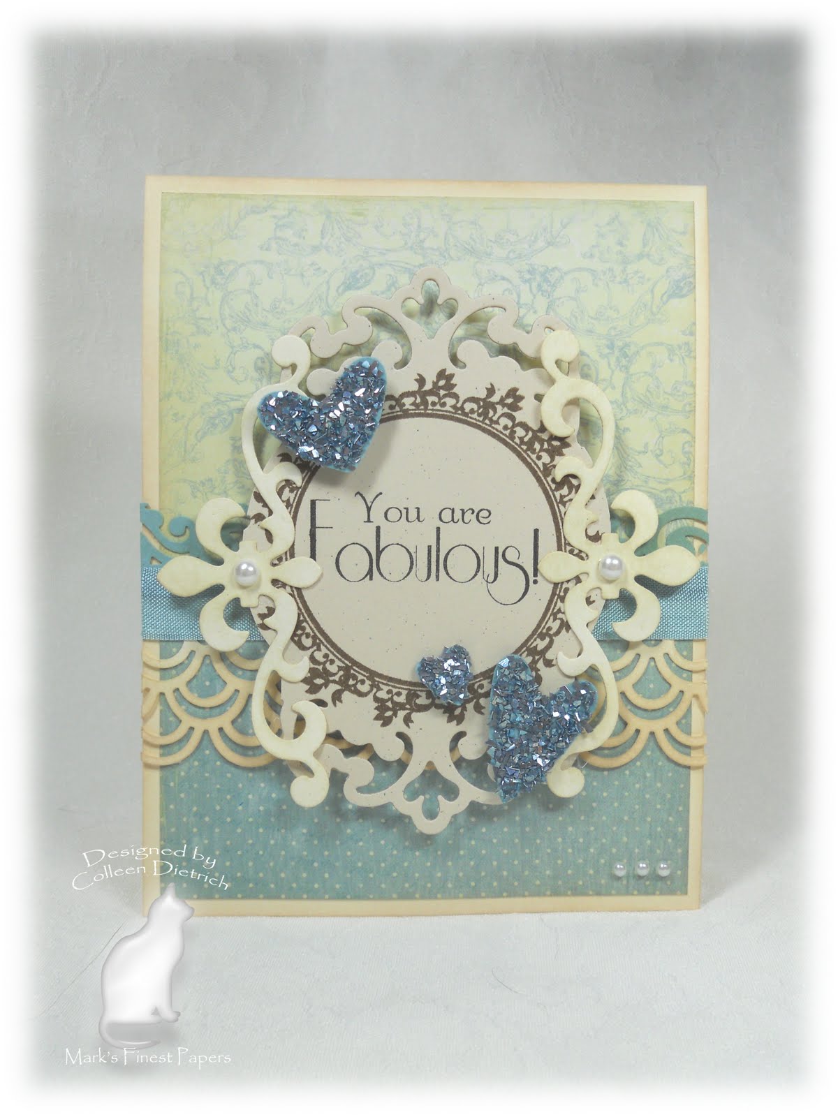
Mark's Finest Papers 65 - Three Hearts


I chose the challenge for today's Mark's Finest Papers challenge:  we want to see three hearts on your project.

I surprised myself by going in a fancy, and blue, direction. 

Am I allowed to say how much I love my own card??  Eek!  I am thrilled with how it turned out.


It's 102 degrees here today in New Jersey, and I am nicely ensconced in the air conditioning while my kids and hubby play in the pool.  I am SUCH an indoor type of girl!

Please come play with us this week -- using three hearts on your project -- and link up your creations HERE.  The deadline is Friday, July 29, 2011 at 3 PM EST. 

Thanks for joining me today!

Colleen

Stamps:  Flourishes and Frame, Just Dandy - Mark's Finest Papers
Paper:  Vintage Cream - PTI; Baja Breeze - SU; Botanical papers - Prima
Ink:  Early Espresso - SU; Antique Linen, Old Paper - Ranger Distress Inks; Memento Tuxedo Black - Tsukineko
Punches:  Double Arches - Martha Stewart; Swirl - EK Success
Other:  Big Shot; Baja Breeze Glass Glitter, Baja Breeze seam binding ribbon - SU; pearls; Parisian Motifs, Fleur De Lis Motifs - Spellbinders; sponge

Thursday, July 21, 2011

Play Date Cafe 91 - Color Splash of Your Choice

Hello everyone!  I had this post typed up before I left on vacation, just in case I didn't make it home in time to do so.  We went to Nags Head, North Carolina - The Outer Banks - to see my in-laws and had a lovely time.  This post goes live in a couple of hours, and I'm glad we made it home in time so I could throw in some vaca pics for you to see:

My girls, first day at the beach.

Sunset over the sound, seen from the top floor deck.

The sight that greeted us on our daily trip to the beach.

My hubby took the girls jet-skiing for their very first time.  They loved it!
I was checking my emails tonight, and wow!  Thank you all for the recent comments on my posts while I was away.  I loved reading each and every one, and can't wait to have some time to visit you all in return.  :)  Right now, a large sandy pile of laundry awaits me, so I'd better go. 

Back to our regularly scheduled post!


This week we have a Color Splash of your choice at The Play Date Cafe.  We are using The Twinery's awesome twine,

and I chose Pink Sorbet for my card.

I went really clean and simple on this one, because of a lack of time.  I used a stamp set called Wedding by Hampton Art that was so cheap at Michael's, I'd have been a fool to pass it up.  It included a flourished corner, and I stamped it four times to create this 'medallion'.  The heart and butterfly are from the set, too.

I wish I'd had more time to photograph it against a different backdrop, so you could see the card better.  Ah, well.

This is also the week we say goodbye to our Play Date teamie, Fiona.   What stands out about Fee's creations, in my book, are her wonderful knitted and crocheted items.  One time it was a pair of darling booties, another time a neat book mark with three dangling circles.  She has a very unique and artsy style.   Fee, I will miss you!!  Why don't you leave some love at Fee's blog and let her know she will be missed at the Play Date?  

And don't forget to pop over to the Play Date Cafe to see what colors the other girls have chosen for their Color Splash, and to see what fabby prize awaits one lucky winner!

Thanks for joining me, and I'll see you soon.

Colleen

Stamps:  Wedding - Hampton Art
Paper:  white by PTI
Ink:  Versafine black - Tsukineko
Other:  rhinestones; Pink Sorbet twine - The Twinery
Related Posts Plugin for WordPress, Blogger...