Thursday, February 16, 2012

Play Date Cafe 119 - Beautiful You


It's Color Splash week at The Play Date Cafe!  Yay!  These are always my favorite.  This week's splash is a Bright Pink.  Remember to use just a splash - just a tiny bit of this pink. ;)

I can't wait to show you what I made.  I love it!
I knew I wanted to use this dress form from The Girls' Paperie Paper Girl set, and I had already stamped the image.  It was lying on the table, and I had the lace out for another project.  I threw a small piece (headed for the trash) near the dress form, and voila! - an idea was born.

The Bella Toile background stamp from Stampin' Up! (sadly, retired) seemed a perfect fit for this ultra-girly card.  The sentiment and flourish are from Verve's Celebrating You set.

Our sponsor this week is the ever-popular, much-loved The Twinery!


Go check out what my teammates created for you this week.  There's more than just cards to see!  And while you're there, check out the prize up for grabs too.  ;)

Colleen

Stamps:  Paper Girl - Girls' Paperie; Celebrating You - Verve; Bella Toile - SU
Paper: white - PTI; Basic Black - SU
Ink: Versafine Onyx Black - Tsukineko
Other:  Big Shot; circle, Labels Four dies - Spellbinders; Pink Sorbet twine - The Twinery; pink bling - Queen & Co.; lace

Wednesday, February 15, 2012

Victorian Birdcage

It's been a while since I played along with a Splitcoast challenge, and I spotted one that caught my attention:  TLC364 'Wrinkle Free Distress'.  This involves using Distress Inks (by Ranger), a craft sheet, and a water mister.  This was a fun technique and I will definitely do it again!

I don't have an official craft sheet, but I used a little mat that came with my hot glue gun, and it was perfect.  A craft sheet is non-porous, slick and can withstand heat from a glue gun and other crafting tools.  There is a tutorial for the wrinkle free distressing technique HERE.


The stamps I used -- the birdcage and the flowers in the top left corner of the card --  are from Blockheads Paper Arts (click on image or caption to see the set at the store):

The first thing I did was ink up my 'craft sheet' with Peeled Paint and Broken China Distress Inks, then mist gently with a bit of water.  Then I placed my card front over the inks and pressed down.  When I removed my card, I hit it with a heat tool.  This, of course, can make your paper curly, so I weighted it down for a bit with heavy books.

The rest was just as easy:  stamp the birdcage (which fills up 2/3 of the card) and the flower heads, add some ribbon, pearls and a flower.


The flower is assembled from Prima Wildflowers, which come in white, but I dyed in coffee and let dry.  A decorative brad helped assemble the petals.

A big HELLO to all the new faces I see in my Followers on the side bar, and to my new email subscribers!  It's so nice to see you here.  :o)

Colleen

Stamps:  Victorian Eccentricities - Blockheads Paper Arts
Paper:  white - PTI
Ink:  Broken China, Peeled Paint Distress Inks - Ranger
Other:  ribbon; pearls - Queen & Co.; Prima Wildflowers; Antique Brad - SU

Monday, February 13, 2012

My Heart Beats for You

I created a Valentine today for my sweetest husband, based on this Mojo Monday sketch:


I used Webster's Pages 6 x 6 papers, from the Waiting For Santa collection, which I've been hoarding TOO long.  Those are on the smallest rectangular layers.  There's a bit of Baja Blue cardstock there, and the largest layer on the card is retired (yes, I know, again) Stampin' Up! Christmas patterned paper in River Rock.


This sentiment is from Verve's Heart to Heart, and so is the stamped double heart behind it.  The heart comes as two different stamps:  a solid, and an outline.  You can use them separately, or together.

I put a small crocheted lace ribbon tab beneath the sentiment label, 'cause that's the challenge at CARDS: create this week -- 'cards with ribbon tabs'.

The crocheted lace looks like upside-down hearts to me, so I used a bit of that, too.


Beneath the stamped heart, I used the Wrought Iron corner punch to create one little 'crown'.

One more challenge entered:  Ribbon Carousel Challenge 39 - 'Anything Goes'.

I'd better run...that Ribbon Carousel challenge closes in hours!

Colleen

Stamps:  Heart to Heart - Verve
Paper:  Webster's Pages 'Waiting for Santa'; Baja Breeze, Very Vanilla, River Rock dsp - SU
Ink:  Cherry Cobbler - SU; Antique Linen and Walnut Stain - Ranger
Other:  Big Shot; Wrought Iron corner punch - Martha Stewart; pearls - Recollections; crochet trim - Mark's Finest Papers; Labels Four, Labels One - Spellbinders; Dotted Scallop punch - EK Success

Marigold Mania

This is a card that was rejected by Paper Crafts magazine for their most recent publication call.  I happen to love it, and it took forever to line up all these marigolds, one by one!


I used a flower from the Blockheads Paper Arts set, Flower Garden.

I began with the center marigold, lining things up with a ruler, then worked out from there.  And I used a stamp positioning tool, such as the Stampamajig, to help me get things right.  I can't use rubber stamps without that indispensable tool.


I stamped one more marigold, on a piece of scrap cardstock, then colored it and trimmed it out.  It's attached to the card with a foam dimensional sticker.  The orange satin ribbon is vintage, from my grandmother's sewing room.

I'm curious what you all think about the black frames around my photos today.  I usually soften and blur the edges, but this is a different look.  Thoughts?

Thanks for coming by!

Colleen

Stamps:  Flower Garden Full Sheet - Blockheads Paper Arts
Paper:  white cardstock - PTI
Ink:  Memento Tuxedo Black - Tsukineko
Other:  Botanical punch - Martha Stewart; orange satin ribbon; Copic markers

Sunday, February 12, 2012

Hydrangea Get Well

My father-in-law is having knee surgery next week, and I made a card to send him while he recuperates.
I think he will like this card, even though it sports some chocolate pearls and a bit of satin ribbon:


I used strips of retired Stampin' Up! patterned papers on a Certainly Celery card base.  In fact, except for the card base, everything on this card was a scrap, including the ribbon.

Can I just tell you how much I love the Fiskars sentiment set, All Year Greetings?  I bought it half-off (so it was $4.00) at a craft store near me, with the intent of using it on a lot of cards for submission to magazines.  I wound up really falling for it.  The sentiments are nice, the fonts are mixed and fresh, and they stamp like a dream!  I don't need to prime it like I need to with other inexpensive polymer stamps.


Another find I LOVE and have coveted for quite some time is the Botanical Script stamp by Inkadinkado.  I kept putting off getting it because it retails for $11.99, for just one stamp.  I found it on clearance at a JoAnn's store for $2.97!  How could I pass it up??


If you are not my Facebook friend, then you would not have seen the message I posted this past Friday, about my 13 YO daughter.  Some of you may recall this post, where I shared about her battle with anorexia last year.  Since the beginning of this school year, she has spoken to several different health classes in her grade about anorexia.  Part of the curriculum is about eating disorders.  Haley told her teacher that she wanted to give these speeches, telling all the details of her illness.  It was completely up to her, no one pushed her into it, or told her what to say.  She is a 'pro' at it now, and feels very empowered during her talks.

Last Friday, the students from the current health class gave her this poster, with individual notes of encouragement attached:


It touched my daughter so deeply that she cannot wait to go to school tomorrow just so she can thank everyone who included a note.  :o)

Thanks a bunch for joining me today!

Colleen

Stamps:  Botanical Script - Inkadinkado; All Year Greetings - Fiskars
Paper:  Crumb Cake, Certainly Celery, Confetti White, patterned papers - SU
Ink:  Close to Cocoa - SU; Antique Linen - Ranger; Versafine Onyx Black - Tsukineko
Other:  chocolate pearls - Queen & Co; brown satin ribbon; Big Shot; oval die - Spellbinders

Saturday, February 11, 2012

Up, Up and Away

I decided to play again in the Flourishes Timeless Tuesday challenge, "Fly Away With Me."  We are to focus on birds, and my card does include birds in the trees, but the focus is on a giraffe in a balloon:


Talk about a quick card to make!  All of this is patterned paper from Stampin' Up! (retired, of course; I seem to have so much of that).  I just cut out the giraffe in a balloon image, popped him up on foam dimensionals, and added some pearls.


A little sentiment from Verve and I was done!


How satisfying to make something so cute in so little time!

Challenge entered:  Simon Says Stamp - 'Love is in the Air'

Hope you have a wonderful day!

Colleen

Stamps: Friendly Phrases - Verve
Paper:  all SU patterned paper - name unknown
Ink:  Versafine Onyx Black - Tsukineko
Other: pearls - Recollections

Friday, February 10, 2012

What's New?


I got my March/April issue of Paper Crafts magazine yesterday, and am so excited to see my card on page 37!  And today was the day they sent out email acceptances for the upcoming Stamp It! issue...and I was one of them.  :o)  That's happy news, for sure.  I sent in a whopping 23 submissions, but they only picked one.  Hey, I consider myself lucky to at least be in there.  Thanks, Paper Crafts!

I've got a fun card to share with you right now:


I love how all the text comes together:  the tiny print on the Poppy Parade patterned paper, the large ABC's in the circle, and the sentiment.


Challenges entered:


Thanks for coming by!  I really appreciate your visit.  :o)

Colleen

Stamps:  Just Sayin' - The Craft's Meow
Paper:  Poppy Parade, Regal Rose cardstock, Peach Parfait & Poppy Parade patterned paper - SU; white - PTI
Ink:  Versafine Onyx Black - Tsukineko
Punch:  corner rounder - SU
Other:  Poppy Parade marker, Peach Parfait ribbon - SU; pink bling - Queen & Co.

Tuesday Trigger - Sending My Love

I am playing in the Tuesday Trigger challenge at Moxie Fab World, and this is the inspiration picture:


I used Mehndi Medallions from Wplus9, which I just got in the mail the other day, and had time to play with it this morning.  LOVE this set in a BIG way!


I created this card pretty quickly, and it's one layer (except for the pearls):


The mix-n-match sentiments are pretty cool, too.

Gosh, my photos look so dark!  I am having such a frustrating time with my camera, and learning the subtleties of lighting your subject.  Hmmmph!

Thank you for coming by!    :o)

Colleen

Stamps:  Mehndi Medallions - Wplus9
Paper:  white - PTI
Ink:  Crumb Cake, Chocolate Chip, Pretty in Pink - SU; Versafine Onyx Black - Tsukineko
Punch: corner rounder - EK Success
Other:  pearls

Thursday, February 9, 2012

Paint Chip Valentine

My friend, who is a Girl Scout leader, came up with the idea of using paint chips to make Valentine cards for our troop.  She asked me for further ideas on how we might do this.  I thought it about it for a while, and this materialized today, in under 20 minutes:
No stamps were needed, no ink, either.  I was glad I had chipboard pieces and stickers on hand that were perfect for the job.


The paint chip strip is actually one I was using.  We are painting our bathroom Barely Teal by Benjamin Moore Paints, and it's at the top of this color strip.  I only needed that one little piece, and the rest were headed for the recycling bin.

I am definitely entering this in the Around The House challenge over at Moxie Fab World, using tools from around the house.  Love it!

Also entering at CARDS: create, where the challenge is Valentines.

Thanks for joining me again!  You all have a wonderful day.  :)

Colleen

Paper: white - PTI
Punch: corner rounder - EK Success
Other:  white glitter alpha chipboard - Colorbok; 'u' sticker - Paper Bliss/Westrim Crafts; glitter heart chipboard sticker - Recollections; paint chips

Play Date Cafe 118 - Thanks


Golden Yellow, Pacific and Cobalt are the bright, happy colors this week at The Play Date Cafe.  They totally remind me of sunny, summer days.

I first tried a more vintage style card and completely failed, so I went CAS instead - that's my usual go-to solution for a tricky color combo.


I used Pacific Point, Summer Sun and Brilliant Blue cardstock, punched and layered onto an embossed card base.  The sentiment is Verve - Celebration of Thanks.


Simon Says Stamp

Our sponsor is Simon Says Stamp, which has a HUGE online store.  One lucky player wins the terrific prize this week!

Check out what my stamping sisters did for the challenge this week HERE.  One of the things that I love about our team is the diversity in card-making styles.  :-)

Thanks for joining me today!

Colleen

Stamps: Celebration of Thanks - Verve
Paper:  Summer Sun, Pacific Point, Brilliant Blue - SU; white - PTI
Ink:  Versafine Onyx Black - Tsukineko
Punches: Scallop Dot - Martha Stewart; corner rounder - SU
Other: Big Shot; Labels Four die - Spellbinders; white seam binding - Wrights; Diamonds and Dots embossing folder - Lifestyle Crafts

Wednesday, February 8, 2012

Strength & Hope


Today's card is a bit of a departure from my normal styles (my 13 YO wrinkled her nose up at this one).   I had these papers lying around, and I really wanted to give them a try and mix patterns.  One of the papers (bottom left corner) is from a beautiful day journal, which I barely used and know - realistically - that I never will.  I used to be big on keeping a diary when I was a teen, and tried again when my first-born was very small.  I'm just too darn tired at bedtime to record stuff in a book.

Another paper, the one under the flower, is actually a small gift card from a cheap-o pack of 10 from the craft store (bought for a dollar).  It's really soft and pretty, reminding me of Anna Griffin papers.

The top left paper with a green background is a scrap from my cousin (thanks, Kristen!).


The gorgeous paper flower is from Mark's Finest Papers, and the little teacup charm is from them also.


The sentiment (Stampendous) is on a Fancy Tags Two die cut (Spellbinders), which I also sponged while the paper was still in the die.

Challenges entered:


I'm off to paint the bathroom a bit more, and try to whip up some simple Valentines.  I'll see you tomorrow with a new Play Date Cafe challenge!

Colleen

Stamps:  Sincere Sentiments - Stampendous
Paper: Barely Banana, Mellow Moss, Very Vanilla - SU; patterned papers
Ink: Antique Linen Distress - Ranger; Versafine Onyx Black - Tsukineko
Other: pearls; paper rose, teacup charm - Mark's Finest Papers; Big Shot; Fancy Tags Two die - Spellbinders; sheer ribbon - Stamp Simply Ribbon Store

Tuesday, February 7, 2012

Silhouettes

This is my second post for the day.  Please visit HERE to see 'Parrot Tulips Valentine'.

I've not used a stencil on a card in a long time, but had the opportunity to play with one the other day.  I used Adirondack Color Wash to create a pretty silhouetted scene:


The stencil I used is from The Crafter's Workshop, available through Blockheads Paper Arts:

I protected an area on my table with paper, then laid my template on white cardstock and spritzed until I could see the images very clearly.  I let it dry for a few moments before removing the stencil.  After my paper was dry, I placed some heavy books on top to help flatten it out again.


I trimmed my image and added a strip of Pacific Point cardstock which had been border-punched.  A piece of seam binding ribbon - from my scrap bag - was tied around the layer, then I mounted it with foam dimensional stickers to the card base.  A little bit of olive bling helped finish off the card.

This template is an ample size (6" square), so I actually got two cards'-worth out of one project.

Challenges entered:


I visited my doc today about those x-rays on my hands.  He tells me it is osteo-arthritis, not rheumatoid arthritis (thank God!).  He recommended glucosamine-chondroitin, as did my friend who is a pharmacist.  I know I need to be careful about how much time I am on the computer, too.

Thanks for visiting me!

Colleen

Stamps: none
Ink: Adirondack Color Wash spray - Lettuce
Paper: Pacific Point - SU; White - PTI
Punch: Double Arches - Martha Stewart
Other:  Mini Butterfly Meadow 6 x 6 Template  - Crafter's Workshop; white seam binding; green rhinestones - Michael's 

Parrot Tulips Valentine

It feels like forever since I posted (it was only last Thursday), but so much has happened in the days between.  My 10 YO had a birthday party to attend and a Girl Scout cookie booth to be part of on Saturday.  Before and after those two events, my husband and I had more painting to do in the bathroom (we're going from a deep hunter green to a light, crystal-waters blue).

I also cleaned my house as best as I could, because my sweet friend Andrea came for a visit on Sunday.  She brought her daughter, and my girls were so excited to hang out with her.  We have a trampoline now, and those three were out there most of the time.  Andrea and I were thinking of crafting together, but we talked the whole time.  I made (er, heated up) stromboli and a side salad for lunch, and my dear hubby took all the young girls out to lunch.  I absolutely love Andrea's company and she feels like a sister to me.  Plus...she always brings me goodies. ;-)

OH!  One more thing before I show my card today.  The deadline for Paper Crafts' Stamp It! publication call ended yesterday, and I wound up submitting 23 projects.  !!!  Yes, that took up so much of my time the last three weeks.  I enjoy the publication calls because I am pushed creatively further and further.  In fact, as the deadline approached, I felt that my cards were getting better and better.  Let's see if the Paper Crafts gals agree!  I should find out by Friday if I've made it in.


This card goes to my mom for Valentine's Day.
It just occurred to me that I made her a tulip card for Christmas too!  The tulips in this pot are Parrot Tulips, and here is a pic of a real one:


All those flourishes and etchings make me happy!  I'm anxious to make a card using the birdcage stamp soon.


I used a sticker from Heidi Grace called Quotes & Phrases - Happiness.  It looked a bit plain next to that glorious pot of flowers, so I surrounded it with pearls.  Of course!

Challenges entered;

A big thank you to those of you who have offered advice on both cameras and hand pain.  I am absorbing everything you say, and can't wait to get a new camera....and control this arthritis!

Colleen

Stamps:  Victorian Eccentricities - Blockheads Paper Arts
Paper:  white - PTI
Ink:  Memento Tuxedo Black - Tsukineko
Punch:  Botanical - Martha Stewart
Other:  pearls - Recollections; Copic markers

Thursday, February 2, 2012

Play Date Cafe 117 - Sparkly Thanks


Robin Egg, Lilac and Bisque...our colors for this week's Play Date Cafe challenge.  Soft and beautiful, aren't they?  I love the picture of the weathered door in the inspiration grouping above.

I knew right away that I could use the sparkly ribbons I bought on clearance after Christmas at JoAnn's.
I created a frame with them, mitering my corners with this help.


The center panel uses a stamp from Stampin' Up!'s Clearly For You, with Wheat Versamagic Chalk Ink.  Around the border of glittery ribbons, I put together a mix of 3 different Spellbinders die cuts.


The butterfly, from SU's Nature Walk, sports some clear glitter, though you can't see it too well here.


The base of the card is stamped with Vintage Wallpaper by Market Street Stamps, in the same Wheat chalk ink as the center panel.

We have a new designer joining us this week.  Alicia Thelin is a name you may know from publications, and we're super excited to have her be part of our team. :-)  You can check out her neat style at her blog, scrappybetties.  Welcome, Alicia!

Our sponsor at The Cafe this week is Melanie Muenchinger, a GinaK Designer.  She has designed many of those glorious stamps, so beautiful!  Head over to The Play Date Cafe and check out the designer line-up of creations, and our fabby prize, too.

Thanks for joining me!

Colleen

Stamps:  Vintage Wallpaper - Market Street Stamps; Clearly for You, Nature Walk - SU; Celebration of Thanks - Verve
Paper:  white - PTI
Ink:  Wheat Versamagic Chalk Ink; Versafine Onyx Black - Tsukineko
Other:  blue, lilac glitter ribbon - JoAnns; pearls; Big Shot; Fancy Tags Three, Fleur de Lis Motifs, Parisian Motifs dies - Spellbinders; clear glitter

Wednesday, February 1, 2012

Black Tie and Diamonds

This is my second post of the day.  You can see the Viva La Verve post HERE.

Got your attention with that post title, huh?  The card I made last night reminds me of just that.


I created a toile-like pattern using a stamp from Lost Coast Designs, available at Blockheads Paper Arts:

Love it!  It has the same feel as the older Anna Griffin stamps I fell in love with, and aren't available any more.


Here's my velvet "bow-tie", topped with a button from my stash (thanks, Aunt Kay!).  There's lots of sticky Scor-Tape holding this baby together, plus a few stitches.  I glued the whole thing down with Aleene's Tacky Glue when it was assembled. (And here's what a lazy crafter I am:  I only had white thread / needle on hand to stitch this together, otherwise I'd have to go down to the cellar for black thread.  So I brought out a black Sharpie marker and colored my white thread.  ;)

The "diamonds" didn't photograph too well, but here they are!

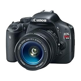
Does anyone have any suggestions on a good camera to buy?  I am currently using a point-and-shoot Nikon Coolpix S4000, and find it falls short in doing close-up pix.  I've done a little research, and have started asking around.  I'm kind of interested in this Canon, but it's at least $600 so I need to save for a while:

Canon EOS Rebel T2i 18 MP CMOS APS-C Digital SLR Camera 

with 3.0-Inch LCD and EF-S 18-55mm f/3.5-5.6 IS Lens


Anybody have any experience with this camera?

Colleen

Stamps:  Lily Flourish - Lost Coast Designs
Paper:  white - PTI; Basic Black - SU
Ink:  Versafine Onyx Black - Tsukineko
Punch:  Lattic Edge - Martha Stewart
Other:  white satin ribbon - Nicole; black velvet ribbon - Michael's; bling - Queen & Co.; button; thread/needle

Viva La Verve #4 - Hugs and Kisses

Here's the final sketch of January for the Viva La Verve challenge (you have one more day if you want to play!):


I'm delighted and amazed that from now on, the fourth and final sketch challenge each month from Verve will be a clean and simple design.  That's just up my alley!  I do find the typical Verve sketches to be tricky.


My Valentine uses retired and oh-so-gorgeous Stampin' Up! paper, a thick strip of their pink grosgrain ribbon, and a few embellishments.  This was a breeze to make!


The die cut is Martha Stewart, sentiment Verve (of course!), and the little glittery chipboard heart stickers are by Recollections.

I'm entering this at Really Reasonable Ribbon too:  use red and pink with a ribbon.

Thanks to all of you who have commented on ways to combat hand pain, and wished me well.  I liked Lisa's "one day on the computer/one day off" approach...though it would be so hard to stay away!!  LOL
I think our strangely-warm winter is a benefit to my hands.  It's going to be 64 degrees here today in New Jersey.  Totally weird!

See you in a little bit with another post for the day, then tomorrow with a brand new Play Date Cafe challenge.  :-)

Colleen

Stamps:  Heart to Heart - Verve
Paper:  white - PTI; Real Red, patterned paper - SU
Ink:  Versafine Onyx Black - Tsukineko
Other:  Pink Pirhouette grograin ribbon - SU; chipboard hearts - Recollections; doily die cut - Martha Stewart; pearls
Related Posts Plugin for WordPress, Blogger...