Tuesday, June 29, 2010

Of The Earth...Finally!

Hello everyone! What a hot day it is again here in New Jersey. We need rain very badly, and as much as I water my plants outside, it's not enough. I have been spending a lot of time recently removing flowers and transplanting some in other spots around the yard. It is hard work for me, as I am a weakling, but it must be done. :)


Onto stamping matters! I made this card for the Clean and Simple Challenge this week over at Splitcoaststampers. We are to use colors similar to Bashful Blue, Certainly Celery and Pumpkin Pie. A cheery combo, if you ask me!


I brought out my Of The Earth stamp set for the first time - hooray! Sure would make me happy to use all of my stamps that have never seen ink (by me, as some are 'pre-owned'). So now it's one down, many more to go!

A close-up of the image, colored with markers.
By the way, you'll see ribbon here in this close-up, instead of a sentiment. I had the darndest time getting that stamp to work right for me twice! I gave up, and went to ribbon instead. No stamping mistakes, only opportunities!

Happy Stamping,

Colleen

All supplies Stampin' Up!:
Stamps: Of The Earth
Ink: Basic Black, SU Markers
Paper: Pumpkin Pie, Bashful Blue, Certainly Celery, Whisper White
Punches: scallop border
Other: dimensionals, Stampamajig

Monday, June 28, 2010

Bird in a Nest

I bought my Extra Large Bird Punch a little while ago and it just sat untouched in my craft cabinet. There's plenty of beautiful and sweet inspiration out there using this punch, but I never got around to it until now. I dreamed up the nest idea a couple of weeks ago and thought what a cool idea it would be (in my own honest opinion! haha). I also made this for the Cupcake Craft Challenge #93, which is Summer Fun. I loooooove watching the different birds in my back yard here in the summer, so that is one of my simple pleasures. :)
As you can see by the Bird Pieces photo, I chose to use different designer paper for the birds that ended up on my cards. (Remember, I always make two cards...one to keep and one to give away) I do love the Bella flowers on the birds, but I thought a brighter color like the red gingham would stand out more. I will use those floral birds for something, though, trust me!
For each card, I punched out a bird with wing, a white extra-wide oval, and scads of "branches" in three shades of brown: Chocolate Chip, Close to Cocoa, and Soft Suede.
I randomly placed those branches, some with shortened stems, some long on the oval with a Zig 2-Way Glue Pen. The outer most branches touching the bird are propped up on tiny dimensionals.
When that was assembled, then I put dimensionals on the back of the oval and adhered to the embossed layer of the card. And I know it's hard to see, but there's a little shiny silver stud for an eye on the birdie.

The inside of the card.
I used the floral swag from Tender Toile stamped in Chocolate Chip ink,
and the sentiment is from Teeny Tiny Wishes.

Thanks for dropping by today. I truly appreciate your visit!

Happy Stamping,
Colleen

All products Stampin' Up! unless otherwise noted:
Stamps: Teeny Tiny Wishes, Tender Toile, Warm Words
Ink: Chocolate Chip
Paper: Whisper White, PTI white for card base, Riding Hood Red, Close to Cocoa, Soft Suede, Chocolate Chip, Bella Rose dsp
Punches: Extra Large bird, Modern Label, Word Window
Other: silver 'pearl', dimensionals, Big Shot, Cuttlebug ef Birds and Vines, silver brads, Zig 2-Way Glue Pen, Stampamajig

Friday, June 25, 2010

Summer Fun, as seen by an 8-year-old

This is my eight-year-old's idea of Summer Fun, the Stampin' B's Challenge #64.
Kerry occasionally loves to stamp with Mom. I get excited when she joins me, because I am eager to share my passion for this hobby with her.
Yesterday we had some down time when a storm blew through (and I do mean 'blew': my patio umbrella went up, up and away! I had to chase it down in driving rain, blowing winds and a fierce lightning storm - yikes). Kerry wanted to participate with me in the Summer Fun challenge and asked me what kind of summery stamps I have. I actually don't have all that many. (gasp! A reason to shop for more stamps!) She chose Medallion background as a sun (so clever of her!) and tried to create a picnic scene with a picket fence. She used watermelon and lemonade stamps from SU (I have NO idea what set they came from; they were sold loose at a yard sale), grapes and a lady pointing from Bizarro (these two are at least 20 years old, wow!), and a butterfly and flower from SU's Cause for Celebration, an older retired set. Her fence and cup of lemonade are popped up on dimensionals. A girl after my own heart...I can't LIVE without dimensionals!
Thanks so much for visiting. I hope you've enjoyed seeing a budding artist's work!

Happy Stamping,
Colleen

Stamps: Bizarro - lady, grapes; Stampin' Up! - Cause for Celebration, Medallion, unknown set
Paper: Close to Cocoa, Whisper White
Ink: Summer Sun, Basic Black, Pixie Pink, Sage Shadow, Orchid Opulence
Punch: MS Picket Fence
Other: dimensionals, marker, Stampamajig

Ivy Birdhouse


My friend from Splitcoaststampers, "Benzi", is a Design Team Member of Stampin' B, a website that encourages you to have fun with your stamping for the utter enjoyment of it. Their current challenge is Summer Fun (#64).

There are many things about summer that I love, and seeing all the different birds visiting my yard is one of my pleasures. I do not have a bird feeder or a bird house, but they come anyway and they are most welcome!

I used Splitcoaststampers' Sketch Challenge 286 to help me design my card. SCS sketch challenges are issued every Wednesday.

On my green layer, I stamped a solid ivy image in Always Artichoke and Old Olive, to give depth and to echo the ivy climbing up the birdhouse. And the picket fence punch seemed perfect to go with my bird and garden theme! I just punched both sides of a strip of white cardstock.

Here's a closeup to see my sky blue bling a little better:

The sentiment on the bottom right corner of the card (see top photo) is from Teeny Tiny Wishes, which is a near-perfect set in my opinion! I use it ALL the time.
Thanks for visiting with me today!
Happy Stamping,
Colleen


Stamps: D.O.T.S. 'Ivy Birdhouse', Teeny Tiny Wishes (SU)
Ink: Tsukinenko Memento Tuxedo Black, Always Artichoke, Old Olive, Basic Black
Paper: Bashful Blue, Old Olive, Whisper White, Close to Cocoa
Punches: Martha Stewart Picket Fence
Other: Copic markers, dimensionals, Stampamajig, bling from AC Moore

Thursday, June 24, 2010

Hooray For Damask

I absolutely love anything with a damask design.
When I was in my early twenties, I would go shopping at a local thrift store on my lunch hour. I found the most gorgeous old damask table cloths in mostly white, but occasionally other colors. I felt like I had found real treasures. Sometimes I would find just a pack of napkins, and I snapped up whatever I could find (and the prices were ridiculously low). If a pack of napkins were a bit too stained for my taste, I'd buy them anyway and dye them with Rit. My two colors then were burgundy and deep gray. I still have them, and we use them quite a bit...even with young kids. The darker colors can hide a lot of Chef Boyardee stains. :D

Before my grandmother passed away, she let me pick out some sumptuous damask tablecloths and napkins that she had either: 1) never used or 2) managed to wash with magic detergent. They were in impeccable condition. One set is golden yellow, one is soft pink, and a pack of napkins are baby blue (or if you think in terms of Stampin' Up! colors, they're So Saffron, Pretty in Pink, and Bashful Blue). I was thrilled to inherit these beauties.

Now, it seems you can find damask designs everywhere: backpacks, pencil cases, post-it notes, folders and binders, tote bags, personal-size calenders and much, much more. I couldn't be happier. Why, even the collapsible containers from the Container Store, in which I store completed cards and cardstock/designer paper scraps, are covered in a chocolate-colored damask design. (swoon)

Which brings me to my card.
I like to take my inspiration from unlikely places, and today's card was inspired by a shirt worn by, I believe, Meredith Vieira of the Today Show. A couple of days ago, I saw her wearing a pink shirt that had a light gray damask design on it. (At least, I think it was her...it could've been elsewhere) Instantly, I thought: CARD!

For as much as I love damask, I really don't have too many stamps like that. This design is a stamp from the "Friends 24-7" set by Stampin' Up!. I used my Stampamajig to help me get an all-over design on the pink card layer. Simple matting in black, pink and white was all that was needed. I did heat emboss the main image with black embossing powder, but you can't see that from the photo.

I used my SU black journaling pen to help draw a frame around the main image, and darn it - it smudged! That's okay...it was a happy accident. :) I wound up covering the corner smudges with silver half pearls.

My envelope, using two grays: Basic Gray and Going Gray, both by SU.

Thanks for joining me today and bearing with me while I spout about damask!

Happy Stamping,
Colleen

Stamps: Friends 24-7
Ink: Going Gray, Basic Gray
Paper: Pixie Pink, Basic Black, Whisper White
Other: black embossing powder, dimensionals, heat tool, silver half pearls, black journaling pen, ruler

Wednesday, June 23, 2010

Sweet Thank You's

I have always believed it is important to send a 'thank you' card or letter to someone when they give you a gift, whether the gift is bought at a store, made by hand, or a loving gesture. I am trying to teach my two girls the same thing.

Before I made my own cards, I would buy each girl her own set of cards to use for thank you notes. But now that I have this awesome hobby, I make them!

This simple thank you is about as simple as it can get (well, almost). I used Stampin' Up!'s "Sweet of You" set - an oldie, and one of my $5 bargains - with a Stampamajig to help me position the sentiment right over the dessert stand. The image was stamped with Tsukinenko's Memento Tuxedo Black ink, which is superb for use with Copic markers.
I made a total of 8 cards, and it took about an hour.

Happy Stamping,
Colleen


Stamps: Sweet of You
Paper: Whisper White
Ink: Tsukinenko Memento Tuxedo Black
Other: Copic markers, Stampamajig

Ice Cream Colors Monogram

On my previous post, I used designer paper strips from a bag of scraps I get from my local Stampin' Up! demonstrator (for $1!!). Here are more of those same strips, this time completely covering a Whisper White card base. I cut each strip to a 4 1/4" size (the width of the strips varied, and I left them as they were), then pasted each down in a random pattern.
The cheery patterns and colors of this designer paper set were perfect for making a monogrammed set of thank you cards for my 12 year old daughter to use. She recently celebrated her birthday and needs to write some thank yous. :) The monogram was created using Lovely Letters punched out and layered on a Chocolate Chip scalloped square, then popped up on dimensionals.


$2.00 for all this cardstock; can you believe it??

Happy Stamping,


Colleen
Stamps: Lovely Letters by SU
Paper: Whisper White, retired designer paper by SU
Ink: Chocolate Chip
Punches: 1 1/4" square, scalloped square
Other: dimensionals

Thursday, June 17, 2010

Fishy Father's Day

The other day I posted a golf-themed Father's Day card for my husband and his dad. This card is for my husband's non-golfing step-dad, John. He does like to fish, though, and as I am quite lacking in masculine stamps, I thought this would be so apropos.

The fish stamp is, like, 20 years old. It is from a company called Bizarro. I just found out today that they are still in business! Good for them. Way back when I got the fish stamp, they used to include a free stamp in every order over a certain dollar amount. Don't know if they still do, but my fish was free! He's been sitting in my stamping supplies for way too long, uninked. I am so glad to have used him.

Rather than color in these fish images, mostly because I think I could not do them justice, I decided to leave them looking like pen illustrations. When I arranged them on the vanilla cardstock layer, there seemed to be something missing. I used my Stampin' Up! journaling pen and a ruler to create a fine, thin border. I also punched 1/16" holes where their mouths are and threaded them onto twine. Knotted the twine, then fed it through tiny holes punched through the cardstock layers. On the back, I used Scotch tape to secure the ends of the twine. Then I arranged the fish, which have dimensionals on the back, in fanned-out positions.


I usually decorate the inside of my cards, and I did a little bit of something on this one. Just another fish in black, and a Father's Day sentiment in Chocolate Chip to give it simple flair.

Happy Stamping,
Colleen

Stamps: fish from Bizarro; Teeny Tiny Wishes, Linen background, Print Pattern background by SU
Paper: Close to Cocoa, Very Vanilla, Old Olive
Ink: Close to Cocoa, Chocolate Chip, Basic Black
Other: twill tape, twine, 1/16" hole punch, dimensionals, Stampamajig, Scotch tape

Tuesday, June 15, 2010

Father's Day Golf

My husband loves to play golf, but rarely has the time to go. For Father's Day, I wanted to give him a card about his favorite sport (but wait - maybe that'll just make him sad??). My father-in-law also loves this sport and actually lives on a golf course in Nags Head, North Carolina, so I made one for him too.

Though I am sure there are plenty of punch art golf cards out there, I dreamed this design up myself, and did not copy anyone else's art.


This photo shows the elements I used to create my golf green, hole and flag. But after I took my photo, I realized the square "flag" was not going to work. I had plans to cut it on the diagonal, and tried that, but the flag just looked stupid. :)


More about the flag construction in a moment.


I sponged the flag, hole, and golf green with their respectively-coordinating ink pads before assembling the card. Unfortunately, you cannot really see that sponging, although I still think it gives a bit of dimension anyway. Check photo of finished card at the top of this post to see the sponged pieces all put together.


After that square-punched flag did not work out, I tried this: cut a piece of cardstock about 1" x 1 3/4". Find the center of the short side of the rectangle and mark it with a pencil dot. Line up the pencil dot and the bottom right corner of the rectangle in the cutting slot, then slice.


Next, line up the newly-created top right corner of the piece and the bottom left, then slice.
This gave me the perfect pennant shape I was looking for.

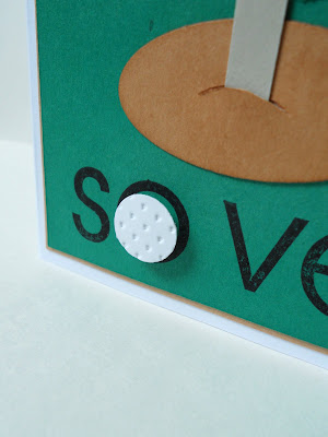
I used Stampin' Up's Heart Embosslit to create my golf ball, because it creates texture while it die-cuts the heart. After running the Embosslit through my Big Shot, I used a 1/2" circle punch on the heart, then turned over my "golf ball" to the negative side of the embossed piece. I adhered it in the center of the "O" in the sentiment with a dimensional.


I really do love trying to think outside the box. That's not one of my strong suits, but I'm trying!

Hope the men in your life have a wonderful Father's Day.

Happy Stamping,

Colleen

All supplies by Stampin' Up!
Stamps: So Very
Paper: Creamy Caramel, Glorious Green, Whisper White, Going Gray, Brilliant Blue
Ink: Basic Black, Creamy Caramel, Brilliant Blue, Glorious Green, Bashful Blue and Baja Breeze (for the sponged sky)
Punches: 1/2" circle, large oval
Other: Big Shot, Heart Embosslit, Stampamajig, craft knife, dimensionals, sponge

Thursday, June 10, 2010

Inspired by a Priest's Stole

When I attended my niece's Christening last weekend, the priest presiding over the event wore this gorgeous, gorgeous stole. It's the scarf part that hangs around the neck. My sister said the priests there have special stoles that coordinate with the church's colors and fleur-de-lis theme throughout the building. I found myself thinking of a card right away! I wish I could have taken a picture of that stole, but I didn't feel comfortable asking. :)


I am no great photographer, and found it difficult to take a picture that shows both the gleam of the gold embossing AND the tone-on-tone damask effect on the vanilla cardstock. I've included a second photo that shows the damask just a bit more, I think.

My 'studio' is my dining room floor, which is the brightest room in the house most of the day.

For the vanilla card base, I took the squarish motif from Baroque Motifs and stamped it in an even pattern with Versamark ink. On a piece of Brocade Blue cardstock, I again used Versamark to stamp the flower block from Carte Postale. I sprinkled gold embossing powder from Stampin' Up! (ooh, that's nice stuff) on them and hit it with the heat tool.

The fleur-de-lis, also from Carte Postale, is gold-embossed as well, but you can't really tell here! I chose not to put a sentiment on it, because I thought it was so beautiful as-is. The inside is blank, until I decide what the card will be used for. And, yes, I made two!


Happy Stamping,
Colleen


All supplies by Stampin' Up!
Stamps: Carte Postale, Baroque Motifs
Paper: Very Vanilla, Brocade Blue
Ink: Versamark
Other: gold ep, heat tool, dimensionals, Stampamajig


Flourishes Challenge Sympathy

I do love black and white cards, and Flourishes is hosting a challenge this week (FTTC70) involving black, white and one other color. My other color is gray. I CASE'd the layout from a card I saw somewhere, but I know it's not in my Favorites Gallery at Splitcoaststampers. I am not sure who to give credit to, but if it looks like your card, give me a shout, and thanks for the inspiration! I did change the color scheme, ribbon and sentiment.

I made two of these cards, as I always, always do.


I have a hard time parting with most of the cards I make, so I keep one and the other goes into my "Give Away" box. Am I alone? I just like looking at my creations from time to time. I'm sure I'm a geek... :)

Happy Stamping,
Colleen

All supplies from Stampin' Up! unless otherwise noted:
Stamps: Happy Harmony, Thoughts and Prayers
Paper: White from PTI, Basic Black
Ink: Basic Black, Going Gray
Other: Big Shot, Cuttlebug birds and vines folder, gray velvet ribbon, Stampamajig

Tuesday, June 8, 2010

Black and White Tulipe

I would love to say I created this for a challenge, but I did not. I feel very uncoordinated when it comes to challenges. Time slips away from me, and a challenge is over before I know it. My friend Emily is super-fantastic at challenges. She enters many, and wins many! She'll create a card, and it'll satisfy four or five challenges at once! That's talent.


My inspiration for this card is from an upload on Splitcoaststampers. It's similar, in black and white, but I changed mine to have a positive/negative effect over the background. The "designer paper" is just the Bella Toile background stamped in black. The black cardstock layer was run thru the Big Shot with a Texturz plate, using the large dot pattern.

Helpful Hint: I like the pattern choices of the Texturz plates by Stampin' Up!, but they sure aren't the same as embossing folders. Embossing folders make crisper impressions into your cardstock. Texturz plates offer lighter, more subtle impressions. By adding a slim piece of cardboard, or a spare piece of cardstock, or even a folded-once piece of computer paper, I can get a deeper impression with the plates.

This card is going to my mother, who lives in Houston. She loves anything black and white. And she is a major supporter of my card-making habit, so I like to drop her a line and let her know how much I appreciate it!

Happy Stamping,
Colleen

Stamps: Bella Toile background
Paper: Whisper White, Basic Black
Ink: Basic Black
Other: Big Shot, Texturz plate, rhinestone stickers, Tulipe Bigz Die, dimensionals

Monday, June 7, 2010

A Pile of Hearts


When my 8 year old daughter was about 4 or 5 years old, she would say to me, "Mom, I have a pile of hearts in my body for you." This is such a special saying to me, because she was so young and found such an interesting, poetic way of expressing her love for me. (sniff) We still say it to each other today.

I decided to turn that saying into a card today, which I will give her soon; a "just because" kind of card. It also fits an older Splitcoast Color Challenge (CC129).

On each of the pink and green hearts, I used adhesive on the bottom of the heart and dimensionals at the top of each corner. That way, the bottom of each heart lies flat on the paper, while the top curved parts are propped up. For each of the pomegranate hearts, I used thicker dimensionals on the whole heart. I wanted them to stand out further from the others.

Hope you have a pile of hearts in your body for someone extra-special!

Happy Stamping,

Colleen

All supplies by Stampin' Up!
Stamps: Elements of Style
Paper: Old Olive, Purely Pomegranate, Pretty in Pink, Whisper White
Ink: Basic Black
Punches: Full Heart, 1" circle
Other: Big Shot, Texturz Plate, dimensionals

Punchy Cocoa Gardens


Well, I'm just now posting last week's Splitcoast Color Challenge, CC273. A new color challenge is issued each Tuesday, so at least I've made it before a new one comes out! If you've read my previous post, you know it's been a busy time here!


The colors in CC273 are: Close to Cocoa, Barely Banana, and Garden Green (all SU colors, or something close to them).


The idea for this card came to me as I was getting ready for bed last night. In fact, I had so many ideas for new cards, my pen was flying over my sketch paper, making rough drafts. I have WAY more ideas and inspirations for cards than I will EVER have free time to create them!


For a long time I wasn't sure how to incorporate the Stampin' Up! Lattice Bigz Die on my cards. Slowly but surely, I've been coming up with different uses for it. Check out my gallery for some other cards using this die.

I think my fellow Punchkateerz will be happy with this card! Lots of punching/die-cutting going on here!

Happy Stamping,


Colleen

Stamps: Teeny Tiny Wishes
Paper: Barely Banana, Close to Cocoa, Garden Green, Whisper White
Punches: Boho Blossoms, Modern Label, 3/4" circle, double circle punch (flower centers)
Ink: Basic Brown (for sponging dirt), Garden Green
Other: Big Shot, Lattice Bigz Die, Little Leaves Sizzlit, dimensionals

Saturday, June 5, 2010

Chanticleer


Life's been a bit hectic these past few days, and will be today and tomorrow, so I see no new-card-designing in my immediate future. :( Our house air-conditioner broke (it was 85 degrees in here on Thursday), my husband's car air-conditioner broke, my daughter (the birthday girl) has a severe, painful case of swimmer's ear and has missed school, I had to work until midnight last night and taught 5th grade yesterday morning....all too much at once. But now we've got the two A/C things under control ($1,000 later; ouch), Haley's been to the doctor twice and seems slightly on the mend, and I'm somewhat rested after a long work day yesterday. Today is the Christening for my niece, and tomorrow is Haley's birthday celebration. Busy weekend!

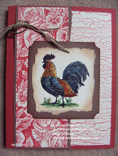
For today, I thought I'd show you two rooster cards I had made a while back. Those of you who know my gallery on Splitcoaststampers have seen these before. I call this post "Chanticleer", which means rooster in Old French and Middle English, dating from the 14th century (source: http://www.merriam-webster.com/).


I thoroughly enjoyed making these cards for two of my four "moms" (one is my mom, two MILs, one step-mom) for Mother's Day last year. The main stamp set used is a former hostess set called Rustic Rooster by Stampin' Up! Love it. I enjoyed coloring in those birds with my SU markers and a blender pen. The red card's layout was inspired by a card by Sharon Harnist, which I found on SCS here. I realized that I must be quite inspired by her work, because I have many of her cards in my Favorites Gallery on SCS. Thanks for all those wonderful ideas, Sharon!

I wish all of you a wonderful weekend.

Happy Stamping,
Colleen

Red Card:
Stamps: Rustic Rooster, Floral Background, Weathered Background
Paper: Close to Cocoa, Ruby Red, Whisper White
Ink: Close to Cocoa, Ruby Red, Stazon Black
Punches: ticket corner punch
Other: Antique Brass Hodgepodge Hardware, twine, dimensionals, Stampin' Up! markers, blender pen
Black Card:
Stamps: Rustic Rooster, Bella Toile background
Paper: Basic Black, Whisper White, Ruby Red
Ink: Basic Black, Stazon Black, Going Gray
Punches: ticket corner punch, Martha Stewart border punch
Other: dimensionals, Antique Brass brads, SU markers, blender pen

Wednesday, June 2, 2010

An Irish Christening

My niece, who has lots of Irish in her, is being christened this weekend. I wanted to make a card that would reflect that heritage, but still look soft and sweet. Since I have no sentiment stamps appropriate for such an event, I had to be creative. I used a sentiment from Stampin' Up!'s Best Yet, and decorated one layer with shamrocks from SU's Lucky Me.

The white sentiment layer was created by using a scrap square of Whisper White, and punching all four sides with a Martha Stewart Flower border punch. No corner punch needed! Hooray! I propped up the punched flowers with two different-sized dimensionals, to give some interest. Oh, and those little green gems in the flower centers are from my kids' craft bin. I just help myself whenever I need to!


Happy Stamping,
Colleen

Stamps: Best Yet, Lucky Me - both SU
Paper: Glorious Green, Barely Banana, white from Papertrey Ink
Ink: Glorious Green, Basic Black
Punches: Martha Stewart fringe flower, flower border , SU corner rounder
Other: dimensionals, ribbon, SU Texturz Plate, Big Shot, gemstones

Inspired by a Tissue Box


You really can find inspiration for your art just about anywhere. Take my tissue box, for example.

When I set it out, my first thought was, "Finally; someone designed a decent looking tissue box." Then I realized with the elements on it, I could approximately recreate it on a card.


Using three sets from my ever-growing Stampin' Up! stash, I came up with this:


Pretty, huh?

Happy Stamping,
Colleen

Stamps: Baroque Motif, Bella Toile background, Abundant Joy
Paper: So Saffron, Whisper White
Ink: Baja Breeze, So Saffron, Memento black ink by Tsukinenko
Other: SU markers, Copic markers, dimensionals

Tuesday, June 1, 2010

Cheery Cherries for a Darling Daughter

Soon it will be my daughter's 12th birthday. I cannot believe how she has grown in the past year, going from a little girl to a willowy pre-teen. She loves that her birthday is in June, for many reasons. One thing we have always associated with her birthday is that our cherry tree usually bears lots of fruit right around her special day. We would serve a big bowl of cherries at her outdoor family birthday parties. This year, for whatever reason, there is hardly any fruit at all on it, and I am missing those big, dark red, sweet beauties!

I thought a cherry card would be an appropriate theme for Haley's big day this year. I am following a sketch from Splitcoaststampers (SC278) that was recently issued (I'm a bit behind, though; it's not the most recent sketch). And I was also inspired not only by the big cherry tree outside my window, but also by my friend Emily's card (her username is ejkeaton on SCS). It was a beautiful card featuring cherries, and I just love it.

Regarding the construction of my focal point's background, I have to say I had a really hard time making my Stampin' Up! Punched Scallop border and corner punches to work in tandem. Sometime ago, I had found a source on Gretchen Barron's website, a guide to cutting squares and rectangles with this punch duo. I guess I need to reread it, because I spent far too much time and wasted too much cardstock (sniff) trying to get this black square to look good. I did use Gretchen's suggested sizes, but somehow I still managed to mess up lots of squares. What I did was this: cut a 2 1/2" square of black cardstock and use ONLY the border punch. It was somewhat off, as you can see, but I kind of like the added square-ish decorations on the corners. Or is that me giving up and being lazy? ;)


Happy Stamping,
Colleen

Stamps: none
Paper: cherries dp from Stampin' Up, Basic Black, Real Red, Kiwi Kiss, White from PaperTrey Ink
Ink: Real Red (sponged around cherries), Kiwi Kiss (sponged around leaves)
Punches: 3/4" circle, 5 Petal flower, punched scallop border (all SU)
Other: dimensionals, sponge


Inspired by a Bathing Suit


When I saw a recent cover of Parent's Magazine, I knew I had a card in the making. The little girl model wore a ruffled swimsuit that just begged to be translated into ruffled layers of punched cardstock. As I looked at her swimsuit, I started immediately thinking in terms of Stampin' Up!'s colors....Melon Mambo, Regal Rose, Pink Pirhouette, Pumpkin Pie, Green Galore, Gable Green and Soft Sky.

I had recently made an all-white card using this same idea of using virtually only punches to decorate my creation. It was so fun to make.

I belong to a group on Splitcoaststampers called The Punchkateerz, a wild and wonderful group of ladies who love their punches. I do believe these cards more than fit the bill for a punchaholic's dream come true.


Happy Stamping,

Colleen


Bathing Suit Card
Stamps: Picture This by Stampin' Up!
Paper: Melon Mambo, Regal Rose, Pink Pirhouette, Pumpkin Pie, Gable Green, Green Galore, Soft Sky, Whisper White
Punches: Martha Stewart Lace Doily border, scalloped oval and large oval by SU
Other: Melon Mambo and Basic Black markers by SU, dimensionals
White Anniversary Card
Stamps: Teeny Tiny Wishes by SU
Paper: Whisper White
Ink: Basic Black
Punches: Martha Stewart border punches, SU Punched Scallop border, scalloped oval and large oval (SU)
Other: dimensionals, small half pearls
Related Posts Plugin for WordPress, Blogger...