Thursday, July 31, 2014

A card for Dad

Hello everyone!  I could swear that I posted this card before, but cannot find it on my blog or Pinterest board.  Geez, that's what happens when:  a) you are getting older and memory becomes fuzzy, and b) you've written waaaay too many posts on your blog (um, 895.  Ahem.).


The story with this card:  I happened to use up some scraps that were lying together, and a Father's Day card was born in early January 2014.  I used a sentiment stamp from Lizzie Anne Designs 'Dream Big' Monthly Mix May 2010.  I received the set back when I designed for the Play Date Cafe.

I glued a strip of burlap onto a scrap of caramel cardstock first, and was then able to prop it up with foam dimensional stickers.  Before adhering, though, I tied on some garden jute twine.


I'm back tomorrow with a feminine card, as part of a special blog hop.  Hope you'll join me then!

Thanks for dropping in.  =D


Card #1:
Stamps: Lizzie Anne Designs 'Dream Big' Monthly Mix May 2010 Paper: Creamy Caramel, patterns - SU; white - PTI Ink: Night of Navy - SU Fibers: burlap; twine Accessories & Tools: circle punch - SU

Wednesday, July 30, 2014

Magnolia Peace Christmas

Hello all!  I'm super-late in sharing this card, which was published on page 61 in Paper Crafts Magazine's Holiday Cards & More, Volume 8 - Summer 2013.  Just never got around to it 'til now!


Still lovin' my Market Street Stamps background stamps.  This one is Gingham.  I wanted to give a homespun feel to this card, you know, all cozy.  The 'handmade ornament' (some die cuts, satin ribbon, and a magnolia sticker topped with pearls) is just what I'd expect from a rural Christmas.  Vermont, perhaps?  Ahhh, I am instantly transported to snowy fields and forests, with wood smoke coming from chimneys of log cabin homes.  Sounds good to me.


I'd really better get a leg up with my Christmas cards.  Once September rolls around, it's a quick slide to that holiday.

Thanks so much for coming by today!


Stamps: Gingham Background - Market Street Stamps; sentiment - Merry Christmas Trees - Hero Arts Paper: Naturals White, Basic Black, newsprint patterned paper - SU Ink: Crumb Cake - SU; Versafine Onyx Black - Tsukineko Fibers: red satin ribbon Accessories & Tools: pearls; magnolia 3D sticker - K & Co.; circle dies

Monday, July 28, 2014

"A bit about me"...blog hop!

Hi.  :) Apparently there's a blog hop out there in the blogosphere, and it's kind of like a chain letter.  You know, you're tagged, and you have to tag someone else in return.  This hop is meant for each participant to share more about themselves or their work.

My friend Sindhu from Trapped In Craft tagged me recently, so 'Thanks, Sindhu!' =D  She is such a sweet blogging friend, halfway across the world from me.  Turns out we're both Pisces, born in March, and we are introverts.  Yay for introverts!  We've got to stick together.  ;)

Sindhu and I have been following each other's blogs for quite a while.  I have loved seeing her card-making style change over time and become more focused on the clean-and-simple side of things.  She is now a master, in my opinion, and her blog is filled with happy cards.  Go take a look; you'll be delighted!

-------------------------------------------------

Click here for the original 2/6/14 post.

I'm a little nervous doing this.  It's hard!  What on earth would folks want to know about me?  (sits here a while, pondering.) Okay, here we go:


1. How long have you been making cards?  I barely count it as 'making cards', but I used to sell cards at the office where I worked in the late 80's and early 90's.  I'd bought a box of pre-folded card bases, and stamped something simple on the front, colored in with pencils.  I felt so proud of them at the time, but...well, you know, after all these years, they seem very crude compared to what I do today. After that, I didn't stamp again until attending a Stampin' Up! workshop in 2007.  I started my blog in 2010, and am so glad I took that leap.

My very first stamp sets (yep, I still have 'em!):
Assortment by All Night Media

Bear Mail by All Night Media
Click here for the original 5/22/12 post.

2. Rubber or clear stamps?  Both!  For a long time, when I thought that Stampin' Up! was the only stamp company out there, rubber was just fine.  After I discovered a Stampamajig, that really made things easier.  Funny that I don't remember my first experience with clear stamps, but oh boy, I fell fast in love!  My rubber stamps were left in the dust as clear stamps and I began dating.  =D  Lately, though, I am giving a lot of love to rubber.  Feels good to rediscover them.  And they're happy too!

Click here for the original 2/21/13 post.

3. Do you follow stamping trends?  Most definitely not.  Heck, I've never even followed clothing trends, ever.  I'm just not that kind of person.  (Well, I did own a Members Only jacket in the '80s, and bought Izod polo shirts.  But I was a teen then, so let's chalk it up to age.)  I love what I love, and don't care if it's not the latest and hippest thing.  Life's too short.  I'm doing it my way!

Click here to see the original 12/15/11 post.

4. What is your creative process? Most of the time, I let the process take me for a ride.  I start with a nugget of inspiration (a button, a piece of patterned paper, particular ribbon or embellishment, or a stamp) and build around it.  I feel my way along, and it's hard to describe but I can tell you that there's a formula of sorts.  The formula includes:  fibers, embellishments (chipboard, buttons, stickers), a mix of shapes (circles, rectangles, flourishes, for example), die cuts/punches, and usually a bit of bling.  Some cards are all about having things off-center, and some are symmetrical, where everything is perfectly balanced, like the snowflake card above.  

Organization is key for me.  It helps to know what crafting supplies I have.  When I used to craft in my dining room, I packed my supplies in cabinets and baskets so tightly due to space constraints, I forgot what I had.  After moving up to the attic studio, things are more spread out, which helps a lot.  

Click here for the original 4/3/13 post.

5. What is your card-making style?  I have a few:  vintage/shabby chic, clean and simple, and clean & classy/elegant...and (cue the drumroll) masculine.  Yes, I've taken a liking to a certain style of masculine cards.  They are not filled with power tools, or motorcycles and trucks, but have a more genteel nature about them.  As for clean-and-simple cards, I don't do them as well as I'd like, but that part of me still needs to express itself once in a while.  Hope you'll bear with me on that!  

Click here for the original post on 1/27/14.

This card was never featured in a post.  It's quite similar to the one above, and that's why.  ;)

If you've made it this far and read all the way through, God bless you!  It's a long post, I know.  One more thing before I go:  I am tagging my dear, dear friend Emily of My Little Slice of Bliss.  Her creations may look clean and simple at first, but when taking a closer look, you can see she adds so many loving details. And talk about creative:  Emily has used sandpaper, dryer sheets and toilet paper on cards in the most innovative ways!  I've got too many favorites of hers to list them all, but take a peek here, here, here and here.  Thank you, Emily, for sharing your creativity with all of us!

See you soon!

Thursday, July 24, 2014

Wishing You A Swell Birthday

Hi there!  Sharing a birthday card with you today, and it features a bird.  I have come to know SO many stampers who love birds, that I could make a dozen of these and still not have enough to go 'round!


I'm trying to use up my stash of American Crafts metal badges, and this one is really cute.  (You can see another card using an AC badge here.)  The K & Co. birdie is perched on its edge, which I layered onto some patterned paper and then a doily die cut.  I used matte gold sequins bought at MJ Trimming in New York City back at Christmastime.


Thanks for coming by.  =D
I hope you all have a 'swell' day!


Stamps: 'Wishing You A' - Chalkboard Birthday, 'Birthday' - Fancy Sentiments - Inspired By Stamping Paper: kraft - PTI; Groovy Guava paisley, Pear Pizzazz pattern, Blush Blossom - SU Ink: Versafine Onyx Black - Tsukineko Fibers: Certainly Celery twill - SU Accessories & Tools: bird sticker - K & Co.; doily die cut - Martha Stewart; 'Swell' badge - American Crafts; circle punch - SU; matte gold sequins - M & J Trimming 

Tuesday, July 22, 2014

Seize The Sketch #25 - a dainty 'Hello'

Hello everyone!  It's time for a new sketch at Seize The Sketch challenge blog, and our hostess is Mona Pendleton.

My card feels very dainty, if I had to describe it in a word.  The delicate font of the sentiment, the light and airy lace, and finely-detailed patterned papers make it seem very feminine, indeed.


Upon writing this blog post, I see that I did not place my sentiment properly, according to the sketch.  Oh well!  Better send the card police after me!


Thanks to the Clearance Rack at Stampin' Up!, I had bought the Everyday Enchantment designer series papers for a song.  The colors in the papers prompted my color scheme.  There were no red pearls in my stash, so I used a red Copic marker to customize a white one.  Super easy to do; just allow enough time to dry before adhering to your project.

 The focal point was created with a few layers of paper flowers (Prima), topped with a Webster's Pages Whimsy heart.


Sure hope you are inspired to join us!  The challenge lasts two weeks, and you can find all the details HERE.
Mind if I share?  I was tickled to find my pirate card from March 2013 featured over at Paper Crafter's Library recently!  You can see the Nautical-themed post HERE.  Thanks to Aliya White, who wrote the article and kindly asked my permission to use the card.

Thanks for your visit today.  =D


Stamps: Heartfelt Greetings - Inspired By Stamping Paper: Everyday Enchantment patterned paper - SU; True Black, kraft - PTI Ink: Frayed Burlap - Ranger; Versafine Onyx Black - Tsukineko Fibers: lace Accessories & Tools: pearls; button; floss; paper flowers - Prima; heart Whimsy - Webster's Pages; blue leaf die cut border - K & Co.; red Copic marker


Monday, July 21, 2014

Monochromatic Sympathy for the Paper Players

This is my second post for today.  Please click here for a Pair of Retirement Cards.

I'm back already today, this time with a sympathy card that fits into the Paper Players challenge:  Monochromatic Clean & Simple.  Made this card a week or so ago, but just photo-edited yesterday:


The point of this card was to play with a new-to-me background stamp by Stampers Anonymous/Tim Holtz - Distressed Floral.  Isn't it gorgeous?  The Boutique Borders: Sympathy die and stamp from Papertrey Ink made a good pairing with the background, I think.


Yesterday I photographed 24 cards!!  Yikes, that's a lot of photo-editing facing me!  It'll take me some time.  I tend to do mine in batches, sitting for hours in front of the computer, banging out a bunch at once.  How do you do yours?  One at a time, or a group of them?


Stamps: Boutique Borders: Sympathy - PTI; Distressed Floral background - Stampers Anonymous/Tim Holtz Paper: Sahara Sand, Old Olive, Very Vanilla - SU; white - PTI Ink: pale taupe - Anna Griffin; Versafine Onyx Black - Tsukineko; Sahara Sand - SU Fibers: ivory satin ribbon - Anna Griffin Accessories & Tools: Boutique Borders: Sympathy die - PTI; Elegant Scrollwork die - Memory Box; Branch punch - Martha Stewart; paper flower

A Pair of Retirement Cards

Hello everyone!  I realized a short while back that I had zero retirement cards in my stash. Thought it would be good to have at least a couple on hand -- and one of them already went to my father-in-law.  His is the second one.  But I'm sure you could guess that =D.


The girly one above makes great use of skinny scraps of patterned papers.  Couldn't we all make loads of 'em by doing this??  What crafter doesn't have skinny scraps!

Stamps: Teeny Tiny Wishes - SU Paper: white - PTI; Sahara Sand, patterns - SU Ink: Versafine Onyx Black - Tsukineko Fibers: Ash Pink seam binding - Hug Snug Accessories & Tools: pearls

And now, the more neutral / masculine card.


My inspiration jumping-off point was this badge from American Crafts. Reeeeallly wish they had printed the word 'relax' in a bolder color.  It's so pale!  But I took my color scheme from it, and grounded it with gray cardstock to tie in the color of the metal.  The green is an accent to help liven things up.  It seemed too sleepy with just the blue/yellow/gray combo.


Hope I've inspired you to make some retirement cards for your stash.  Thanks so much for your visit today!

Stamps: Essential Messages - Hero Arts Paper: Barely Banana, Basic Gray, teal dotted pattern - SU Ink: Versafine Onyx Black - Tsukineko Fibers: green twine - American Crafts Accessories & Tools: green button, green border sticker - SU; metal 'Relax' flair - American Crafts

Wednesday, July 16, 2014

The Card Concept #14 - Hugs

Bold card, coming at ya!  It's a reminder card so you'll come play with us at The Card Concept.  =)


Oooo, I'm rather liking a bold card once in a while!  The color combo for the current challenge pushed me out of my comfort zone a bit, and that's a good thing.


When I made my initial card for challenge #14, I had the Punched Tin background stamp from Market Street Stamps still lying on the table.  I put this one together that same day.  Actually, I like this card better than the first one!


If you'd like to play along with us, click HERE for more details on the challenge.

See you soon!


Stamps: Pennant Party - Paper Sweeties; Punched Tin background - Market Street Stamps Paper: True Black, white - PTI Ink: black - Rubber Stampede Fibers: red satin ribbon
Accessories & Tools: red gems - Queen & Co.; blue flower puffy fabric sticker - Carolina collection - Anna Griffin; circle die - Spellbinders; Mini Wavy Pennant die - My Favorite Things

Tuesday, July 15, 2014

Christmas Party Dress

Christmas in July!  How about a Christmas card to make us feel a little cooler?  I made this one a long time ago for a publication call, but it was not chosen.  It's okay:  I am so happy to share it here!  It also gives me a chance to play for the first time in a Virginia's View challenge:  Die Cuts.


This festive scene was so fun to create.  I used a Purple Onion Designs sentiment, and cut it apart, ransom style.  Behind it are a few die cuts from Anna Griffin, K & Co. and Colorbok.


I have my friend Carol to thank for this fabulous Sizzix Sewing Room Dress Form, which was die cut in chipboard. I painted it with Ranger Picket Fence Crackle paint and when it was dry, distressed the edges with ink.  The red top was hand-trimmed to fit, and pearls were added.


This is how I made the skirt:


  1. Stamp Bijou Borders / Technique Tuesday on a rectangle of paper with two different inks (rose and cherry), then ink the edges. 
  2. Punch a white strip of cardstock with the Doily Lace punch / Martha Stewart.  Ink scalloped edge, and adhere to the underside of the border-stamped rectangle. 
  3. Using a scoring board - or just a ruler and bone folder or stylus - score lines every 3/8".  
  4. Begin folding / pleating the piece in accordion fashion.  
  5. When finished pleating, gather top portions together, filling craft glue between each fold.  Let dry.
  6. Adhere to dress form with craft glue, and cover the top of 'waist' with ribbons or trims.
Thanks so much for stopping by today!


Size: 4.5” x 6 7/8”

Stamps: Bijou Borders- Technique Tuesday; (sentiment) Purple Onion Designs Paper: Very Vanilla, Cherry Cobbler, Whisper White - Stampin’ Up! Ink: Cherry Cobbler - Stampin’ Up!;, Tuxedo Black - Tsukineko; Tattered Rose - Ranger; Chestnut Roan - Clearsnap Fibers: gold thread;  white braid trim) Waverly Accessories & Tools: Paint: (Picket Fence Crackle) Ranger; holly border, framed holly - Anna Griffin, pink grid – Flea Market - Colorbok; pearls; Doily Lace punch, Scoring Board - Martha Stewart, Sewing Room Dress Form die - Sizzix

Monday, July 14, 2014

A Tale of Two Shoes & Las Vegas pics

Hello, friends!  It's been a while since I sat at this keyboard to blog.  There were many posts scheduled ahead of time lately, and now I am coming to you 'live' for a change.  =D  At the end of this post, I'm sharing some pics from our recent Las Vegas vacation, but first, I'll start with the cards and a big THANK YOU to my new subscribers!  I am delighted that you like my stuff enough to sign on, and hope I will continue to inspire you.
Long post alert -- I am feeling very chatty today and have many photos to share!
A while back, my friend Rebecca sent me a whole bunch of goodies, just because, and the Stampin' Up! set, Fabulous You, was in the box.  Fiiiiiinally, I inked up this adorable shoe and started with a muted color scheme.  I outlined the butterflies and the shoe with W01 and W00 Copic markers to give a subtle shadow.


(here's that box of goodies -- honestly, it was like Christmas morning! Rebecca, thank you again!)


After a pastel version, I pumped up the colors.


Entering the above card at CASology:  'Glow'.  These colors are so bright I can see the Chiquita Banana lady wanting to wear it!

photo credit

I learned how to merge two pictures with my photo-editing software (GIMP - it's very powerful, and it's free), so I could see the two shoes side-by-side.  It looks like I just sat the cards together in one pic, doesn't it?  happy dance!


Our trip to Vegas was fun.  That is truly a city that never sleeps!  We're not gamblers, really, but took in some shows and a trip to the Grand Canyon.  Hope you enjoy these pics:

Family selfie, first night in Las Vegas.

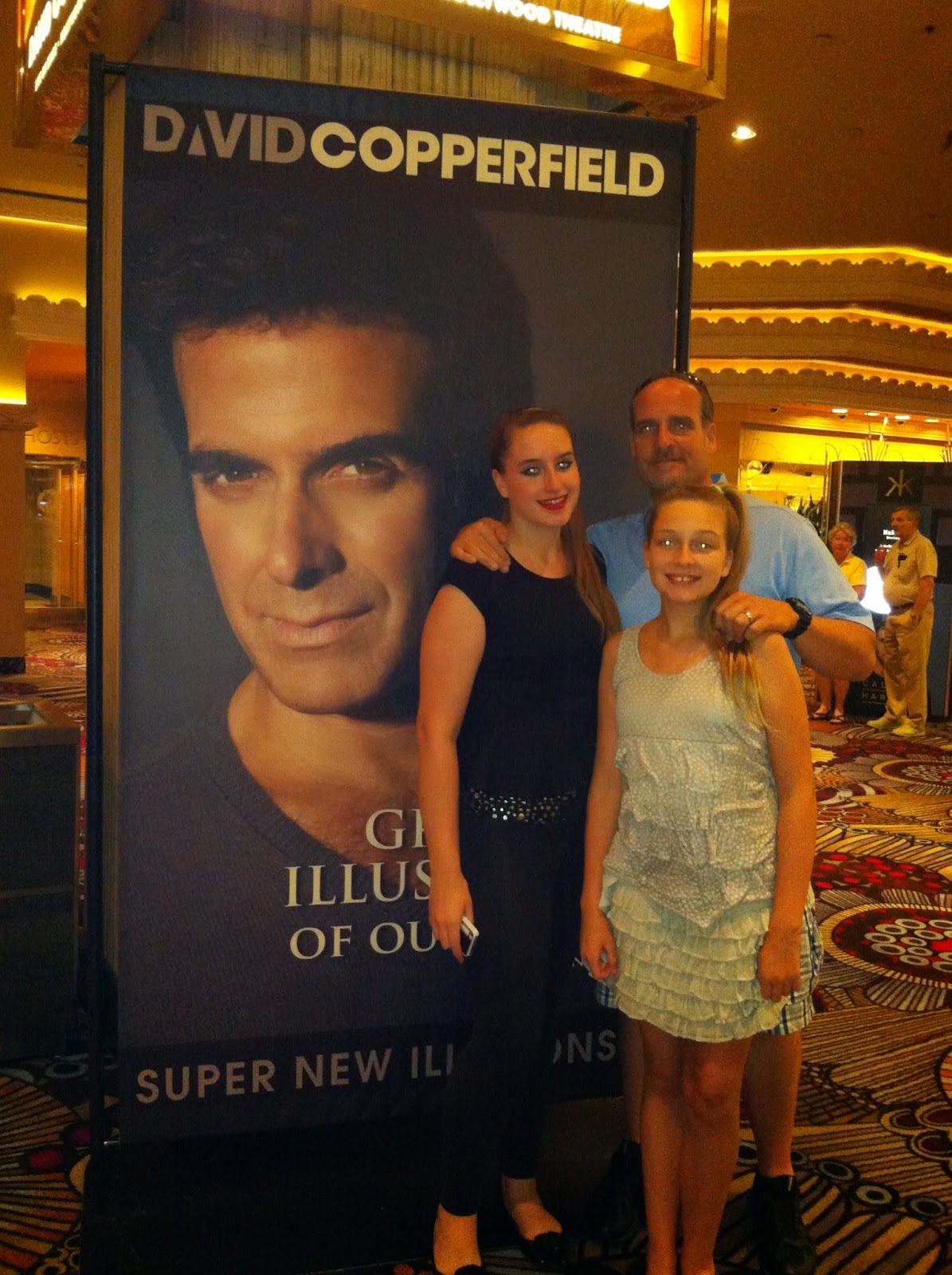
We saw an amazing show by David Copperfield.  I didn't know that he is from New Jersey, too!

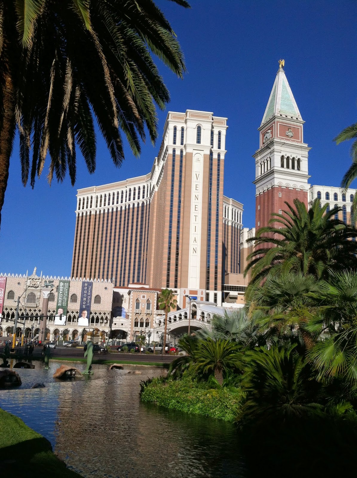
We stayed at the BEAUTIFUL Venetian hotel.
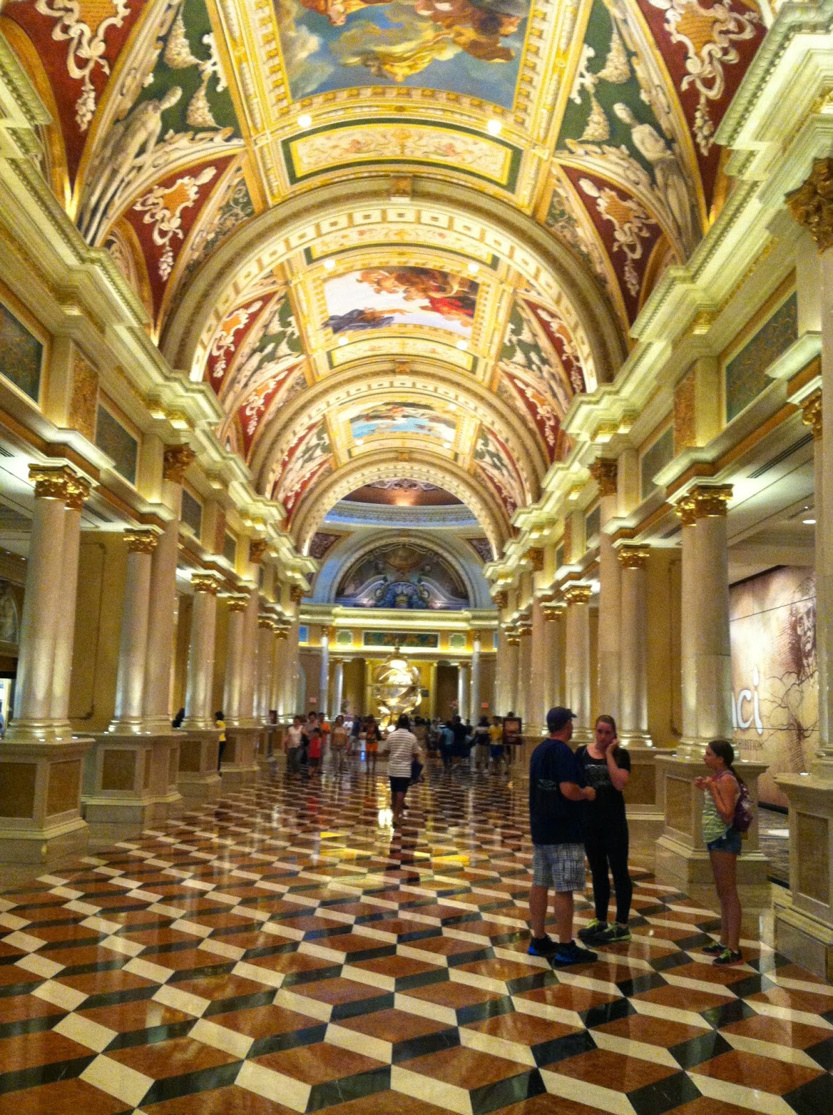
Venetian hallway.

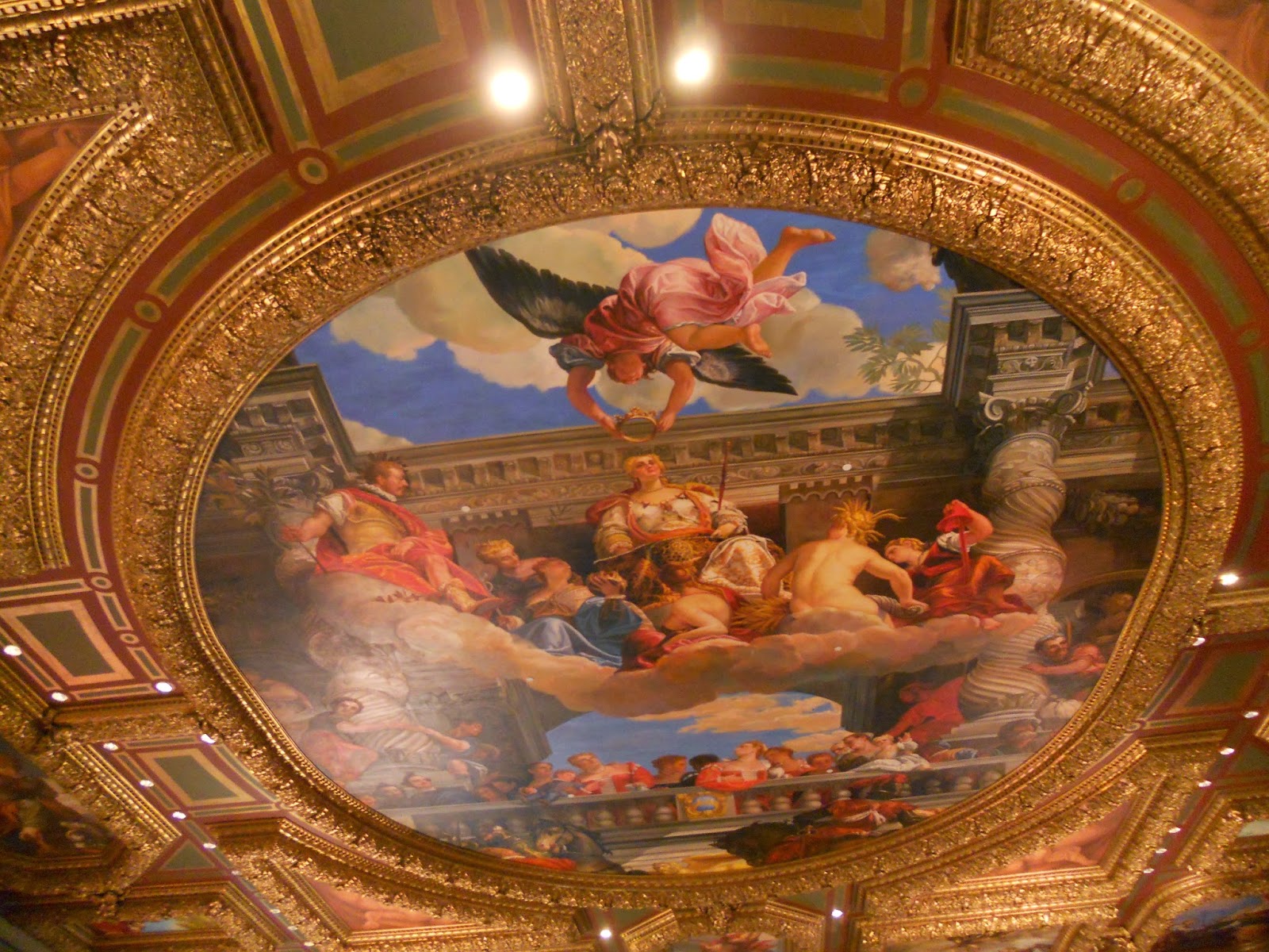
Amazing gilt work and frescoes lined the ceilings.


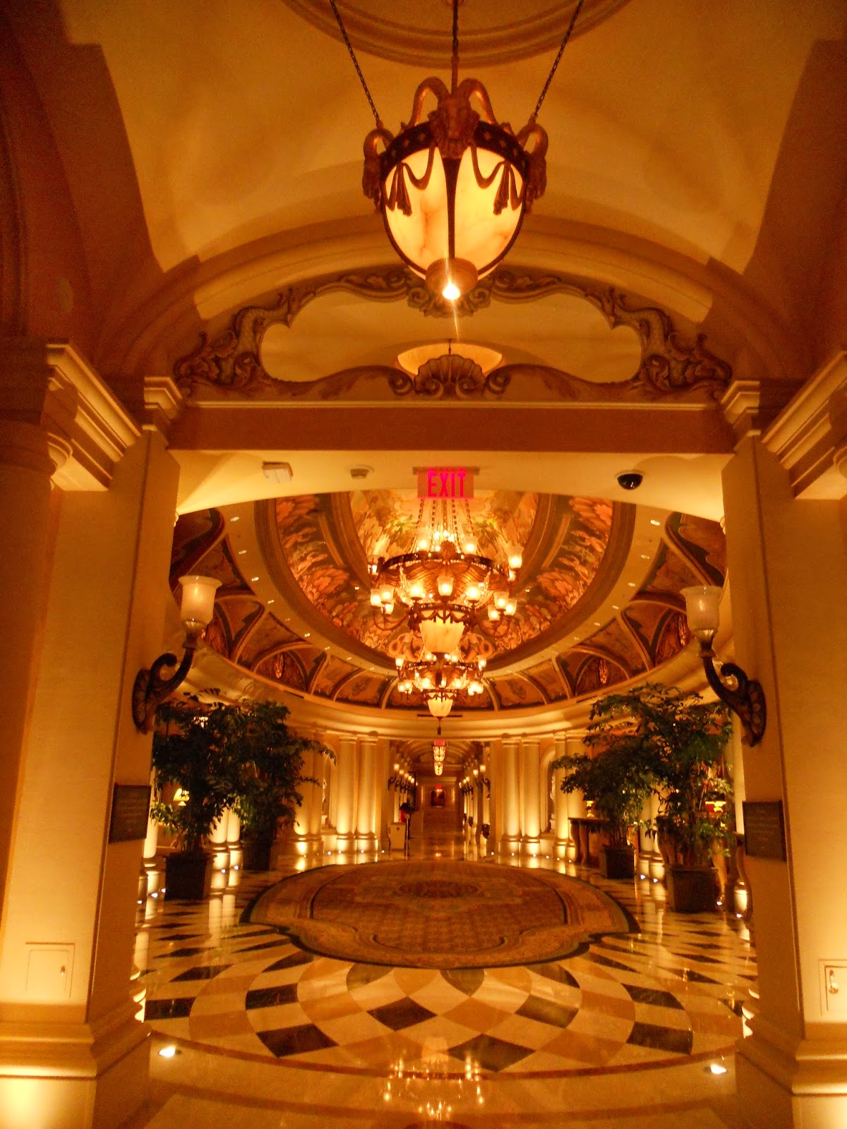
I never tired of seeing the beauty in our hotel.


Venetian hotel lobby.

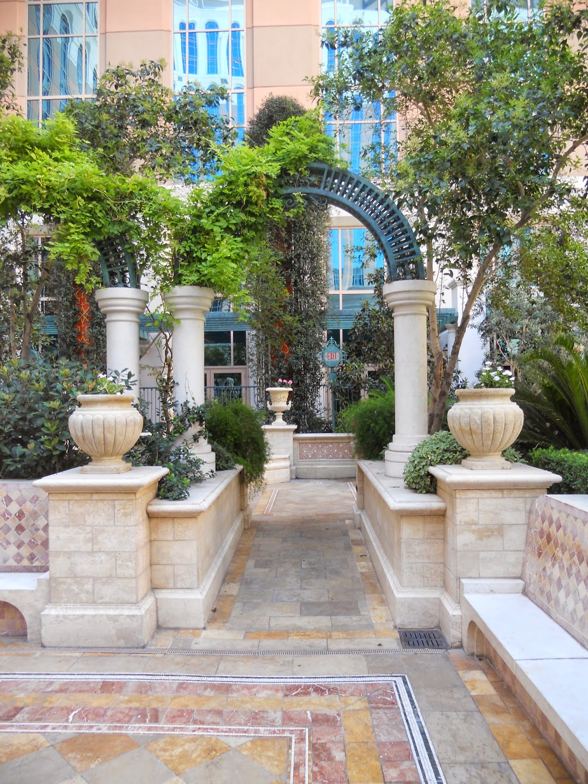
Even the pools at our hotel were amazing.  This one looks like an ancient Roman garden.


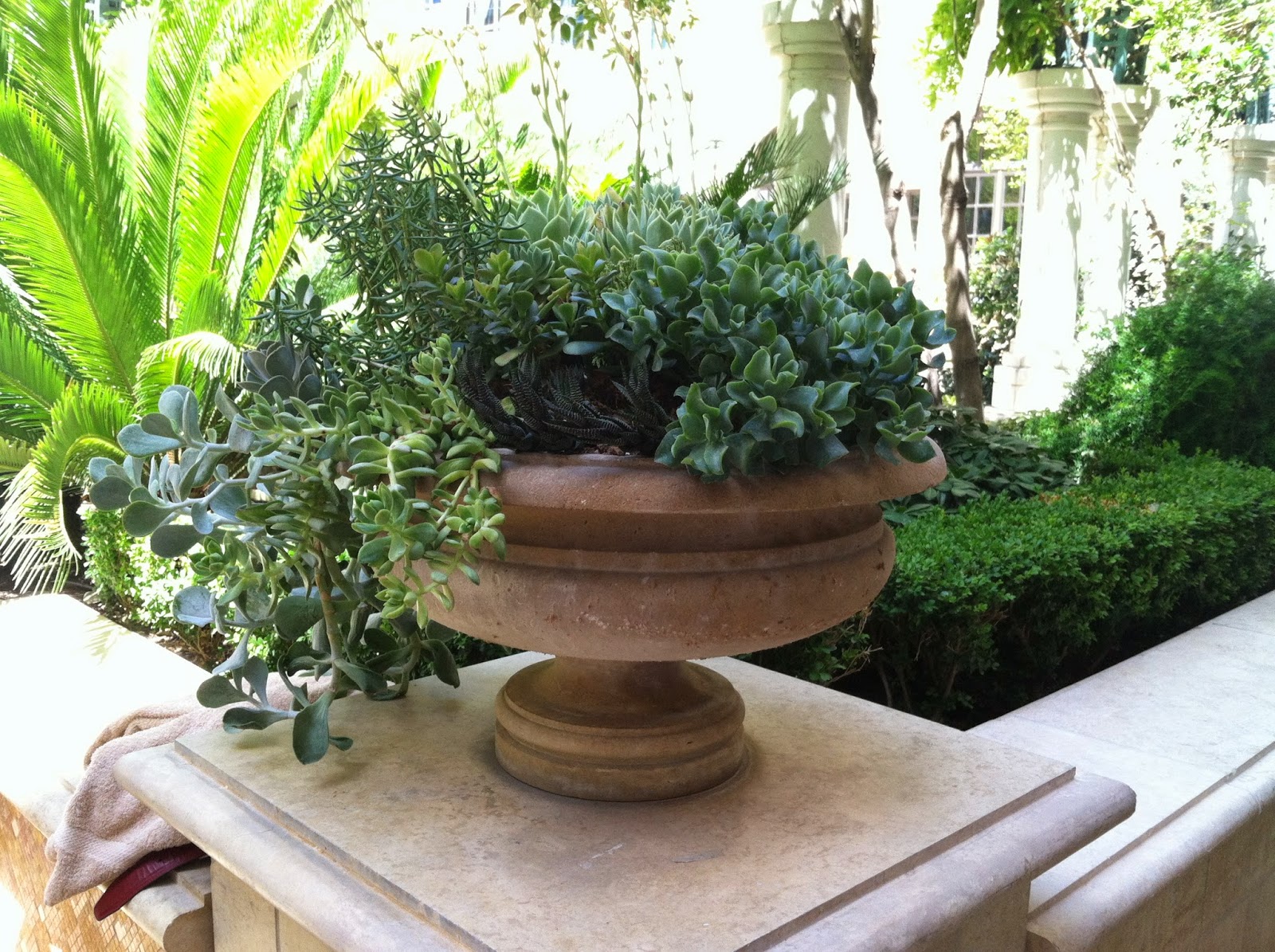
My sister-in-law is really into succulent plants, so I took this shot for her.


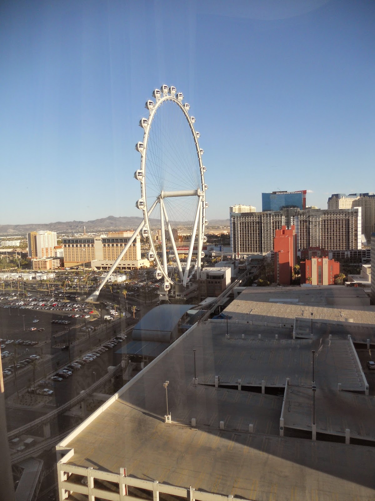
This is High Roller, a reaaaally big Ferris wheel that we could see from our hotel room window.  We did not go on it, because a couple of us are quite unhappy with heights.  (me being one of them!)

Inside the Venetian are shops that make you feel as if you are outdoors, but all in air-conditioned comfort.  We ate lunch at Canonita.  Yummy, yummy fish tacos and fantastic spicy salsa.

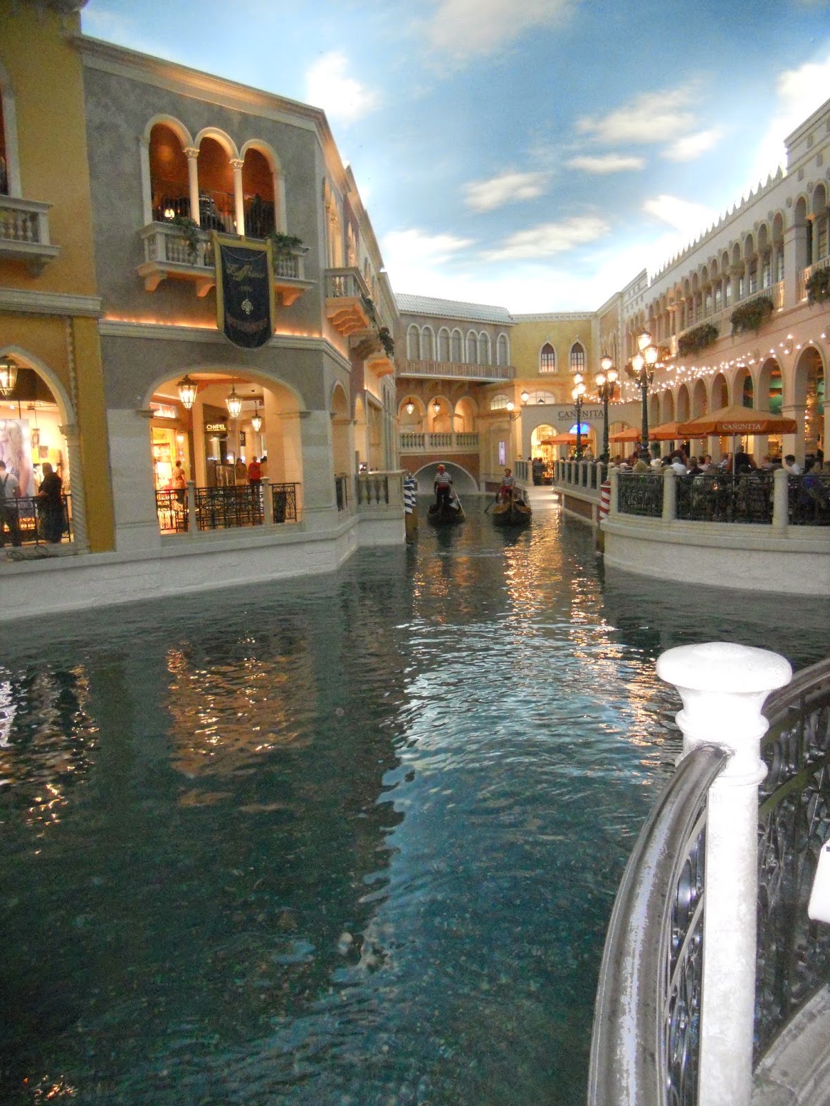
There's a gondola ride inside the hotel, and another outside.  This one is indoors.

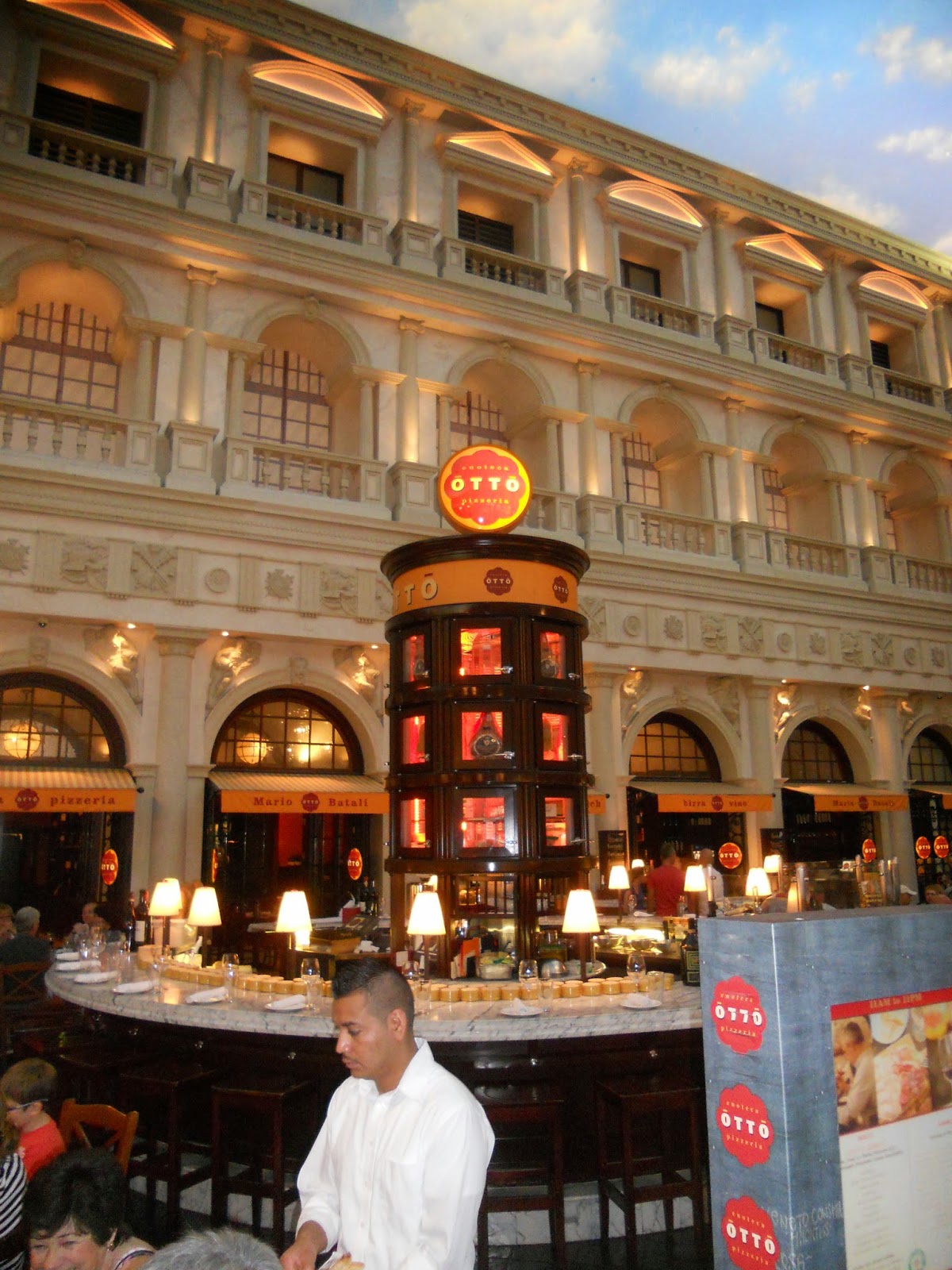
We ate another lunch at Otto, owned by chefs Mario Battali and Joe Bastianich. Oh, my goodness, the food was divine!

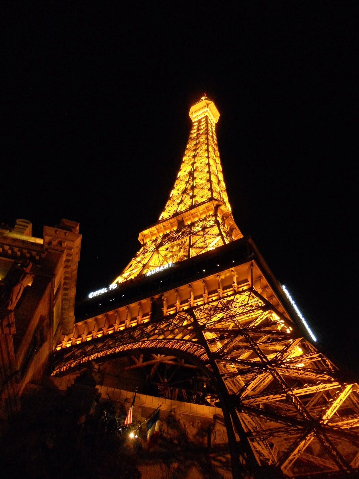
One night, we took the monorail to the Paris hotel for dinner.  We did not go up into the Eiffel Tower:  it was late, we were still on East Coast time, and had been running all day.  Oh, and the line to go up into the tower was pretty long.


From a gift shop where Bally's meets Paris:  yes folks, you can own your own jewel-studded hamburger.  (!)

The Strip is really something to see at night, with all those lights.

Hubby and I in front of the Hoover Dam.  We stopped for 20 minutes on our bus tour to the Grand Canyon.  

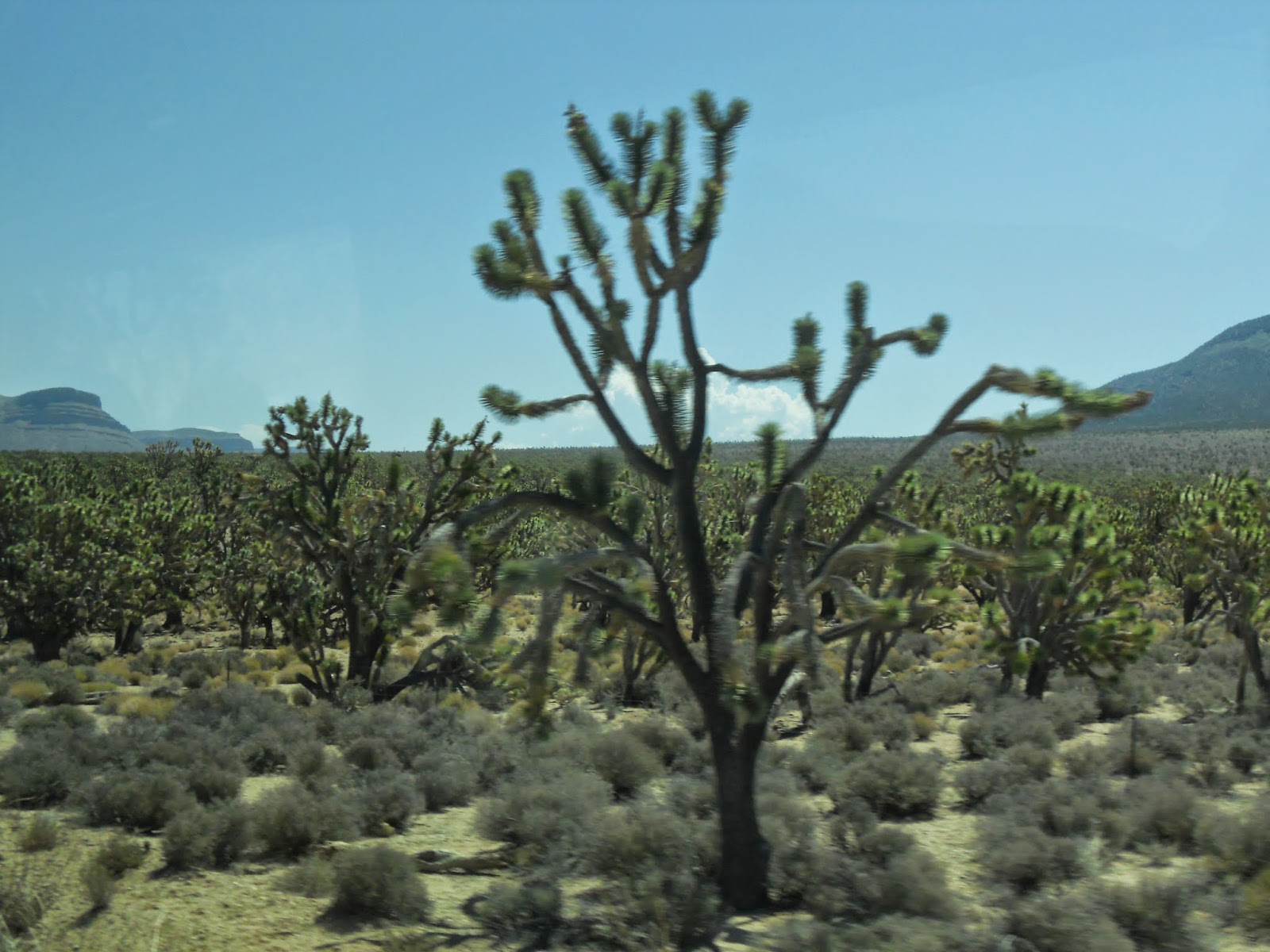
We passed through a 'forest' of Joshua trees.  These looked like cactuses to me, but they are trees.  If you cut into a trunk, you will not see rings like with average trees.  The way to roughly determine how old each one is:  count the branches and multiply by 10.

Let me tell you folks, even dry heat, at these temps, is HOT!! LOL

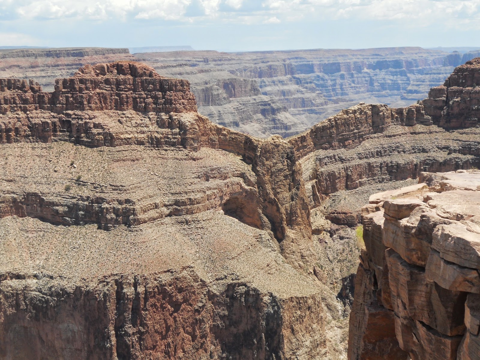
Can you see the eagle, with its wings outstretched, in this rock formation?  We visited the west side of the Grand Canyon, where the Skywalk bridge is located.  It is located on the land of the Hualapai Native Americans.

The red dirt and rocks remind me of Kauai, Hawaii.

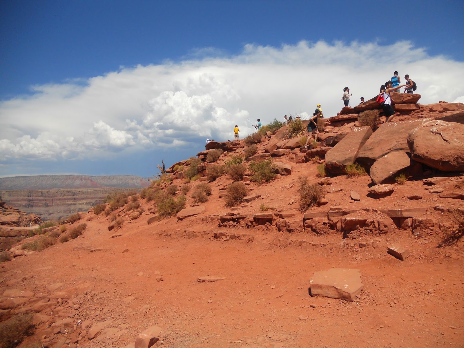
Can you see a white speck on the top of that one rock pile?  That's my husband, daredevil that he is.

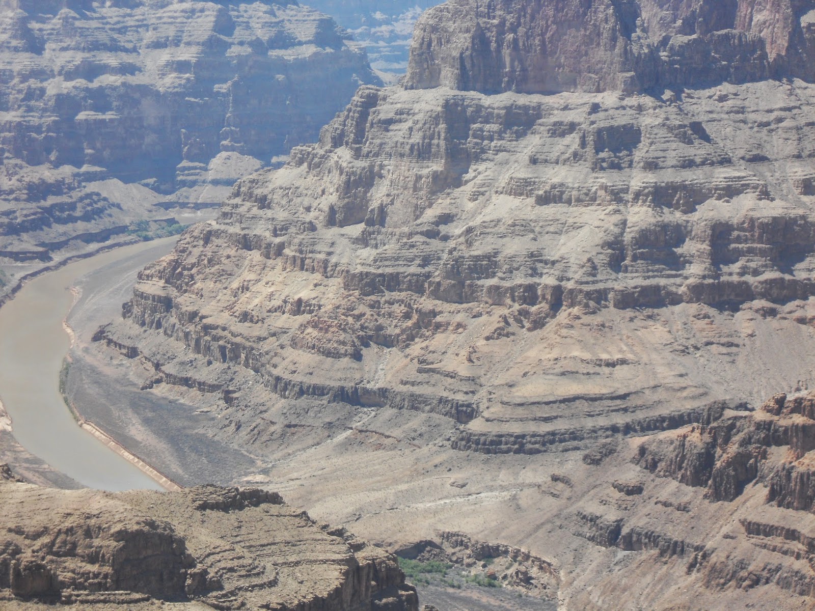
There's water down there - the Colorado river - but it looks almost the same color as the rocks surrounding it.

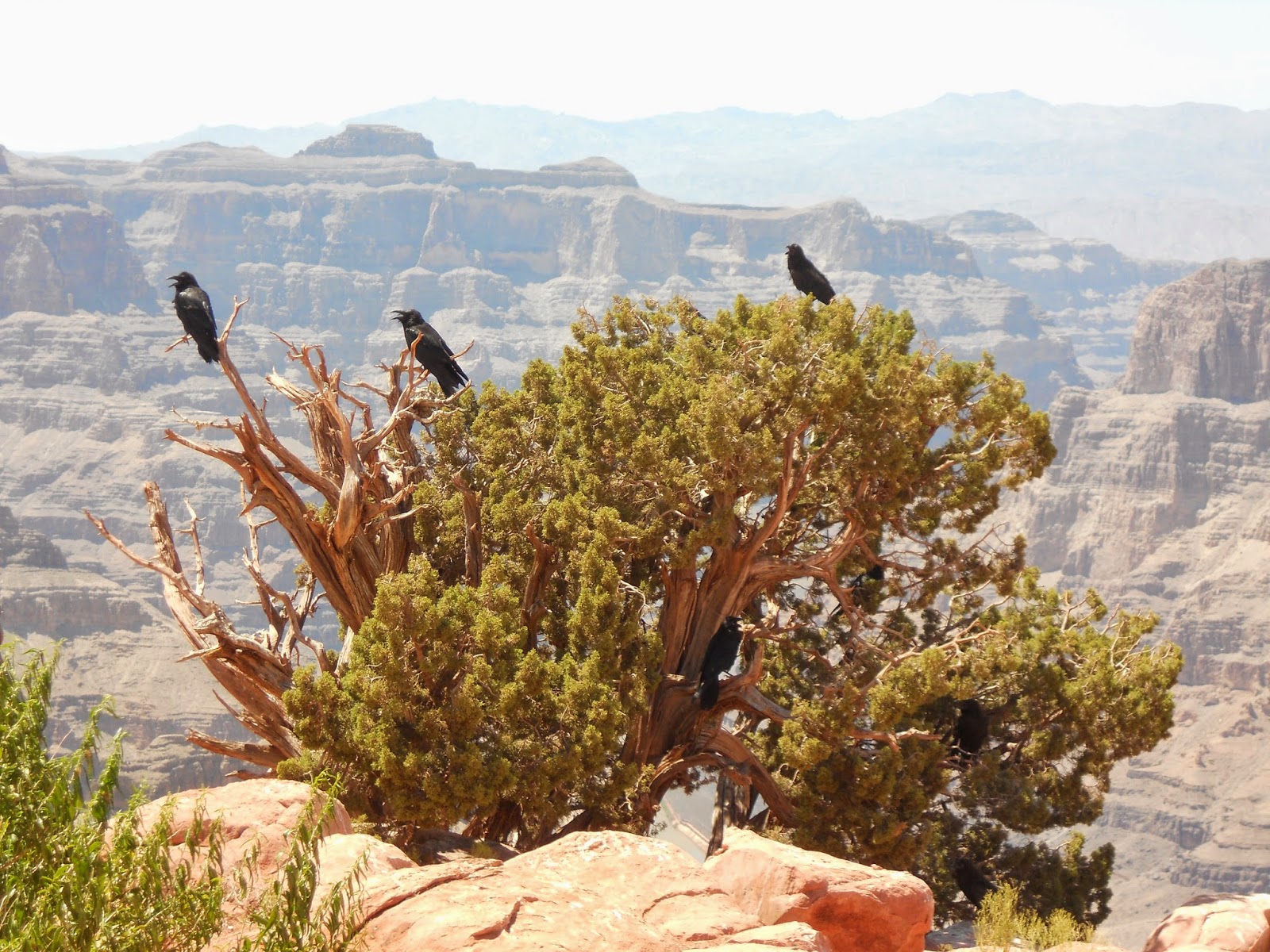
These black birds (ravens?) rested in a tree on the very edge of the cliff.   I used my camera zoom to get this pic.  Ain't no way I'm going any closer to the edge!  It makes my stomach flip just thinking about it.  ;)  The birds sat with their mouths open.  I'm guessing it's how they perspire.

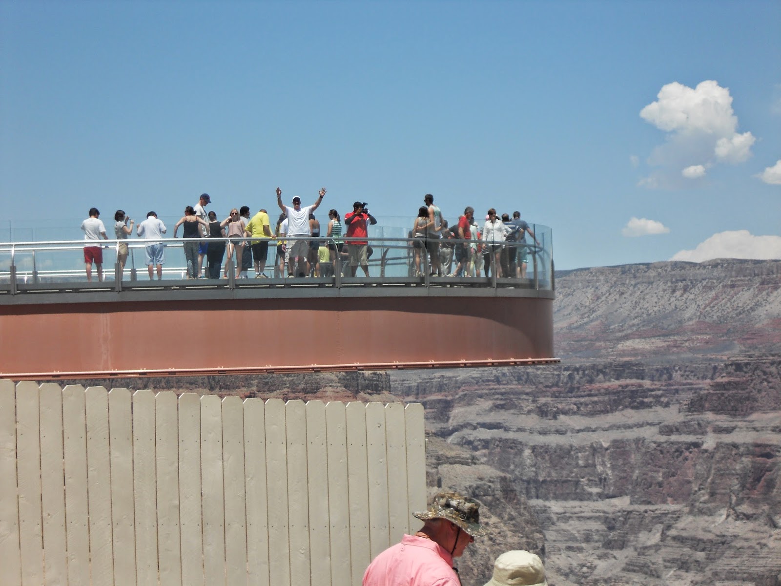
Here's the Skywalk Bridge, hanging 4,000 feet above the base of the Grand Canyon.  Hubby is in the white shirt with his arms raised.  It has a clear glass floor so you can see to the bottom.  Um, no thanks.

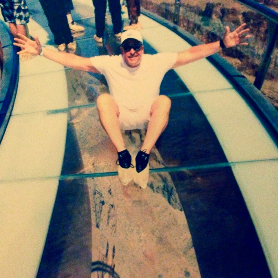
Sitting with his booties on, 4,000 feet on top of the Canyon.


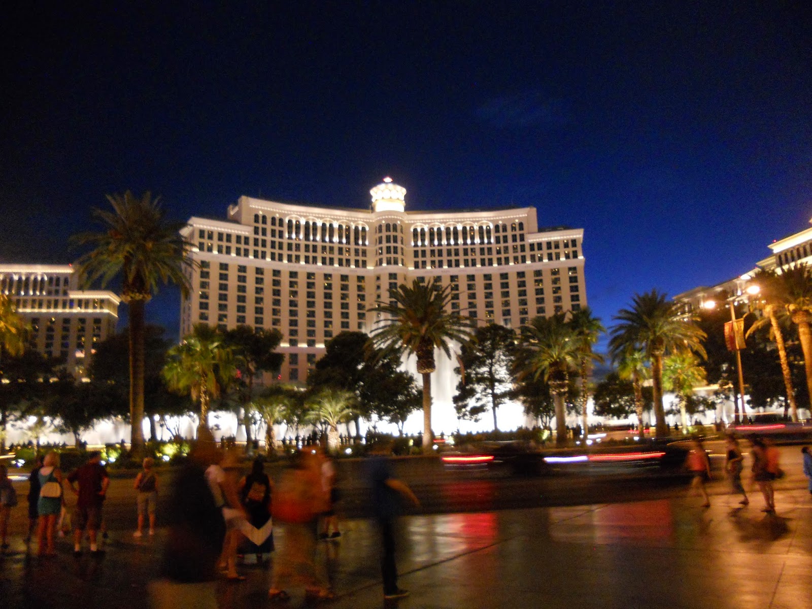
The Bellagio hotel, with the fountain show beginning.

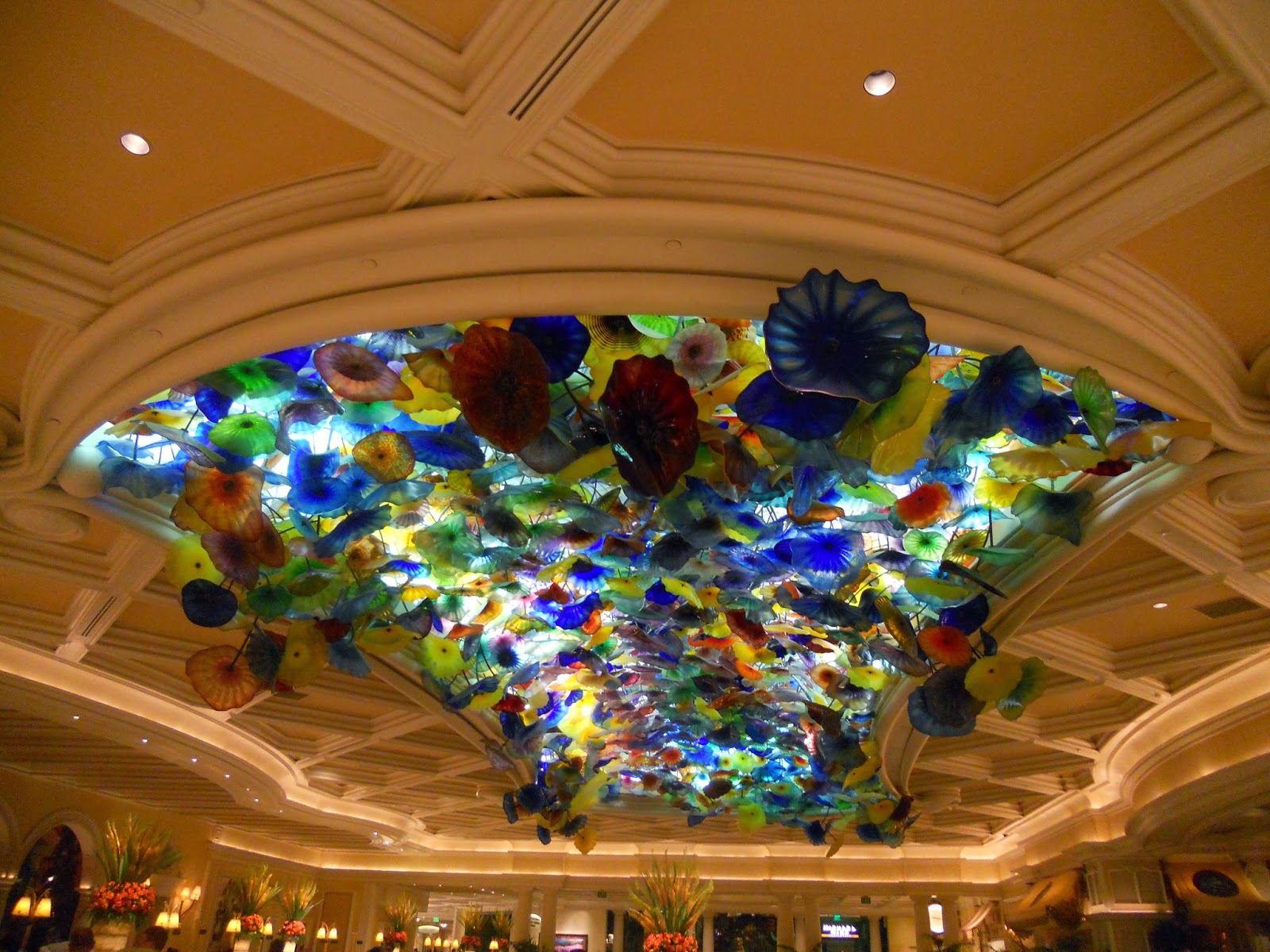
Inside the Bellagio hotel lobby, a ceiling full of glass poppies.

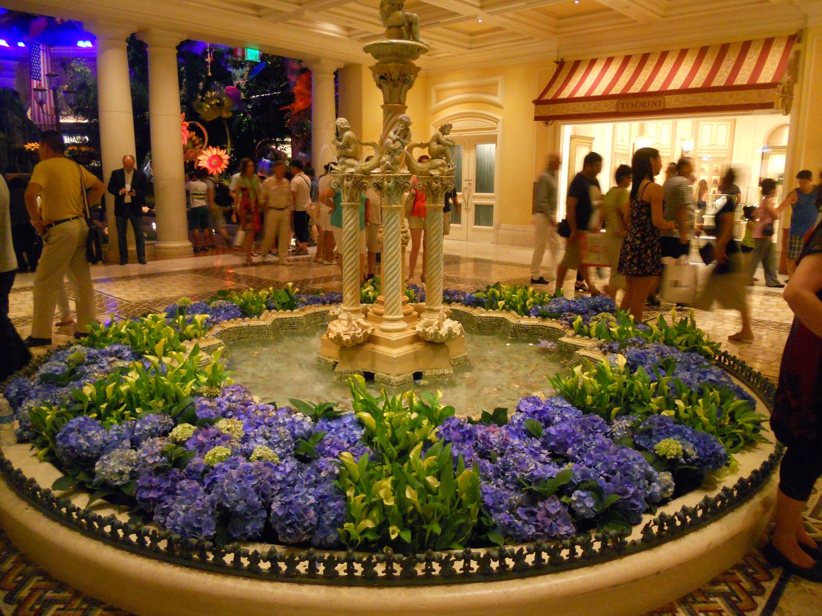
The Bellagio has BEAUTIFUL gardens indoors.  I spied these hydrangeas.  Love!

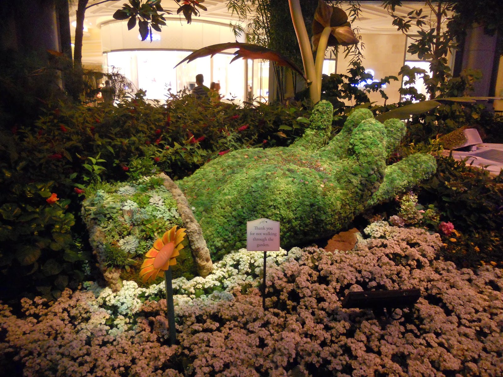
A large hand, made from greenery.

A whimsical, larger-than-life garden tool and poppy.
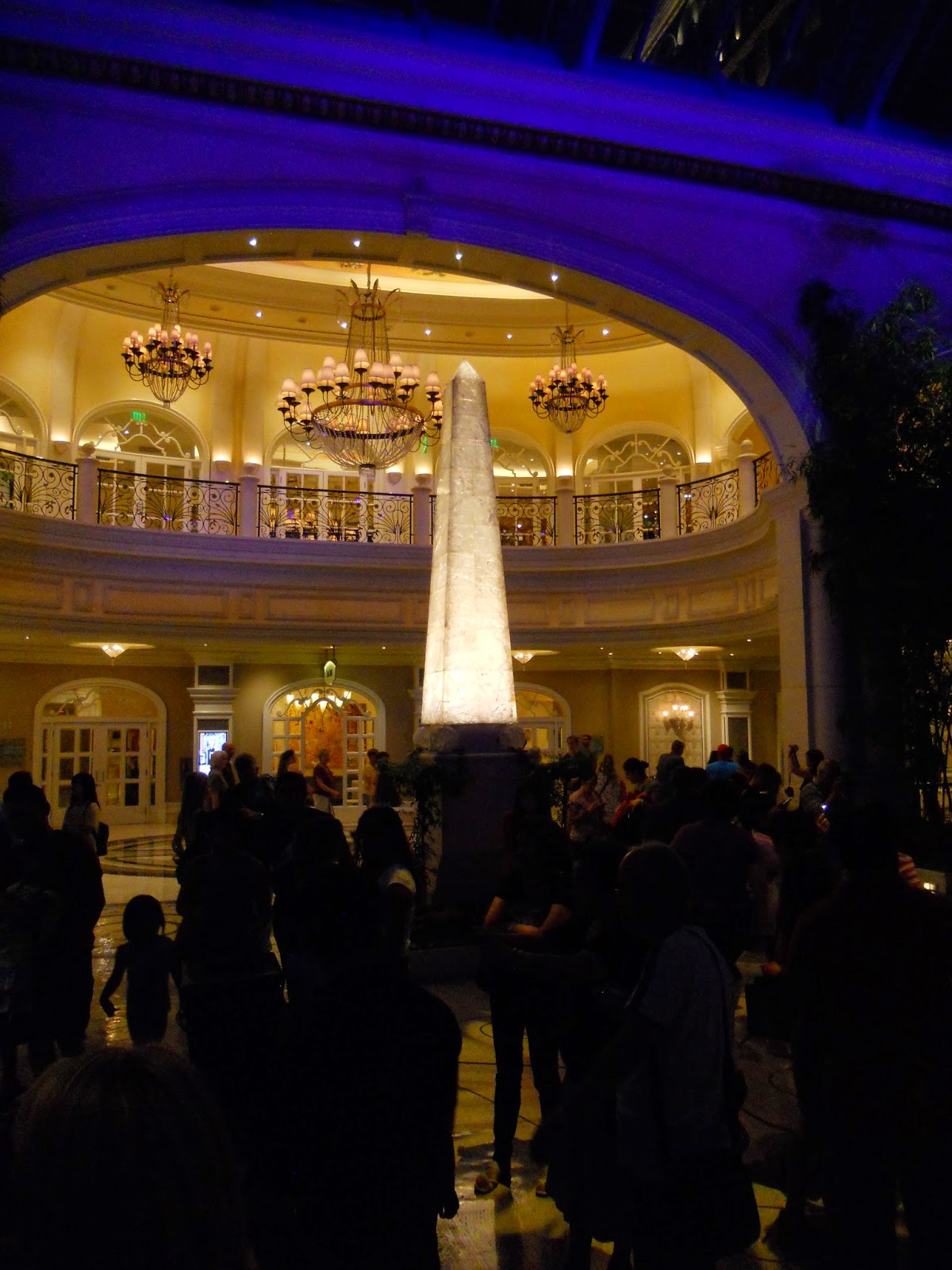
A lighted obelisk.

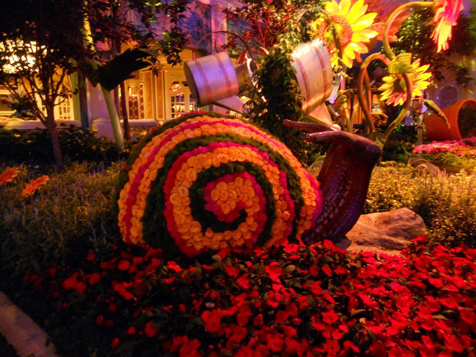
A cute snail, covered with flowers.

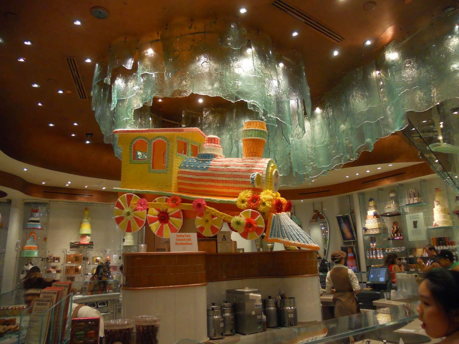
Inside the Bellagio, a French pastry shop features a train covered entirely in candy.

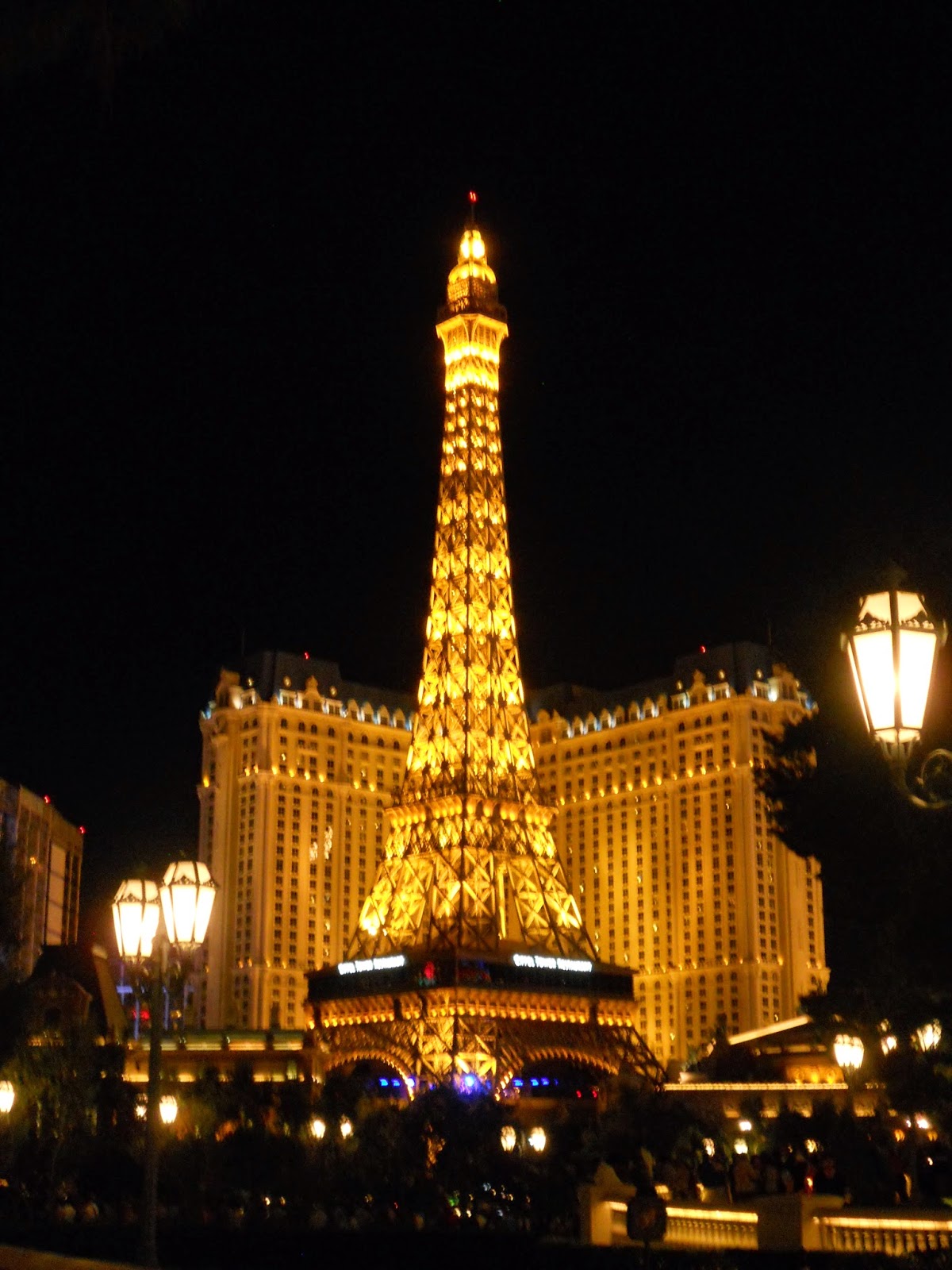
From the Bellagio, it was another great shot of the Eiffel Tower in its entirety.

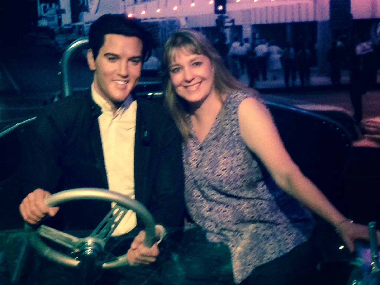
At Madame Tussaud's Wax Museum, I met a really handsome young man named Elvis Presley.  ;-)
Thank you so much for your visit, and letting me share my vacation pics!


Stamps: Fabulous You - SU; 'for you' - Cherish - Inspired By Stamping Paper: white - PTI; Summer Sun - SU Ink: Memento Tuxedo Black - Tsukineko Accessories & Tools: Copic markers; circle , corner rounder punches
Related Posts Plugin for WordPress, Blogger...