Thursday, September 15, 2011

Play Date Cafe 99


Oh, what a pretty color story this week at The Play Date Cafe.  :-)   I just know we're going to see some soft and lovely creations from our players 'hanging' in our gallery there!
Our Design Team was blessed to receive some stamps from our sponsor, Paper Makeup Stamps.


My stamps included this sweet girl and a couple of sentiments:


I stamped the sentiment repeatedly in Barely Banana to create a customized background paper:


We have a new gal starting with us this week at The Play Date Cafe, Stacy Rodriguez.  Stacy is well-versed in scrapbook layouts and 3D items, as well as cards.  We look forward to all the goodness she'll bring to us each week!  Welcome, Stacy!


The prize this week at The Play Date Cafe:  a $15 gift certificate to Paper Makeup Stamps!  Hope you'll get a chance to play with us.  :-)

Thanks for joining me today!

Colleen

Stamps:  Moody for Computers - Paper Makeup Stamps
Paper:  Lavender Lace, Barely Banana - SU; white by PTI
Ink:  Barely Banana - SU; Memento Tuxedo Black - Tsukineko
Other:  ribbon - Stamp Simply Ribbon Store; Big Shot; oval and scalloped oval dies - Spellbinders; Copic markers; pearls; dimensionals 

Wednesday, September 14, 2011

Inspired by a Curtain Panel

I love it when I am able to come up with a concept of a card, create it, photograph it, and upload it to the blog within a couple of hours.  That is SUPER rare for me!  It helps that this is a clean and simple design; makes things move along much quicker.


My inspiration came from two things:
  • and a curtain panel from Bed Bath and Beyond:
On white cardstock, I used an Anna Griffin stamp three times - in Going Gray and Basic Gray dye inks, and in Versafine Onyx Black.  Tied on a recycled gift bag handle/ribbon, put on a sentiment and bling, and there you go.

I have to show you the amazing difference between dye inks and Versafine, in case you don't already know it:


The Basic Gray ink is in the top part of this photo and has a more 'puddled' unclear look when used with this stamp.  The bottom row uses Versafine, which is meant to bring out the details better in a stamp.  It sure does!  I was thinking "Oh, these Anna Griffin stamps (bought on eBay a while back) are no good!"  But with the right ink, well, that is a different story.  Guess I'll keep 'em! 

The sentiment is one I need to remind myself of allllll the time:


Thanks so much for being here!  I hope your day is a good one.  No, make that a GREAT one!

Colleen

Stamps:  sentiment - Here For You - Verve; design - Anna Griffin
Paper:  white - Mark's Finest Papers
Ink:  Basic Gray, Going Gray - SU; Versafine Onyx Black - Tsukineko
Other:  pink gem - Queen & Co; ribbon - recycled from gift bag

Tuesday, September 13, 2011

Botanical Birthday

Today is the birthday of a good friend of mine.  She loves nature, and decorates her home in an earthy palette, with simple, elegant pieces.  I always feel peaceful in her presence. 

I made this card for her, using several beloved sets from Stampin' Up! - Nature's Pace, En Francais, and Botanicals (new to me, from eBay).  The sentiment is from Mark's Finest Papers Just Dandy


I used a page from my old Miss Manners book, too, as a background paper (which you can hardly see - doh!).  The lace - love it! - is from Mark's Finest Papers, and the velvet ribbon I think might be old SU stuff. 


Challenges entered:
Thanks for popping by today! 

Colleen

Stamps:  Nature's Pace, En Francais, Botanicals - SU; Just Dandy - Mark's Finest Papers
Paper:  Always Artichoke, Crumb Cake, Whisper White - SU; Miss Manners  book page
Ink:  Walnut Stain, Antique Linen, Frayed Burlap Distress inks - Ranger; True Thyme, Crumb Cake, Mellow Moss - SU; Versafine Onyx Black - Tsukineko
Other:  lace - MFP; pearls; velvet ribbon - ?; dimensionals

Monday, September 12, 2011

All things are possible

When I created this card the day before the 10th anniversary of 9/11, the event was weighing on my mind.  As I watched the memorials taking place yesterday, I cried buckets.  I did, indeed, feel as if I were at a funeral.  It makes my heart very heavy to think of all that our country has lost since that day, and what American families and friends have lost. 

My husband is a great patriot.  He has told me countless times that when terrorists attack, we must not let them believe they have won.  We must get up and rebuild and move forward, because we are Americans.  We must never forget those who are lost, but we should not lie down in defeat.

I thought the Verve sentiment, "All things are possible", can reflect the courage we all share as humans. 

My sister went to school with a girl who lost her sister on 9/11.  She was 29 years old, worked on the 104th floor of the North Tower as a vice president for Cantor Fitzgerald.  Her name was Danielle Kousoulis.  On the news yesterday, I saw her sister and parents on television as they made their way toward the 9/11 Memorial.  My heart goes out to the Kousoulis family, and the thousands of others who lost someone that day.


Challenges entered:
Thanks for joining me today.

Colleen

Stamps:  Here For You - Verve
Paper:  Basic Gray, Sahara Sand, Whisper White - SU
Ink:  Sahara Sand - SU; Versafine Onyx Black - Tsukineko
Punch:  Martha Stewart
Other:  Big Shot; Floral Doily Motifs die cut - Spellbinders; Vintage Wallpaper and Finial Press embossing folders - SU; gray satin ribbon - Really Reasonable Ribbons; pearls; sponge

Thursday, September 8, 2011

Play Date Cafe 98 -


Our new color story at The Play Date Cafe is TEAL, MUSTARD & NAVY.  Jax keeps coming up with the neatest color combos!  Although these deep, rich colors would not be my Go-To palette, my card came together really easily.

The Cafe's sponsor this week is

They kindly let us pick out stamps to play with, and I LOVE mine:


The Filigree Star paired so nicely with this sentiment, and I gave both a gleam with gold embossing powder.


We have some sad news to share as a team this week.  :-(  Two of our teammates are leaving the Cafe.  Libby and Tracey each have family matters that need attention, so they made the decision to retire from the PDCC.

I will miss Libby and her spunkiness.  She makes me laugh!  Her creations always have a fun look, echoing the wonderful personality of their maker.  :-)  And Tracey has the most beautiful, unique stamping style that amazes me each week.  She usually makes her own patterned paper and is addicted to embossing powder.  ;-)

I hope you will leave some love at their blogs.  And head over to  The Play Date Cafe to see our tribute to these wonderful ladies.  We will miss them very much!

Colleen

Stamps:  Filigree Star, We Create Our Tomorrows... - DRS Designs
Paper:  Night of Navy, Taken with Teal, So Saffron - Stampin' Up!
Ink:  Versamark - Tsukineko; Night of Navy - SU
Other:  velvet ribbon - SU; floral ribbon - Michael's; pearls - Recollections; gold embossing powder - SU; heat tool; dimensionals

Wednesday, September 7, 2011

CAS Butterfly

This is a super simple card I have for you today.  The coloring took the most time, and it was a pure pleasure to do.


I am CASEing a morning glories card I found somewhere on the Web and saved to my computer.  The photo of the card didn't have a watermark :-(, so I don't know who made it.


I used a butterfly from an older Stampin' Up! set called Touch of Nature.  I LOVE so many of SU's older stamps.  I haven't even used all of them yet.  It bums me out that I can't use them when I make cards for magazine submissions.  They usually want current products, and although I have some things that are current, my heart lingers over older supplies/stamps that I hold dear.

At least Paper Players won't mind if my challenge submission uses an older stamp!  They want to see birthday cards this week.

Before I go, I want to show you a project I worked on this summer.  I made porch curtains out of all-weather fabric from Waverly.


Curtains closed to block the afternoon sun.

Curtains open and tied back.
It was an easy project and I am so happy with the outcome.  I used a pole from Plow and Hearth, meant for outdoor use.  The fabric was on deep discount at JoAnn Fabrics when I bought it.  I was lucky to find the same material that had been used to make the porch cushions a couple of summers ago.  A friend made and covered them for me, using foam made for boat cushions.  The wicker furniture belonged to my grandparents, and they purchased it used from a convent many years before.  I don't know how old it is, but I cherish it so much.  Not only is it beautiful, but it was part of the scene as I grew up.  The set had been painted bright orange, then mustard gold, then pea green, and then white in my youth.  I think I prefer the classic white, thank you.  ;)

Cristabel in my crafting area.
I'll be back in the wee hours of tomorrow morning with a new Play Date Cafe card.  See you then!

Colleen

Stamps:  Timeless Tags - Craft's Meow; Touch of Nature - SU
Paper:  Wild Wasabi - SU; white - PTI
Ink:  Memento Tuxedo Black - Tsukineko
Other:  Big Shot; Perfect Polka Dots embossing folder - SU; Copic markers; circle die cuts - Spellbinders

Tuesday, September 6, 2011

Purple Asters

I do have real asters that will bloom in a few weeks in my backyard, but today's are blooming on my card.


Well, technically these are Black Eyed Susans, from the Mark's Finest Papers set Black-Eyed Susans for Encouragement.  ;-)  I think they make great asters!

Things to know about this card:
  • This is a CASE of my friend LeAnne Pugliese's card which you can see HERE.  Her card is orange, but I picked my fave color - purple.
  • I'm playing at Ribbon Carousel Challenge blog - my first time.  :0)  It's Anything Goes this week.
  • Also playing at Flourishes' Bring Back Beautiful - theme is Monochromatic.
Some more details --


Thanks for letting me CASE you, LeAnne! 

We went to Washington, D.C. for an overnight trip last week and I wanted to share some pix with you.
My girls in front of the (currently non-tour-able) Washington Monument.

The Wizarding outfit worn by Daniel Radcliffe, who plays Harry Potter.

A crown featuring gems worn by Marie Antoinette.

Biggest doll house I've ever seen!

The Ruby Red Slippers worn by Judy Garland in "The Wizard of Oz."  That was my oldest daughter's very favorite movie for the longest time.

My husband next to Rutherford B. Hayes, US President.  We visited Madame Tussaud's Wax Museum, which was a terrific tour!  My kids think this President looks my husband might in a couple of decades.

My daughter with Rosa Parks.

My children have been adopted by The Kennedys.

A bust of Marie Antoinette.  Madame Tussaud was asked to make a death mask of her at the time of her execution.

Honestly, doesn't Morgan Freeman look so real??

Me with Johhny Depp aka Captain Jack Sparrow.  I LOVE Johnny Depp!
Thanks for joining me!

Colleen

Stamps:  Black Eyed Susans for Encouragement - MFP; En Francais - Stampin' Up!
Paper:  Lovely Lilac, Old Olive - SU; page from Miss Manners book
Ink:  Perfect Plum - SU; Memento Tuxedo Black - Tsukineko; Frayed Burlap - Ranger
Punch:  Scallop Edge - SU
Other:  Big Shot; Copic markers; pearls - Recollections, Queen & Co.; satin ribbon - Offray; Elegant Lines embossing folder - SU

Saturday, September 3, 2011

A Scrap Quilt

Next week is my mother-in-law's birthday.  I made a card especially for her, thinking of her taste and style.  She loves quilts and objects that have a distressed patina.  I love to see what's "new" in her home, because she always has the most interesting things!

The card mimics a vintage, distressed quilt.  I chose some patterned papers from my scrap bin, in 1" strips.

I used a 1" square punch to get all my pieces a uniform size, then arranged them in a pleasing pattern.
They were glued down on an ivory square, then embossed with Sugar embossing folder by Sizzix. 


After embossing, I used a rectangular block nail file and gently sanded the raised areas.  The crocheted trim is from Mark's Finest Papers - so pretty!


The sentiment is from Stampin' Up!'s Vintage Labels, on a Spellbinders Lacy Square die cut.  I mounted that on a Scalloped Square punch.  Both were sponged with Antique Linen distress ink, and the ivory card base also has sponged edges.

I popped it in the mail this morning, and hope she likes it!

Thanks for joining me today.  :)

Colleen

Stamps:  Vintage Labels - SU
Paper:  cream - PTI; Rose Red, Basic Black - SU; patterned paper - retired SU
Ink:  Antique Linen distress - Ranger; Versafine black - Tsukineko
Punch:  1" square - Marvy; scalloped square - SU
Other:  crochet trim - Mark's Finest Papers; Big Shot; Lacy Square die cut - Spellbinders; pearls - Recollections; dimensionals; sponge; sanding block

Friday, September 2, 2011

Inspired by a Children's Book


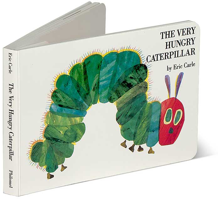
When my girls were small, we read The Very Hungry Caterpillar by Eric Carle.  They especially loved putting their tiny fingers through the holes on each page, where the insect had "chewed" through.


While considering a birthday card for my sister, and trying to tie it in to a challenge, I decided to "CASE" Mr. Carle's illustration.


I love the way it looks!  It's so fresh and clean.  I added subtle detail with my Martha Stewart Score Board:


It was fun to color in these berries.  They are just the juiciest, sweetest berries - can't you tell??  ;-)

I am playing in a challenge new to me (but my friend Bonnie plays there all the time) - Less Is More.  This week's challenge is called "Recipe - Take 3 Challenges."

I chose these three previous challenges for my recipe:
9 - Touch of Red / 26 - Feeling Fruity / 28 One Layer - Use Ink
Another challenge that I haven't played in before:  CAS-ual Fridays, owned by my teammates Julie Ranae and Michele Gross.  They've been around for several months now, but because of my family issues, I didn't have time to play there - until now!  The challenge this week is about being inspired by a favorite book.

This was fun!  Hope you enjoyed this as much as I did.

Colleen

Stamps:  Strawberries - Flourishes; Timeless Tags - Craft's Meow
Ink:  Memento Tuxedo Black - Tsukineko
Paper:  white - PTI
Punch:  corner rounder - Stampin' Up!
Other:  Martha Stewart Score Board; Copic markers

Thursday, September 1, 2011

Play Date Cafe 97 - To The Moon and Back


It's Color Splash Week again at The Play Date Cafe!  Yay!  I love black and white, and always look forward to what our newest 'splash' of color might be.  This week, the splash is RED. 


Our sponsor is TradeFish Designs, and they were kind enough to let our Design Team play with some fun products!  I received "Outta This World".


And here is my take on that:

I know it's not my usual, but I really like it!  I had fun coloring the moon and rocket with Copic markers.  The sentiment is one I've said to my youngest child for many years, so this stamp set just had my name written all over it.  ;-)


A couple of clouds, the moon and rocket are all set up on dimensional stickers.  The stars are stamped in Whisper White craft ink, and the sentiment is heat-embossed in white.
Go check out what the other gals have for you this week, peek at the Cup of the Week prize, and enter your own card to play with us! 

**Special Announcement**  The Play Date Cafe is acquiring a second Private Blend Designer! Please welcome Stacy Rodriguez to our team! Her official start date is September 15th, but we thought it would be fun to announce her new position today and get her ready to join the fun! Can't wait to work with you, Stacy!

Thanks so much for joining me today.  :-)

Colleen

Stamps:  Outta This World - TradeFish Designs
Paper:  white card base - PTI; Basic Black cardstock - SU
Ink:  Whisper White Craft ink - SU; Versamark; Memento Tuxedo Black - Tsukineko
Punch:  corner rounder - EK Success
Other:  heat tool, white embossing powder - SU; dimensionals; Copic markers
Related Posts Plugin for WordPress, Blogger...